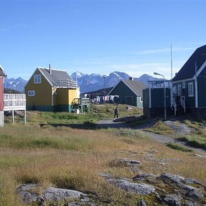
These 3 pictures are all so much better compositionally then the 1st post you made. You simplified the subject, and isolated it so that we're drawn to it with the stream.
Picture 2 just seems some what washed out, while picture 1 has more vibrant colors. The sand sky line runs basically right through the center in pictures 1 & 2. In picture 1 I would have raised the horizon to the top 1/3 of the picture to further emphasize the scrub growth, and stream as that's your main focus. The sky/clouds are a secondary subject.
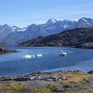
In picture 2, it's the exact opposite. I would lower the horizon to the bottom 1/3 as your emphasis is the sky/clouds. Also in picture 2 there is a tilt issue that you don't have in picture 1.
Picture 3 is a nice vertical composition using the stream to lead one right to the beach house. I like the foreground, and that you off centered the house while positioning the rocks starting dead center. Nicely done. The only issue I have is that once again the horizon line is dead center through the picture. Raising it to the top 1/3 would make the overall composition that much stronger.
These 3 pictures are all so much better compositionally then the 1st post you made. You simplified the subject, and isolated it so that we're drawn to it with the stream.
Picture 2 just seems some what washed out, while picture 1 has more vibrant colors. You're right, need to correct #2. The sand sky line runs basically right through the center in pictures 1 & 2. In picture 1 I would have raised the horizon to the top 1/3 of the picture to further emphasize the scrub growth, and stream as that's your main focus. The sky/clouds are a secondary subject. In both I tried to put the chapel just in the Fibonacci spot.Maybe not exactly there, but almost. Please see http://www.digital-photography-school.com/divine-composition-with-fibonaccis-ratio-the-rule-of-thirds-on-steroids
In picture 2, it's the exact opposite. I would lower the horizon to the bottom 1/3 as your emphasis is the sky/clouds. Also in picture 2 there is a tilt issue that you don't have in picture 1. No, there is no tilt. Please refer to the sea level.
Picture 3 is a nice vertical composition using the stream to lead one right to the beach house. I like the foreground, and that you off centered the house while positioning the rocks starting dead center. Nicely done. The only issue I have is that once again the horizon line is dead center through the picture. Raising it to the top 1/3 would make the overall composition that much stronger. I slould have pushed the chapel a bit to the left to the Fibonacci eye
Never really considered the Golden Mean/Spiral when I compose or crop a picture, as it's so precise. The rule of 3rds for me is a much looser idea that I try to live with. Really, it's non-centering the main subject to another related area of the photograph to make for a more pleasing picture. Whether or not I'm on a grid line or intersection of lines just isn't that important to me. There are even times when I feel that the best/strongest composition is having the subject dead center.


![[No title]](/data/xfmg/thumbnail/32/32707-3c49d54a87afb53e65c60391858400be.jpg?1619735611)

![[No title]](/data/xfmg/thumbnail/42/42257-4c4b35d60337b1b4ec661332486a33be.jpg?1619740066)
![[No title]](/data/xfmg/thumbnail/41/41765-153b10bab62ae8adbcc4d984fd08ed74.jpg?1619739885)