More Photos of Blair

DGMPhotography

Been spending a lot of time on here!
Joined
Mar 23, 2012
Messages
3,160
Reaction score
718
Can others edit my Photos
Photos OK to edit
I really loved shooting with her. Hope to get with her again soon.
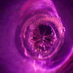
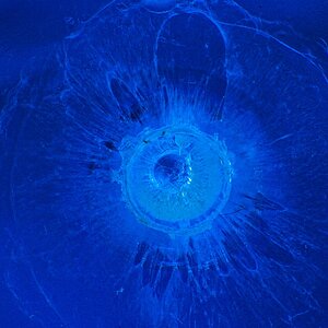
1. $DSC_0421-2.jpg I'm thinking the green drain is kinda distracting, but idk, I like it.

2. $DSC_0446-2.JPG

3. $DSC_0466-2.JPG

Feedback appreciated!!

Thanks!
 
Any feedback?
 
First image is less of a portrait and more of a simple point and shoot headshot. The third one, eye closest to the camera looks soft, and the bricks are very distracting as a background, for me this is a delete. I think the second one works best of the three.
 
Ditto, number two is pretty cool and the only keeper if it were my set
 
I'm getting a general consensus here. My photography friend also said he loved number two. Thanks so much for the feedback! For number 3, what else is wrong besides the soft eye and distracting background?
 
2 is great.
 
In reference to #3

I took me a while to figure out what I wanted to say....but 2 things.

Mainly, it's the eyes. The manner in which she is looking, seem to say she is just looking away from you, not necessarily looking at something else. I think it has to do with the tight crop. There is no "dead space" for her to look into. So, I got a very non-inclusive feeling about it, almost a sense of just "get away from me" by looking at the photo.

Then there are the "nose" guidelines about the nose breaking the plane of the face.

#1 or #3 do anything for me. It's not that they aren't nice pictures.

Good luck and keep shootin'
 
I'm getting a general consensus here. My photography friend also said he loved number two. Thanks so much for the feedback! For number 3, what else is wrong besides the soft eye and distracting background?
Background is leaning, distracting background, top of head is cut off / cropped too tightly, blocked shadows / blown highlights (possibly my monitor here at the office, but learn when to use a flash), stray locks of hair in front of her forehead, nothing but white in her eyes (no pupils visible).
 
#1 is underexposed.
#2 is okay. Her coloring is wonky. I would need to check the numbers but I thing we have too much yellow.
#3 okay. Color cast around chin. Nothing too dynamic about this image.
 
I'd chuck em all to be honest.
 
I'm getting a general consensus here. My photography friend also said he loved number two. Thanks so much for the feedback! For number 3, what else is wrong besides the soft eye and distracting background?
Background is leaning, distracting background, top of head is cut off / cropped too tightly, blocked shadows / blown highlights (possibly my monitor here at the office, but learn when to use a flash), stray locks of hair in front of her forehead, nothing but white in her eyes (no pupils visible).

Thanks for the feedback. I agree on everything except the top of the head cropping. I've read it helps to draw the attention to the eyes, albeit they aren't exactly visible in this image.
 

Most reactions

Back
Top