Mother and son

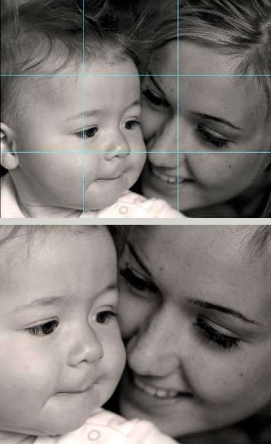
This photos give a very emotional warm feeling. It has an element hard to correctly portray in photography. the human element. It's much more than a smile and I think any human could connect with it. Simply amazing.

P.S. I love my 50 1.8 as well.
 
Okay I've seriously had enough of this. I don't know what kind of lollypop-carrying, potpouri-farting, rainbow-making care-bears you've been hanging out with in the photography world, but THAT WAS NOT CRUDE.

well your title is "i don't mean to be rude" and you started this reply with "i don't mean to be rude" ...
ok well i guess you're claiming that it wasn't CRUDE. i will now google the exact difference between RUDE and CRUDE :greenpbl:
 
How about some real definitions from the OED.

Rude: "Uneducated, unlearned; ignorant; lacking in knowledge or book-learning"
Well, definitely not that one.

Crude: "Rough, rude, blunt, not qualified by amenity"
You tell me.

But I don't even care anyway. Are you really going to argue with me about whether shadow detail is important? This isn't about how I said what I said. It's about technical basics. Don't defend ignorance.

I applaud deadeye for going and looking it up and coming back with a photo with more shadow detail.
 
I didn't expect to be called out for being rude in this thread. :confused:
 
Who are you to jump in on behalf of someone to clearly took my advice to heart and had no qualms about the way I gave it? Come off it with the white knight crap. You wanna get defensive if I say something "rude" in one of your threads? Go right ahead. But don't be a troll. You haven't even added anything useful to the actual photographic discussion.
 
you HAVE posted unhelpful and insulting posts in threads i've started. but whatever. everytime i see you post something, someone thinks you're rude (and it wasn't me to start with here). you do it on purpose- interesting though how you try and defend yourself.

constructive critisism and insulting a person are two very different things. you called her ignorant... that's not really helpful.


the mother's whole face should be in focus as well if you want my opinion and yes, the eyes brighter. one stop down and 2 or 3 stops slower maybe.
 
I just looked at your thread history. It shows that I've never posted in a thread you've started.

And I wasn't specifically calling her ignorant. You misunderstood. Not to mention, that was long after you started with the white knight bull.

And you couldn't even be compelled to comment on the photograph until you got called on being a troll.
 
mmphoto

I think you are way off base. Max is seemingly doing his best to give a direct and helpful response without unnecessary curtseying. If you don't like his style, OK, but I can't read anything unpleasant into his statements to the OP.

He is absolutely correct that the first response of someone here is should be to be willing to learn on their own - and the OP seems to understand that.

We should never confuse directness with rudeness.
 
Dude you totally just made my day.
 
um yeah... i'm thinking that your tone of arrogance became as misconstrued as my tone of caring...
i've accepted that you're "brutally honest" but honestly? you're the one who got your panties in a bunch after aammoore said~
"This is a little crude...I know you didn't mean it that way...she just needs our help..."
all i did was ask why you're so defensive and bringing up potpouri farts.
chill!!
 
I would say without knowing what you were trying to do here, Tha Baby was main objective... I think on a shot like this you should post camera data...

I mean , I think with this You used the natural light of the room...

baby could be sharper, but overall , not a bad deal here...

as said, shadow detail is very visible around eyes in Mom, but again you are shooting down on her, and eye lashes causing shadow in eye areas.., without flash or lighting this is to be expected.. mom also has dark eye makeup on probably.. all you can do is bracket on a natural shot as this, baby is also going to shadow mom in this situation....bracket, to late now , but you needed to increase f/stop up to two times ...

maybe this again is the effect you wanted.. its not that hateful, but its not a portrait either..

and MAX, I actually think you did pretty good this time!! maybe a little strong, or worded that way, but not real offensive... make me proud young fellow...
 
Now, back to the picture.
While the baby is cute (let's get that out of the way) and it is a good grab shot, that's not the same as having a really good picture.

IMO, this picture is underexposed. The colors are close to each other in tone and thus the BW is really sort of muddy.

Secondly, the faces are too close to the bottom edge. There was a discussion on another thread that asks why people are always suggesting a closer crop and the answer was that, when the composition is off, you can't add but can only crop to make it better.

Look at the image below. The thirds lines show that a good portion of the image is pretty empty and bland but more important doesn't partcularly add to the impact or frame the rest. I would expect a stronger picture when the important elements are closer to the intersection of the thirds.

Yah, yah. I know that this isn't a rule but I think it applies here.

So, to sum this up. More light, more space under the chinsy.


img6351copyor3compwl6.jpg
 

Most reactions

Back
Top