Mud

omeletteman

TPF Noob!
Joined
Jan 9, 2005
Messages
922
Reaction score
15
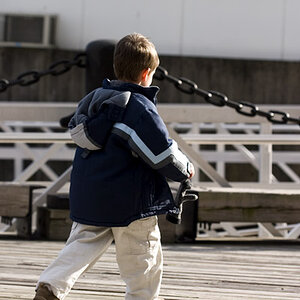
Alright so I've never posted in the critique gallery before, but since I had a specific question about this photo, I figured I might as well bite the bullet and go for it. Ok so first of all, photo:

167uiqh.jpg


Question: is the wood at the bottom of the frame too much? Does it just seem like wasted dead space?

I was hoping to use the wood to lead the eye up to the bike, and create a sense of isolation between the bike and its surroundings.

So, let me know what you think. Thanks.
 
i too think it's fine
 
You nailed it with this photo.
Nothing to be critisized. Great sense of depth ... great leading the eye to the lonely bike by the lines between the planks (is "planks" the right word here?) ... and great DOF!!!
 
bike could be a bit bigger in frame if you ask me, otherwise i like it.
 
i like it! scroll up and down a few times with this picture. its pretty cool the effect it has, like it changes dimensions.
 
i glad you put the photo up before the question. as soon as i saw it i thought wow! its only after continuing reading i questioned it. Its deffinatly an amaizing shot and the wood isnt too much!

Ganoderma said:
i like it! scroll up and down a few times with this picture. its pretty cool the effect it has, like it changes dimensions.

lol thats funny!
 
thanks for the replies everyone. I really apreciate it.

If I get it printed I will probably take markc's advice and crop to the 8x10 ratio.
 
I like it. The array of the whole photo in my mind portrays a vast amount of hope because the leading of the wood to the bike and there onto the vast land beyond. The bench next to the bike is like "sitting and wondering." I think it is very expressive. I like it.
167uiqh.jpg


Question: is the wood at the bottom of the frame too much? Does it just seem like wasted dead space?

I was hoping to use the wood to lead the eye up to the bike, and create a sense of isolation between the bike and its surroundings.

So, let me know what you think. Thanks.[/quote]
 
The wood is too angled. Meaning that when you look at it, all the wood seems to be going off to the right, and the bike not being exactly centered doesn’t help. The bench is also a bit distracting, so if you shot this digitally, you should go into photochop and take it out with the clone tool. Leave the other 2 pieces coming up because those do a nice job of framing in the subject. Personally, I don't think there is too much wood, its just not straight up and down.

Other than that, it seems like a good B&W.
 

Most reactions

New Topics

Back
Top