Music album cover

DanOstergren

TPF Supporters
Supporting Member
Joined
Jun 2, 2013
Messages
4,493
Reaction score
4,141
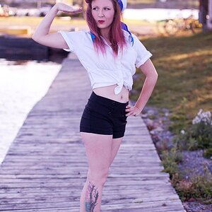
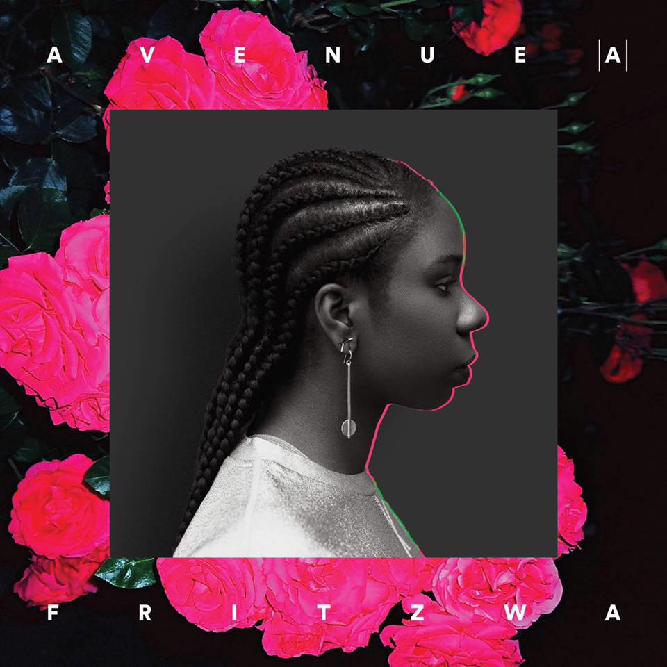
I was commissioned to take photos for a contemporary R&B artist's album cover and some material for a press package. The musician also hired a graphic designer to add some flair to the final image.

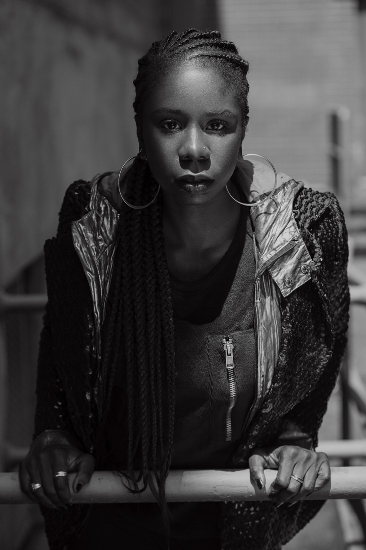
As always, working with a team means having to work around everyone's schedule, and as a result we were limited to shooting at high noon. I shot outdoors using available light in the shade, with a white reflector for some fill light. All were shot using a Canon 85mm f/1.8 lens (set to f/4), on a Canon 5D Classic.

The finished album cover:
14054092_10103248638653895_3763789856095983449_n_by_danostergren-das4a8p.jpg


Here are some of the other images from the shoot.

_mg_3261_by_danostergren-das4ach.jpg


_mg_3212bw_by_danostergren-das4ac5.jpg


_mg_3136_by_danostergren-da2355d.jpg
 
Last edited:
I like your images, in particular the last one, but the album art does NOTHING for me.
 
What Tirediron said. The way they dropped your photo into the floral background is amateurish, IMO.
Your portraits are as I would expect - fantastic.
 
I like your images, in particular the last one, but the album art does NOTHING for me.
What Tirediron said. The way they dropped your photo into the floral background is amateurish, IMO.
Your portraits are as I would expect - fantastic.
Thanks for sharing your opinion. Perhaps there is context that I'm not aware of, but either way I like it. I think it's minimalistic, not amateurish.

Damn, I absolutely love your stuff. (All your stuff.)
Thank you!
 
Last edited:
I like your images, in particular the last one, but the album art does NOTHING for me.
What Tirediron said. The way they dropped your photo into the floral background is amateurish, IMO.
Your portraits are as I would expect - fantastic.
Thanks for sharing your opinion. Perhaps there is context that I'm not aware of, but either way I like it. I think it's minimalistic, not amateurish.

Damn, I absolutely love your stuff. (All your stuff.)
Thank you!
Amateurish was not directed to your photo.

Strictly my opinion but I think the way the designer placed your image into the illustration is lacking. The grey box and thin line of color around the front leaves a lot to be desired. I don't know, maybe there was no better way.

Your portrait is excellent, as always.
 
Awesome. The fourth portrait is particularly good.

What kind of music is she singing? I listened but will have to go back to it when I have some time. Seems interesting like Jazz of some sort. Oh I see contemporary RnB. Sweet.
 
Last edited:
Excellent work. I think the album cover is pretty cool, it is the "cool" contemporary style these days.
 
I like your images, in particular the last one, but the album art does NOTHING for me.
What Tirediron said. The way they dropped your photo into the floral background is amateurish, IMO.
Your portraits are as I would expect - fantastic.
Thanks for sharing your opinion. Perhaps there is context that I'm not aware of, but either way I like it. I think it's minimalistic, not amateurish.

Damn, I absolutely love your stuff. (All your stuff.)
Thank you!
Amateurish was not directed to your photo.

Strictly my opinion but I think the way the designer placed your image into the illustration is lacking. The grey box and thin line of color around the front leaves a lot to be desired. I don't know, maybe there was no better way.

Your portrait is excellent, as always.
I know you weren't directing your comment at my work. I too was just sharing my opinion on the cover. Once the photo was done, it was sent to the record label and then given to the graphic designer. There was a very specific mood board given to me for the photo shoot, so I assume the designer was given very specific instructions as well, so like I said there is likely to be some context behind the editing choices that we're just not aware of. Either it's what the musician or the record label wanted, I'm not sure. I personally like it though; the framing is a nice contrast from the black and white image in the middle, and I think the little pop of color added to the photos ties it together nicely without being too much. Just my opinion though.
 
Awesome. The fourth portrait is particularly good.

What kind of music is she singing? I listened but will have to go back to it when I have some time. Seems interesting like Jazz of some sort. Oh I see contemporary RnB. Sweet.
Her music is definitely a bit different. Not something I would normally listen to, but I also can't deny that she's talented.
 
#4 for me. You did well!
 
I actually really like the finished album art. It's contemporary and reflective of the trends you typically see in album art these days. Whether or not it's everyone's cup of tea is another thing but commercially I think it looks great!
 
I actually really like the finished album art. It's contemporary and reflective of the trends you typically see in album art these days. Whether or not it's everyone's cup of tea is another thing but commercially I think it looks great!
Thank you.
 
Oh, I love that last one. She looks strong and so feminine at the same time.
 

Most reactions

Back
Top