My beginners photo's

scottyboy

TPF Noob!
Joined
Aug 10, 2009
Messages
3
Reaction score
0
Location
York, North Yorkshire
Can others edit my Photos
Photos OK to edit
Hi There all, been browsing these forums for many months now and thought it's time I got involved as you people on here have give me many hours of "damn that's amazing, how the hell did he/she do that, bloody hell I am crap and what, where and how" thoughts running through my head........ So Here are a few photo's which I personally think are good, some might have a difference of opinion and this is why I am here, so here they are, hope you enjoy them...
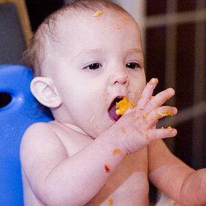
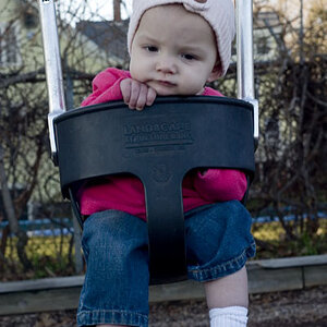

3. Sophie.

Kids001.jpg


4. Sophie Again.

Kids002.jpg


5. Sophie Yet Again.
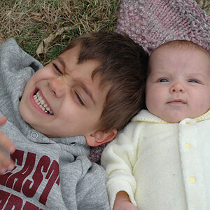
Kids003.jpg


6. Sophie and Amy.

Kids004.jpg


7. Another of the brats.

Kids005.jpg


8. Nooooo Sophie and Amy Yet Again.

Kids006.jpg


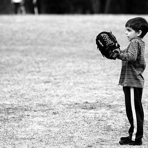
9. The gang of kids.

Kids007.jpg


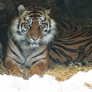
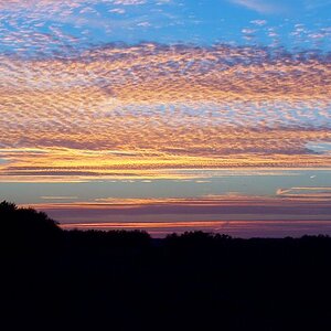
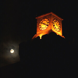
10. The York Minster Last night.

Minster.jpg


Please feel free to give me some C&C on the above so I can as every one is trying to do and learn by their mistakes....

Thanks all of you and look forward to hanging around for a long time as this forum is full of good ideas, information and best of all some amazing photographs.. Thanks again Scott

p.s I forgot to mention they are all straight from the camera.....
 
Last edited:
Before someone say it, dont post too many pix at once if you want C&C.

3-4 max at the time.

:)
 
Post 3-4 for good CC, posting more typically gets you less CC

#1 and #2 seem a bit too quick / snapshotty to me. As in, "oh, moment to capture, CLICK". Nothing wrong with those kinds of images, but as they can't really be repeated, its hard to give good CC.

#3 is odd. I do not like the crop as you cut off part of her chin and even lip. Its ok to cut bits out (mostly top of head) for impact, but as a general rule and until you get more portraits under your belt, aim at framing the head properly in an image.

#4 I dont like nostril shots. Try not to be lower than your subject

#5 and #6 same as #3 in that you are cutting off parts of her face. Zoom out a bit to get more in there. Looks like they have great smiles, but we dont see them

#7 great expression on the little one. I love it. I'm not a fan of the hair in the other girl's face. A bit is ok, too much is distracting. See how much the older girl is cuter when her whole face is in the picture?

#9 fun shot, but the top kid is not aligned :) hehe.

#10 the left side of the image is distracting to what could be a really fun right side. The middle tower and right side have some nice mood to them which is a bit broken by the brightness and odd silhouette of the left side.

Overall, I find some of the BW are a bit flat and need some Levels adjustment or contrast work. But they are decent pictures and definatly a good foundation to build on. Sharpness is not too bad, you just need to work on composition, stepping back and watching the angles you shoot at.
Keep it up, practice practice practice!!
 
Hi I am back again,

well Fremen you point has been taking in hand didnt realise but thanks for you advice on that issue cheers.

shortpballer you completely right in what you are saying, it was my little nieces birthday and she was a little excited and this was just a snapshot and I appreciate your comment as you are totally right in what you are saying, lol....

bigtwinky all the issues that you have kindly taken time to point out have been taken on board too and really appreciate your input, god this photography thing blows my mind, way to much to learn in so little time, but thanks again all of you!!!!!

Scott
 
#1 I think this is very good. I notice you have focused on the eyes
which is really important. I don't know if you use Photoshop but
for myself I would have got rid of the marks on her face. The
background is blurred, but still I find it distracting.
#2 and 3 seem to be underexposed and there's no sparkle in the eyes.
For me, these photos just don't work.
#4 I don't want to look up someone's nose.
#5 I like your composition.
# 6 7 8 9 Here again, I like your composition and tight crops. Your
focusing on the eyes look good. You know, these would be really
good photos but they have a 'muddy' look to them which I think
comes from being underexposed. I think you've done a very good
job.
_____________________________________
http://www.dreamworldimages.ca
Pet Photography Business
Child Photography
 
Cheers Doogan for your comments they have helped me thoroughly as just from you and bigtwinky commenting on my photo's has already made me start to look at my photo's from a different point of view, this is just what I needed as out of all the people I know, none really know what a good photo really is, yeah of course you get people saying awww that looks nice. But for you people taking time out to actually analyze each photo is going to help me endlessly,

Thanks all Again....

Scott
 
.... way to much to learn in so little time, ......

Whats the rush? Take a few tips that you read, understand them, apply them and get used to them. Then move on to something else.

You can't do it all in one shot (haha, pun intended), so start with the basics of composition to nail those down and then start to get artsy.

If you like portraits, look at magazines with alot of portraits in them to get ideas of poses and what works (or what doesnt). If you like landscapes, read nature / national geographic.
 
Post 3-4 for good CC, posting more typically gets you less CC

#1 and #2 seem a bit too quick / snapshotty to me. As in, "oh, moment to capture, CLICK". Nothing wrong with those kinds of images, but as they can't really be repeated, its hard to give good CC.

#3 is odd. I do not like the crop as you cut off part of her chin and even lip. Its ok to cut bits out (mostly top of head) for impact, but as a general rule and until you get more portraits under your belt, aim at framing the head properly in an image.

#4 I dont like nostril shots. Try not to be lower than your subject

#5 and #6 same as #3 in that you are cutting off parts of her face. Zoom out a bit to get more in there. Looks like they have great smiles, but we dont see them

#7 great expression on the little one. I love it. I'm not a fan of the hair in the other girl's face. A bit is ok, too much is distracting. See how much the older girl is cuter when her whole face is in the picture?

#9 fun shot, but the top kid is not aligned :) hehe.

#10 the left side of the image is distracting to what could be a really fun right side. The middle tower and right side have some nice mood to them which is a bit broken by the brightness and odd silhouette of the left side.

Overall, I find some of the BW are a bit flat and need some Levels adjustment or contrast work. But they are decent pictures and definatly a good foundation to build on. Sharpness is not too bad, you just need to work on composition, stepping back and watching the angles you shoot at.
Keep it up, practice practice practice!!


Personally capture 2 is disturbing to me.
 

Most reactions

Back
Top