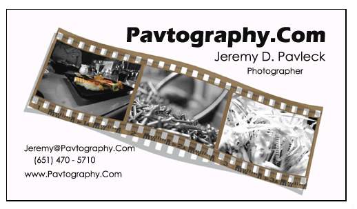
My business card. I hate it, critques please

JDP

TPF Noob!
Joined
Aug 16, 2006
Messages
285
Reaction score
0
Location
Minneapolis, MN
Website
www.pavleck.com
Can others edit my Photos
Photos OK to edit
253896238_2910c3e6fb_o.jpg


I like the filmstrip graphic, it clearly states what I do. I can add another frame to it and have it go to the edges.
But what I'm curious on and sort of at a loss for is the text. It looks to... plain.
Any fonts/layouts you can suggest? Feel free to take the image and edit it, just leave that filmstrip there hehe.
It just doesn't 'snap' to me. I'm also open to the back side.
And, any thoughts on matte vs glossy?
 
Yea i think you've identified the problem already...... the film strip is ok, but the typography lets it down..... i also dont care much for the background colour.

I would change the typeface to something more simple..... and try justifying the main type to the right hand side. AS for the other text at the bottom, justify it centered (its all over the place at the moment) or to the left, and lower it so its level with the bottom corner of the film strip.

You can also make the type more interesting.... like using bold with plain.... ie.. www. pavtography.com (ignore the gaps... it was trying to make it into a URL)

I would also use a black background for this card. ;)
 
I'm right with Archangel on this. Background color other than white. Maybe even dark gray. The way it's arranged on bottom left corner for me is the most distracting. And maybe a stupid thing but personally, I like to see the phone number a little slicker say like:

651.470.5710
 
I like the film strip idea...but I think it's just too small on a business card.
 
Big Mike said:
I like the film strip idea...but I think it's just too small on a business card.
You wanna carry a billboard around, Mike?

:wink:
 
KevinR said:
I'm right with Archangel on this. Background color other than white. Maybe even dark gray. The way it's arranged on bottom left corner for me is the most distracting. And maybe a stupid thing but personally, I like to see the phone number a little slicker say like:

651.470.5710

Thats what I was thinking too. I thought that a gray background would look good.

However, I do really like the film strip. That is what I noticed the most about the card.
 
I also think that the color CANNOT be white in the background on this particular idea. something very dark would be the way to go. That also causes a shadowing problem for the " under the filmstrip" but it would make it look more conisitent overall.
 
I hope you don't mind my criticism of your card. This is all my personal opinion so take it as you will.

My suggestion would be to make sure you align your text. I would align the upper right text to the right and the lower text aligned left. This will help balance out the card. Solidify it.

Also put emphasis on you not your website. You have the website listed twice. I think one URL is enough on a business card.

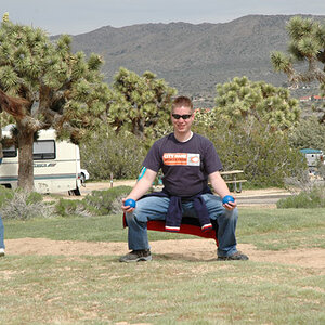
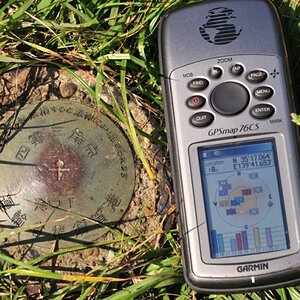
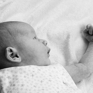
I also suggest you change some of the images. I was confused at what I was looking at with the middle and right photo until I looked at your site.

Also look at the colors... If you are going for wedding photography/portrait keep the light colors. But if what you shoot dosen't matter try using the colors from your website it will help keep a consistency. Between card and website.

As for the film strip extending from edge to edge, try it. Check to make sure that the film strip dosen't split the design in half.

I hope this helps. Please excuse my spelling and grammar, english is not my first language.
 
My idea for a business card was a image on the front, with my name carefully implanted into the image, and then my phone number name and website on the back. Simplistic....

Maybe you can incorporate something like that?
 
anyhow you need change fonts!!!!!)))))) agree with Nekoism about alines....to make fonts more interesting u can use option "Add a layer stile" in Photoshop and play with Drop Shadow & Stroke.....or CorelDraw....for polygraphy better this soft (vector graphics). And better buy dvd with fonts....I have more than 20000 fonts for design...
 

Most reactions

Back
Top