My final panel for my OU course (10 images)

Chris of Arabia

Herding cats since 1988...
Supporting Member
Joined
Mar 10, 2007
Messages
7,824
Reaction score
16
Location
The Magic Kingdom
Website
www.flickr.com
Can others edit my Photos
Photos OK to edit
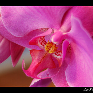
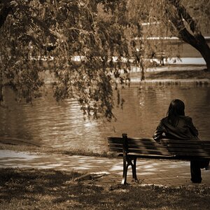
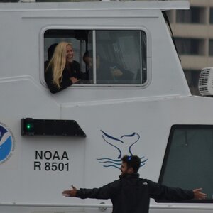
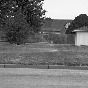
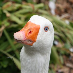
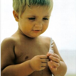
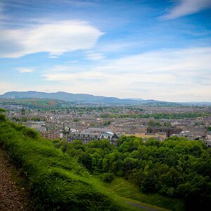
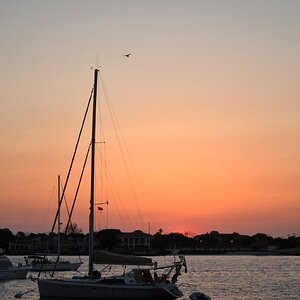
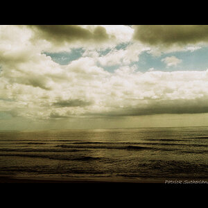
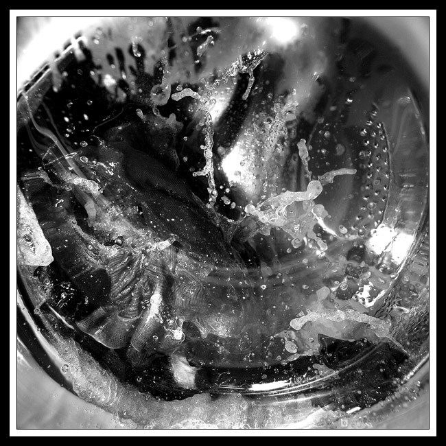
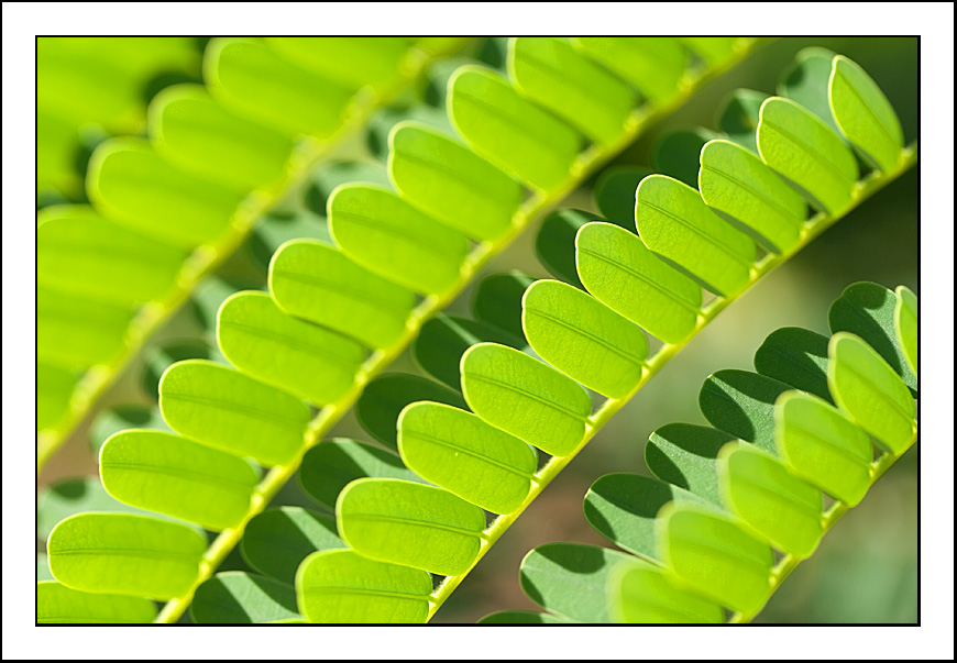
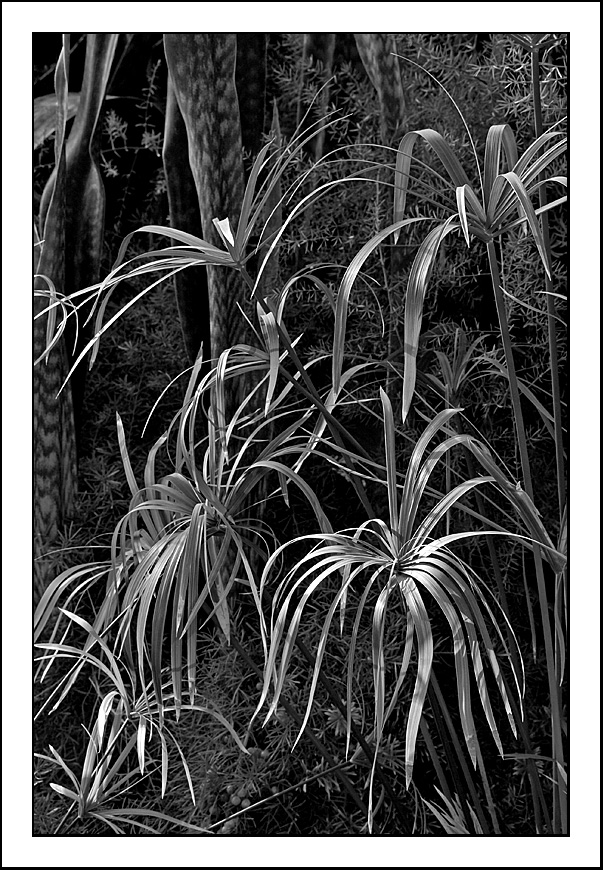
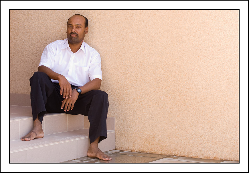
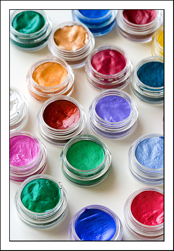
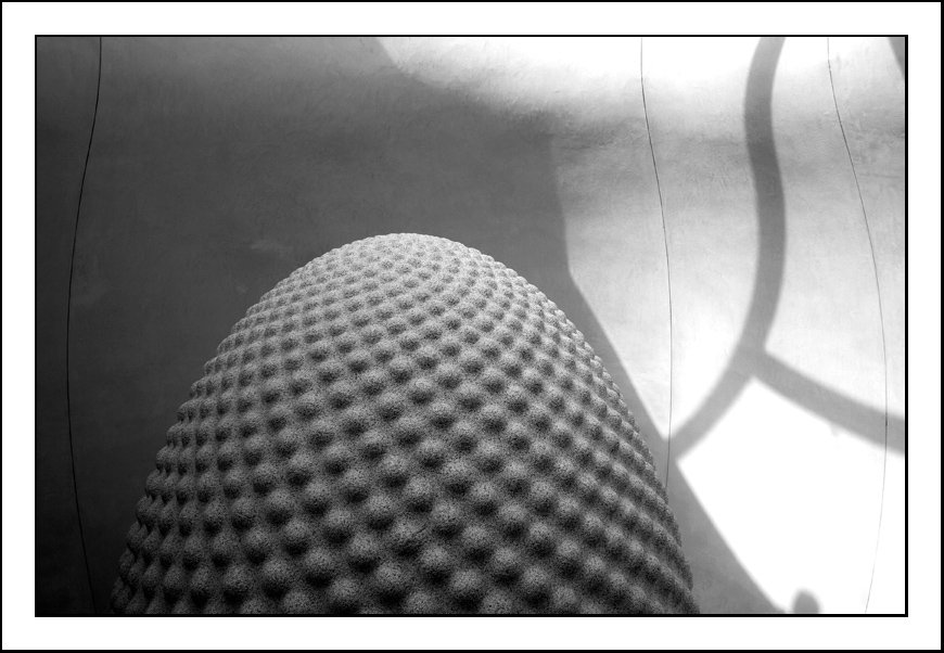
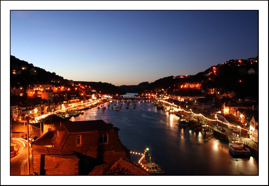
These are the final panel of images (or very close versions of the same images) I'm submitting for my Open University T189 "Digital Photography: creating and sharing better images " course. Its only 10 weeks long, so nothing to get too excited about. Think you'll have seen all these before at some point, hence to reduced size this time round. Hopefully I've hyperlinked them well enough to look at the larger size if you really wanted to. I have to title them too before Monday, but you'll have to make do with numbers for now. They are also in the order the assessor gets to see them too.

1.


2.


3.


4.


5.


6.


7.


8.


9.


10.


I'm still not 100% sure on the last one, but I've a couple of days to mull that over. Think I'll pass?
 
Yep, I'd say you pass! It's good to see them all at once. Have missed a few before now (like #2, which I quite like). Where is #10 from?
 
if i was not a twrok and had time for serious comments, I would comment ;)

but now I can only say there are some very nice images in that collection.

the last one sticks out since it is very conventional compared to the rest. but that is not a bad thing.
 
#2 is very much the joker in the pack - it was shot because somebody asked for a picture of my washing machine whilst it was running during my MOTW thread. I liked the end result, chaotic or not - it amused me at the time, because I can see a pair of my boxer shorts in there.

#10 is Looe Harbour. They allow you to include shots that were taken before the course started. This is one of them, as is #8. It is conventional, which is probably why I'm hesitant about it. I was trying to strike a balance between the number of landscape/portrait oriented shots and between the colour/B+W ones. I felt that last one needed to be colour and landscape which is why it ended up being selected. I could have nipped up the road and got some sand dunes this afternoon, but I don't think that would have improved things much.
 
Chris of Arabia said:
... it was shot because somebody asked for a picture of my washing machine whilst it was running during my MOTW thread...

Be forever grateful, eh? ;) ;) ;) :biggrin:

Why-o-why might I like Photo 4 :scratch: :scratch: :scratch: ???

:lol:
 
Well, all was submitted about 5 minutes ago, along with 600+ words on a selection of questions demonstrating my 'visual awareness', 'technical control' and 'characteristics of my photography' - never before have I written so much waffle in so few a number of words.
 
I love 9! (I know people are falling in love with different numbers but that is probably the best part, is EVERY image is reaching out to touch someone over a broad range rather than everyone liking one number more than all the rest, proving that you didn't just take ONE good photo, but a slew of good photos with the decision in a favorite very hard to make, bravo!) You'll definitely get good marks.
 
Well, today, I got back the final bit of feedback from the marker of the panel of images above. It's a bit of a lengthy narrative, but it's interesting to see how different people view this sort of stuff. The narrative is in two parts and also has a couple of supporting tables which I can't reproduce here.

Part 1 (i) Visual Awareness - unique comments on panel and overall grade achieved (e.g. emerging strengths, weaknesses, visual creativity, variety in use of camera/image editing, overall impact)

A very strong visual awareness here. Excellent. You have chosen a good variety of subjects and the overall impact is impressive. Image 4, flame tree leaf, is a little confusing visually, with the top left of the image seeming rather redundant visually and where the light green leaves, although not bleached-out, seem very light and distracting. Your portrait of the houseboy is fantastic - great mood and composition. The cropping of Image 1 is a little difficult. If it were to be a catalogue shot, what exactly would it be illustrating - the back plate or the neck joint - which it doesn't do particularly well. Maybe a wider angle would have helped. The burnt out highlight (top-centre) was also a little distracting. The Eden Project shot (Image 8) is a little confusing - I was not sure if it's meant to be an entirely abstract shot, or more representational of an actual object. For me it didn't work either way

Part 1 (ii) Technical Quality - unique comments on panel and overall grade achieved (e.g. emerging strengths, weaknesses, technical creativity)

You have a confident and assured technical style. Well done. For Image 9, the top right of the guitar neck seems unsharp, suggesting that there is insufficient depth of field. This then begs the question of where the centre of interest is visually in the image - the eye being drawn to the empty space between the two pickups. This makes the image a little confusing, although the rich tones are pleasing

On the tables, which are marked with tick and crosses for strengths and weaknesses respectively, there were a total of 23 ticks and 10 crosses. Image 4 got 6 of the crosses and Image 6 got 7 of the ticks. Guess I can work out was was liked and what wasn't from that.
 
Did you agree with the comments? As you noted, it's always interesting to get the views of different people
 
I guess I tend to think the reaction to #4 is just a shade on the harsh side, and the effusiveness over #6 is overdone.

I get the impression that the comments on the technical side of #9 were a case of needing something to say. Don't get me wrong, I don't think the images are perfect by any stretch of the imagination, but if technical flaws needed picking up, I'm sure I could have found better examples in the other images.
 
I actually liked 4 quite a bit.

Dani.
 

Most reactions

Back
Top