My Final Photo Portfolio. Please don't be gentle! 56k beware

havoc

Jedi something or other
Joined
Aug 23, 2003
Messages
1,093
Reaction score
4
Location
Portland Oregon, USA
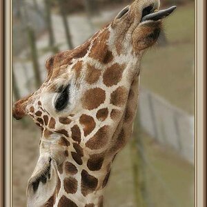
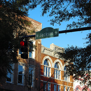
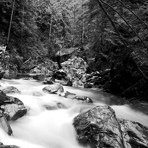
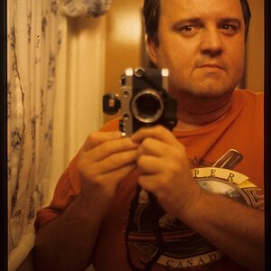
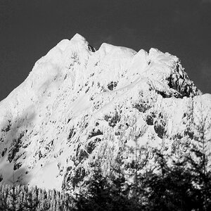
For your consideration, my final portfolio for photo class this term. Please give your opinions good or bad. I really need some critique (since my prof. won't have time). This is my 3rd and firth assignments.

3393%3A55923232%7Ffp46%3Dot%3E232%3A%3D937%3D858%3DXROQDF%3E232347959%3A936ot1lsi

3393%3A55923232%7Ffp46%3Dot%3E232%3A%3D937%3D858%3DXROQDF%3E232347959%3A935ot1lsi

3393%3A55923232%7Ffp46%3Dot%3E232%3A%3D937%3D858%3DXROQDF%3E232347959%3A93%3Bot1lsi

[
3393%3A55923232%7Ffp46%3Dot%3E232%3A%3D937%3D858%3DXROQDF%3E232347959%3A93%3Aot1lsi

3393%3A55923232%7Ffp46%3Dot%3E232%3A%3D937%3D858%3DXROQDF%3E232347959%3B759ot1lsi

3393%3A55923232%7Ffp46%3Dot%3E232%3A%3D937%3D858%3DXROQDF%3E232347959%3B762ot1lsi

3393%3A55923232%7Ffp46%3Dot%3E232%3A%3D937%3D858%3DXROQDF%3E232347959%3B764ot1lsi

3393%3A55923232%7Ffp46%3Dot%3E232%3A%3D937%3D858%3DXROQDF%3E232347959%3B765ot1lsi

3393%3A55923232%7Ffp46%3Dot%3E232%3A%3D937%3D858%3DXROQDF%3E232347959%3A939ot1lsi
 
Hi there Havoc!

The one thing that strikes me immediately is the soft focus, the subjects and composition look good but just not sharp enough.

HTH and good luck!
 
Once again I'll begin with the disclaimer that I always wonder what the actual prints look like. Your scanner could suck as much as my monitor does.

Looking at the whole portfolio as a group I notice a few things. I see three distinct themes: big city archtecture, old buildings, and wilderness streams. Portfolios that stick to one theme will come across stronger. Maybe just shots of the skyscrapers and the old buildings as an architecture theme or the streams and surrounding landscapes as a natural theme. Of course there are portfolios where the photographer is the theme, in which case I'd want to see a more varied selection of your work.

The other thing I see is that some of the prints have a nice snappy contrast range, while others are sort of flat (#2,3,8,9). I like the snappy one's myself; whatever your flavor, the entire portfolio should be printed in a similar contrast range.

Looking at these and other posts you obviously have an eye for composition. Your photos of moving water are your strongest; I'd like to see you work on some atypical compositions of waterfalls, streams, etc... Keep shooting, try new things, and work on the contrast.
 
Thanks for the feedback! The sharpness issue is one i have had since getting my new camera. My professr thinks its a problem with the lens since he shot a roll thru it personally after many discussions that he thought i was doing things wrong. LOL
The contrast i am told by my prof. is high on the archetecture shots, he thinks maybe by slowing my ISO to 64 (from 100) will solve some of the high contrast issues.
I think my scanner does suck though since alot of detail didin't come thru the scans. (especially clouds and the brick work on the windows)
All the architecture & window shots were done with either a #4 or #5 filter, the Falls were with a #3 filter.
The pictures i showed are from 2 different assignments, My Final project portfolio was the waterfall pics.
The biggest problem i think i am having besides technically, is with the brightness of the pics. I get alittle better each assignemnt but my prints are always too dark.
Anyways thats for the feedback, if anyone else would like to comment i would love to hear it. :)
 
When I'm in the darkroom, I print until I get the highlights right. I use a fixed sheet of photo paper (or the white border of another print) as a guide for solid white. I compare the guide with highlight areas that have detail, and highlight areas that don't have detail.

Once I have the highlights figured out I assess the shadows. Do I have areas of solid black? I use multigrade filters to adjust the contrast to get the blacks I want. Of course, adding filtration throws the highlights out of wack, so I have to adjust exposure to get them back on track.

Although I do sometimes print portraits without areas of true black or white, I like to at least see what everyone of my prints looks like with a full tonal range from solid black to solid white.

Dry-down must also be considered. As the emulsion dries it contracts, making the entire image darker. With FB paper the paper also contracts. Only experience will tell you how much you need to compensate for the difference between a wet print and a dry print.
 
You say you've been using ISO 100 film? What are your shutter speeds like? What ISO did your teacher use when he took the roll through your camera? The reason I'm asking is because 100 is pretty unforgiving and extremely easy to get camera shake on. This may be part of the problem with your soft focus. (was it on a tripod? )
 
all my shots were on a tripod, the professor didn't use one cuz it was noon, and he was getting exposures of 1/500th of a second
 

Most reactions

Back
Top