My first 3 sessions as a photographer - C&C welcome

JennaMarie1023

TPF Noob!
Joined
Nov 14, 2011
Messages
6
Reaction score
0
Location
Chicago
Can others edit my Photos
Photos NOT OK to edit
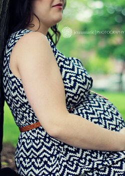
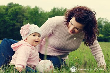
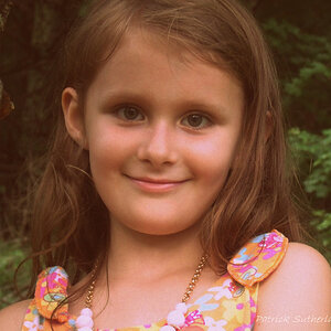
I am just starting my ventures as a professional photographer. I have loved it for many many years, however have never shot portrait photography before. Below are pictures from my first 3 sessions. The close up of the little girl with the pretty brown eyes is my first session ever, the maternity session is my second, and the baby in hat w/ family is my third.

Let me know your thoughts on these - composition, etc. So far, I've been doing sessions for free (for close friends and family to build my portfolio) but want to start charging. Just want to make sure my work is good enough to merit the money!

C&C welcome :)
 

Attachments

  • $IMG_1147 copy.jpg
    $IMG_1147 copy.jpg
    955.6 KB · Views: 379
  • $IMG_2015 copy.jpg
    $IMG_2015 copy.jpg
    1.2 MB · Views: 327
  • $IMG_2427 copy.jpg
    $IMG_2427 copy.jpg
    2.1 MB · Views: 288
  • $IMG_2549 copy.jpg
    $IMG_2549 copy.jpg
    1.7 MB · Views: 307
  • $IMG_2627 copy.jpg
    $IMG_2627 copy.jpg
    1.6 MB · Views: 300
  • $IMG_2673 copy.jpg
    $IMG_2673 copy.jpg
    1.3 MB · Views: 273
  • $IMG_2781 copy.jpg
    $IMG_2781 copy.jpg
    2.3 MB · Views: 250
Not bad, great ideas, good compositions. Easy on the saturation and contrast though, they're a bit nuclear.
 
I agree, you're off to a good start. But the saturation is killer
 
All the dead space in the B&W shot of the dad and the two kids, and all that dead space filled with over-saturated green grass in the shot of the baby girl gumming on the toy giraffe...ehhh...to me those compositions are very weak,and show no idea as to how to properly use the space. Sorry to be so blunt about it, but that is simply bad composition on those two shots. The space does zero to advance either picture, and in the case of that maxed-out,blown green channel grass, it holds the image back, and the blown highlights just look very bad.
 
Interesting feedback, Derrel. I definitely don't agree with you, but I appreciate your perspective and CC. Seeing everyone is so against the grass, how would you recommend re-composing these images to make them more appealing? I'm not one to shoot a subject straight on (i.e. baby centered in composition), and I also don't like to pull in tight to my subjects in all my shots. For those, I was playing around with the thirds.

As for the saturation and contrast, that was something that I chose to do in post (not how it looks SOOC). I personally like it, BUT I understand and can see your perspective. All photographers are unique in how they approach photography and the retouching of those images. We all have our own style and are a bit different in our tastes!

Thanks for the feedback, guys!
 
C&C per req:

1. Not fond of this composition. The focus appears to be somwhere other than the eyes, which have been seem to have been processed so much that the pupils appear blue. The large, blue object lower left is very distracting, and the skin has almost no detail. This looks like something shot wide open with a 1.4/1.8 (I can't verify EXIF at the moment). Just because you have lens that opens to 1.4 or 1.8 doesn't mean you should shoot it there.

2. Generally the object of materinty photography is to show off the pregnancy to advantage. In this case you've "amputated" it with this crop. Additionally, while it is acceptable to crop limbs if necessary, one should NEVER do it at/near a joint (wrist) or along a lateral axis. I also don't like the 'half a face'.

3. This is a cute idea, but I find it over-saturated and the highlights on the pink trousers are far too hot, and there is almost no detail in the socks/shoes. Additionally, the awkward crop of her right knee is disconcerting.

4. This is a cute shot; I think if it were leveled and had some of the empty space image left cropped it would be much stronger. It does need to go back for a rework on the conversion however; your whites are blown and many of the shadows too deep. Did you use any supplemental lighting here? A single OCF low and right would have helped immensely.

5. Not bad; the strongest of the group IMO. Unfortunately, once it's leveled, I think that the child will lose her right finger tips.

6. I do not understand why you have the child fully image right and cropped to the point of losing most of her left arm, yet have all the dead space image left. Additionally, the highlights here appear BADLY blown especially on her had and right sleeve.

7. This one doesn't work for me at all. There are basically two ways to approach an image like this. One is with the subjects occupying the bulk of the image, and the other with the scene occupying the bulk of the image. In this case you've got sort of half-way between, and given that the scene is rather uninteresting (ie no grand scenic view) I don't feel it was the right choice. Additionally, the image leans, suffers from a blown sky, and their placement in front of the house gives the whole image an odd perspective.

Overall, these aren't bad shots, but they all have issues, most of which should not be present in professional-quality work. Things such as a blown sky or tilted horizon are not acceptable. I understand you're claiming artistic license as far as composition and processing, but to be perfectly frank, I'm not sure yet that you understand enough about the rules to break them in quite such a cavalier fashion. I would strongly recommend seeking out a mentor, and a position as a second-shooter for a year or two to hone your skills. Best of luck!

Just my $00.02 worth - your mileage may vary.

~John
 
I agree with Derrel regarding the dead space in those two shots. The compositions work in them for select applications - for example, they'd work well for business cards, as shown by how well your watermark fits into that dead space. However, pull up one of them alone on your screen and imagine it framed on someone's desk or wall. Does the dead space work then? In my opinion, no, particularly in the case of the baby with her Sophie. She is crammed to one side of the frame (significant crops to her head, arm, and lower body) while having cavernous space in the rest of the frame; it just feels way too unbalanced. Crop either of these to a square crop and you still have your subject off center (I agree with your preference not to center the subject) but with better balance.

Note that neither Derrel nor I are including the wide angle shot in our critique. In that one the non-person portion of the frame does add to the shot by setting the scene, so I don't consider that dead space. That shot I would consider a scenery shot, of which the people are just one element, rather than a "people shot".

On the plus side, you have done a good job maintaining a consistent feel to the processing in this set, which is even more commendable since it is across three separate shoots. Regardless of what other people think of your processing - and it is only their opinion, which doesn't have to agree with your opinion or, more importantly, that of your potential customers - you have created a consistent product. You've branded yourself...people see this set and can expect images with the same type of saturation and contrast. From a business perspective this is more useful than presenting a set in which some have high saturation and contrast, others are desaturated, some others have selective coloring, etc.
 
Much better than what mostly posted on this forum. Much better than some member here who has over 13,000 posts (anything is better than this member's work since he doesn't post any of his work here and only critique other people's work :er:)

Keep it up... I can post gazzilion photos by successful photographers with crops and negative space like that. You are the artist.. do what you want.
 
Last edited:
Drama in the thread, lol.

@op - shots are okay. Some do seem a bit over exposed, the last two in particular. The crop on the first two is a little tight. It looks a little odd how you almost cropped into the little girls eye and cut mom off right below the nose. But I like the vivid colors.
 
Number two seems clumsy, due to your cutting off her head. Why?

Numbers 6 & 7 appear "forced" into that "one third rule". Rules can be broken occasionally.
 
Okay, first of all, to be honest, I lost patience with reading all the replies, so I'm sorry if any of this is redundant.
Second of all, I suppose it's okay to disagree with what someone critiques, however, the way you responded to Darrel's reply sounded as if you were going to completely disregard it. It just seemed defensive. As blunt as his response was, it did have merit, and critique was requested by you, so try hard to be open to it.
Rule of thirds is great, however, I agree it didn't quite work for the black and white image of dad and the kids. You caught such a beautiful moment here, I want to be drawn in more, but I feel disconnected from it because of the vast texture of the grass and the bit of "black hole" where your logo is currently sitting... it keeps pulling me away from it. With the image of baby and giraffe, rule of thirds works, but it's just sooo much space and the grass is sooo green that my eye goes back and forth. My attention doesn't hold on the preciousness of the face. I would have at least kept her entire right shoulder in frame...?

Veterans are always going to be super tough on newbies. Get used to it. I still get it and I've been doing this for 6 years now. Listen to what they have to say as long as it's constructive, think about it, and move on. Don't just shut down or get defensive simply because they use words like bad, amateur, or the like... It stings a little, but they might be right and actually help you more than people always saying your work is good.

I personally don't care for the saturation, but some markets are really into that and some pros get on really well with that style. I think that you show real talent and can do really well.
 
Also keep in mind this is a photography forum. You are going to get your harshest criticism from here, since we neither know you, nor have any personal investment in stroking your ego. Your friends, family, and clients who have no knowledge of photography will probably love these compared to their pop-up flash pictures on their Facebook pages.

However, from a technical standpoint, there are flaws in all of them and I tend to agree with the previous posts. Are they detrimental if the client is still happy? No. When you get a client that knows about photography and they are unhappy with you work, are they justified? Yes.

In reality, all you have to do to impress the general population is shoot at longer focal lengths at 2.8 or lower, throw in some editing techniques, and they will be awe-struck because it is not what they normally see of themselves. The anal critiquing is only because you asked for it and the members here are going to go over everything with a fine-toothed comb.
 
The little girl in the first photo has brown eyes?? My screen must be way off..
 

Most reactions

New Topics

Back
Top