PDXshutterbug
TPF Noob!
- Joined
- Apr 18, 2011
- Messages
- 8
- Reaction score
- 0
- Location
- Portland, Oregon USA
- Can others edit my Photos
- Photos NOT OK to edit
I usually do some casual family portraits on the side but a friend needed her daughter's head shots done for an audition. I welcome all C&C on both images since I will be doing another set in the near future and would like to improve!! ") Thank you!!
Thank you!!
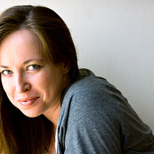
#1:
strob: SB-600 through umbrella @camera left, window lighting @camera right
f/5.6 (1/80) @55 mm

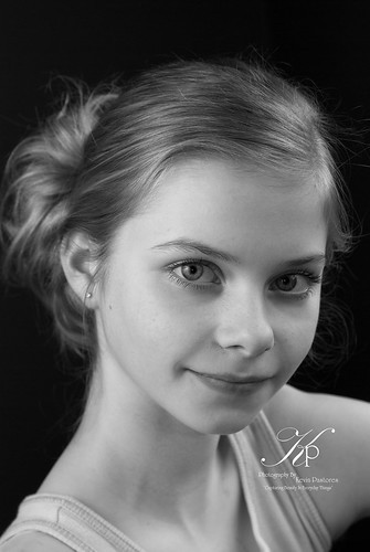
#2:
strob: SB-600 through umbrella @camera left, window lighting @camera right
f/5.6 (1/80) @60 mm
Thank you!!#1:
strob: SB-600 through umbrella @camera left, window lighting @camera right
f/5.6 (1/80) @55 mm
#2:
strob: SB-600 through umbrella @camera left, window lighting @camera right
f/5.6 (1/80) @60 mm

![[No title]](/data/xfmg/thumbnail/41/41795-6bc3a19e590a6be6bd169ab2acaee30d.jpg?1619739896)
![[No title]](/data/xfmg/thumbnail/42/42329-331b54ea6493a8cdd21d8e624fe97e85.jpg?1619740129)