My first "paid" photoshoot.. a 20 month old cutie

Status
Not open for further replies.

OnlyAGlimmer

TPF Noob!
Joined
Mar 24, 2008
Messages
33
Reaction score
0
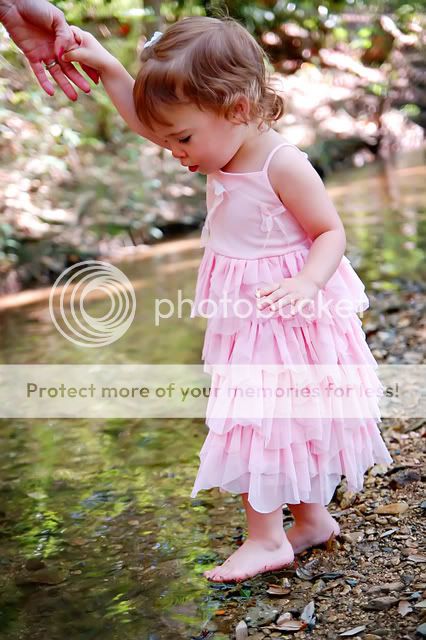
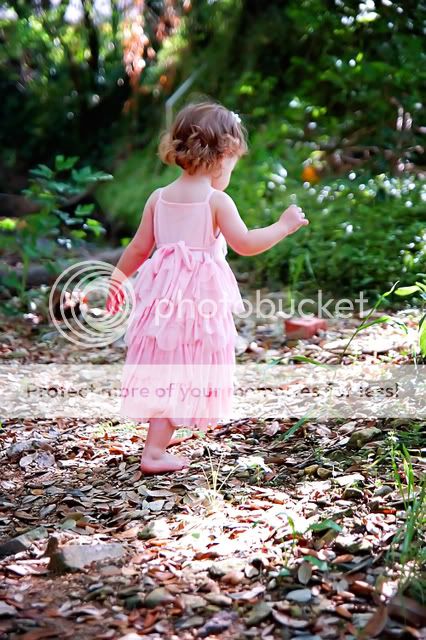
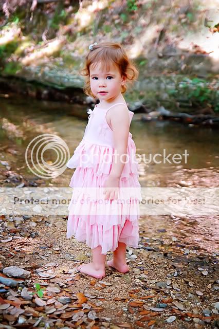
My first paid photoshoot (done really cheaply though to help me gain experience) This little girl was sweet but REALLY shy and serious :lol:

critque is always welcome!

http://i274.photobucket.com/albums/jj270/OnlyAGlimmer/afairy.jpg
afairy-1.jpg


http://i274.photobucket.com/albums/jj270/OnlyAGlimmer/helpfrommom.jpg
helpfrommom-1.jpg


http://i274.photobucket.com/albums/jj270/OnlyAGlimmer/walkingaway.jpg

walkingaway-1.jpg


http://i274.photobucket.com/albums/jj270/OnlyAGlimmer/mariesonlysmile.jpg
DSC_0183copy_filtereddcopy.jpg
 
they all seem a bit overexposed with some flat colors
still, shes a cute kid and i like the composition on these, though a bit of cropping wouldnt go amiss =P

*EDIT* Ah, my mistake hahah
 
I disagree on the exposure. I was just about to comment on how nice the exposure was on these, actually! If your goal is to convey beauty or innocence, a 1/3 or 1/2 stop above is quite perfect for shots of children, beautiful women, etc.

I agree that the cropping could be a bit tighter/more creative though. And the colours are a bit muted for some reason, especially in the skin highlights. I don't know why that might be.
 
Clipping highlights doesn't mean something is overexposed.

I would have increased the exposure on the 1st two. In this case I'd also say it's acceptable to bump up the saturation.

All of these are nicely framed, except the bottom one in my eye. That log surrounding her head... I can't stop looking at it.
 
thanks guys! I'm going to bump up the saturation and remove that log and post the re-do's to see if they are better :)
 
well, the befores are in the links above the pictures, the edited versions are now posted. now I'm thinking I may have overdid the first one.
 
I love all of these. The boost in saturation made such a difference. The color tones are wonderful in the edits. Great job!
 
I also disagree with the exposure its perfect IMO
 
I like that first one a lot! And the 4th one too since there is eye contact and I always crave that:)
The two main things I'm seeing that you could work on is composition and skin color. In that first one, her skin is extremely pink. I saw you didn't have a "do not edit", but let me know if you want me to take this down.
afairy-2-web.jpg

Basically, working in layers, I decreased the red and erased back her dress so it would still be really pink, but her face wouldn't. I used the color balance tool to help get her skin a more natural color as well. I have also discovered that upping the brightness & contrast can really add some pop to my images and thought it would help on this one. Lastly, I added a layer of soft light and then decreased it to about 50% or so. I erased back her face just a little as I thought the soft light looked really good on the river, but wanted a little less on her face.
As far as the composition goes, I think this one would have looked really nice if you had centered her less and included all of her fairy wing. It really is such a nice expression and pose on this one!

In that last one, I would probably do something similar to what I did with your first, but I would also darken the background more so my eye would be less drawn to it. As it stands it sort of competes with her. I would also crop in a tad closer to her. Also, be careful with removing as I can see where you did and it looks a little weird.
Hope that helps:)
 
thanks for the edit! I did edit it again because she looked so pink but your version looks better than the one I came up with :lol:
 
thanks so much for the tips! I followed your directions and ended up with this..

afairy4.jpg
 
The only thing I'd change in that last edit you just posted is to do a layer to make the wings more pink to match the dress instead of peach. Other than that, it looks great!
 
Status
Not open for further replies.

Most reactions

Back
Top