blackphoenix
TPF Noob!
- Joined
- Jan 14, 2019
- Messages
- 93
- Reaction score
- 33
- Location
- Georgia
- Can others edit my Photos
- Photos OK to edit
C&C Welcomed


Follow along with the video below to see how to install our site as a web app on your home screen.

Note: This feature currently requires accessing the site using the built-in Safari browser.
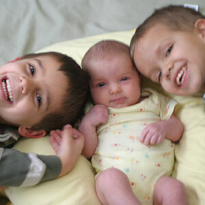
 The lady on the left (Mom?) is posed very well, as is the boy next to her, EXCEPT that he's leaning slightly image right; make sure you get heads vertical UNLESS the tilt is deliberate and that's clear to the viewer. In this case it's just carelessness on your part. The next boy (third from left) has his hands clenched into fists; this is NOT what you want. This makes him look angry and induces unwanted tension in the image. One trick I use in cases like this is to keep a couple of pairs of glasses in my grip box, sunglasses and regular eye glasses, bought at a thrift store. Had you given him something like that to hold, all would have been okay. The girl on the far right has her feet extending too far toward the camera, and the hand on the hat makes it look like it was about to be taken by a gust of wind.... you can you place hands up by the face in single-person fashion shots, not so much in group shots.
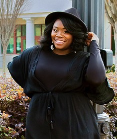
Thank you for the critique! I did feel I messed with the temperature setting a little much. I now know to just use it accordingly. Their were ultimately happy with it but I was kinda on the fence about it because I see it differently. Doesn't seem harsh at all! I just want to get better!Dark skin tones, all black clothing and out doors without supplemental light. You certainly chose a tough one for your first go! Overall, I think you turned out a pretty respectable product.
A few points. First and foremost, the images all appear to have a strong yellow cast. Are you working on a colour-corrected system and did you shoot a WB target? That needs to be corrected. Your background... I suspect you were thinking the fountain was a nice backdrop, but there's so little of it that it just confuses the eye. A very shallow DoF, say f2.8 might have helped a lot. Also watch for the details. The light standard growing out of Mom's head and the blue garbage can image left In the second frame.
In the first image, the bottom is actually cropping off a bit of their feet; add a little room down there. It doesn't need to be much, but just enough so that the feet are all completely in the image. Hands... the bane of a portrait photographers existence. I've often wished I could ask clients to leave them behind...
WAY too much of the feet missing here; either put it back or crop much higher up. Never crop "bits" of body parts, nor near/at/through a joint. Always make sure your choices are deliberate and with thought about the whole iamge. I like the idea here, but you needed to align their heads and hands better. Don't be afraid to touch the clients; put them where you need them. I do this all the time. Always ask if it's okay of course, but don't be shy. Take charge. You're the professional, make them do what YOU want!
Great expression in this lat image, and here the hand placement works nicely. A reflector or fill light would have helped a lot bringing out dteail in the waist area, but a careful, selective raising of the black point will save this. I would also crop MUCH tighter crop on this one. Portraiture is about the face and especially the eyes. They need to be prominent and the point of focus.
Corrected WB (approximately - only so much you can do with a low res .jpg file)
Suggested Crop - notice how much more prominent her face and that fantastic smile are?
Hopefully this doesn't seem unreasonably harsh, but you've stated you want to be a pro, and you're willing to work, so I'm giving you John's personal, more-or-less objective based on 30+ years of experience opinion. Your mileage may vary!
Thank you! Yea white balance is something I have to work on for sure. Scouting is something that I will definitely do next time!I'm glad you came back and posted your results! These are good - I really like the one of them all sitting facing forward. The fact that you avoided shadows in the eye sockets and got good exposure on all of their faces without flash is great. For critique, I won't repeat any of what tirediron had to say - I agree with most of it, especially the white balance correction he did. Other items though - I prefer the pose and crop you have on the woman with the hat standing on her own. I think on the one where they are all turned to the side, it could be an interesting and different pose but you really need to be sure they are all turned at the same angle for it to work. The woman with the hat is at at nice angle, the younger girl and the boy are turned way too far and the woman on the left just needs to be turned a tiny bit more toward the camera - and of course the feet need to be all in.
Not bad for a first attempt!C&C Welcomed
Now you know to watch for post and poles and trash cans, etc.
this is where $$$$ glass can really help out.
probably will be the first and last time I'll ever say this on TPF: images are too warm!
![[No title]](/data/xfmg/thumbnail/35/35932-28690c4fc247cf491230e47fc70ebeb5.jpg?1619737235)


![[No title]](/data/xfmg/thumbnail/37/37631-1af996afcca522b3c5490538125d9599.jpg?1619738155)
![[No title]](/data/xfmg/thumbnail/31/31086-ae0d6678ca78859132ce5375d5300961.jpg?1619734602)