My first portrait photoshoot

MyNameIsChris

TPF Noob!
Joined
Jul 6, 2008
Messages
161
Reaction score
0
Location
330!, Ohio
Website
www.chrisammondphoto.com
Can others edit my Photos
Photos OK to edit
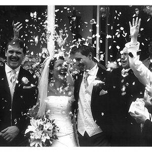
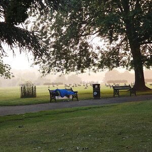
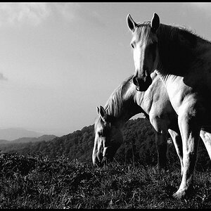
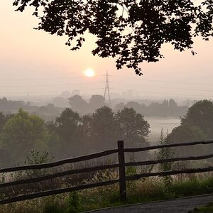
It was informal, but still paid. I've only messed with a few pictures so far but let me know what you think. C&C =]

31ab44af.jpg


79bb0901.jpg


9c5df450.jpg
 
my favorites in this order:
3, 2, 1

very good job =D
 
I like them! However, and I am not sure if it is my moniter or not, they seem a little cold and dark... I think they could easily be warmed up and brightened. Also, maybe lighten up her eye in that last image.
 
i kinda like the effect that makes actually...
but thats just me =P
 
you don't always have to do everything by the book - and by not playing by the rules, you've created some very nice images. I especially like the last one.
 
the last one is the best! good shots overall!
 
C&C Per Request:
1- Her face is pretty dark in this one.
2- I like it, but the crop might be too tight for me.
3- The best of the 3.

Just my opinion.
 
Thanks for all the feedback guys I really appreciate it. It was a sunny day and I thought it would give the pictures a different feel if I took down the saturation a bit and messed around with them so it looked like it may have been cloudy out. I thought it was a different looking style, so I kept doing it :)
 
Also, here is the third picture with her eyes a little brighter. All I did was make a selection and mess with the levels, is there a better way to do it?

a5431dc4.jpg


07fd8073.jpg
 
Last edited:
1 would have been beautiful if you had a super low fstop to achieve great bokah and that fence would not be an issue. This is also super middle gray, needs contrast.

2nd doesn't do anything for me.

The 3rd has great compostion, however there are just too many technical things wrong with it. It looks very plastic-y and Im not sure what you did in postprocess to bring that about. Perhaps portraiture or noise reduction. Or perhaps your exposure was very dark and you had to lighten it so much that you lost a lot of detail.
Also the skin tone is very off... it has a lot of purple (?) in it. Its also lost a lot of detail.
And lastly, one eye out of focus is usually considered a technical mistake when doing portraiture. I have also been guilty of it. Try backing up some, keeping the same fstop, snap the shot, and then crop in PP. That way you get both eyes in focus but can achieve the same composition. Or increase your fstop if your dont' want to step back any.

Thanks for your comments :)
I agree that number two is boring, but she liked it so I kept it.

About the third one though, I'm aware that only having one eye in focus is usually bad but I don't think rules need to be kept 100% of the time. Also, now that you mention it I do see a lot of purple in the picture and I don't really know why. I think I may post that picture in a different thread and have someone have a go at making it look nifty.

By the way, all these pictures were taken with the Canon 50mm f/1.8 II lens on my Rebel XT because my 1D is in the shop.
 
It may be mu computer, but I do not see the purple Kelly mentioned, She looks green to me almost sickly. And yes rules are made to be broken, but fundamentals aren't so much. Equal features such as eyes should be in focus. It is not that hard, and makes a more pleasing image. When you are my age, you wonder if he out of focus is the image or your eyes. Or both. You could have softened BOTH eyes as an improvement. Number one, to me needs a wider angle lens to get just a little margin on each side.
Two is classic. That means boring to some, but it is used so much for a reason.
All of that said, your client is the final arbiter of the success of the images and if she like them and paid you- that the measure of success.
Judge Sharpe
 
I actually cropped the first image close like that because the bottom of the swing was crooked and I didn't like the line it made at the bottom of the image. I think I'm fighting a losing battle so from now on I'll just put both eyes in focus haha. I still like the way this picture looks though.
 

Most reactions

New Topics

Back
Top