My First Senior Portrait Session (11 images)

Universal Polymath

TPF Noob!
Joined
Jul 6, 2007
Messages
160
Reaction score
0
Can others edit my Photos
Photos OK to edit
Well, this marks my first formal studio session, altogether. I've always been a continuous light guy, but ordered some strobes specifically for this session (and for all sessions hereafter). Unfortunately, my strobes and seamless paper didn't show up until the evening before the shoot (which was early the next morning), so I was left with no practice time, and forced to "learn on the fly".

Because of this, I was incredibly nervous during the shoot, and I must have looked it the entire time. This girl was an absolute joy to work with, though, and I managed to loosen up a bit as time went on.

So I could certainly use some practice before I really get this all down, but it'll all be uphill from here (I hope!).

1.
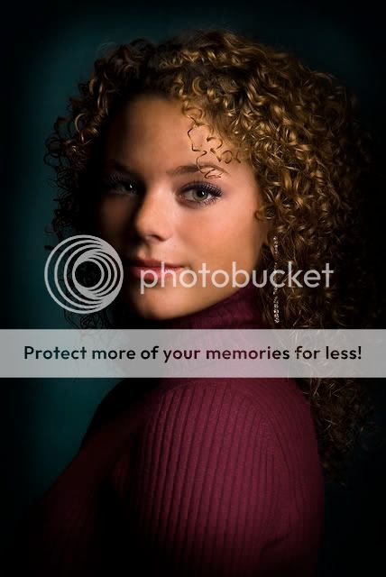
01.jpg


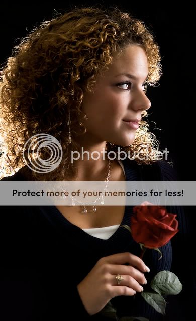
2. So this girl was dead-set on doing a selective color shot with a bright rose being held by a black-and-white her. I decided to save a copy and post it here before I ruined it with such a silly, cliche effect (and no offense to anyone who likes selective coloring!).

02.jpg


3.
03.jpg


4.
04.jpg


5.
06.jpg


6.
07.jpg


7.
08.jpg


8.
09.jpg


9.
10.jpg


10.
11.jpg


11.
12.jpg


C&C is greatly appreciated - Thanks guys!
 
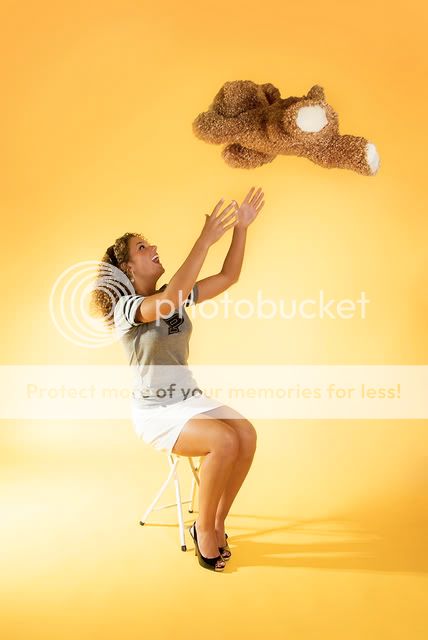
These are fabulous. The lighting is gorgeous and the model is a beautiful girl. #8 cracks me up. It reminds me of the scene from "Bye Bye Birdie" when all of the kids are talking on the phone.
 
These are fabulous. The lighting is gorgeous and the model is a beautiful girl. #8 cracks me up. It reminds me of the scene from "Bye Bye Birdie" when all of the kids are talking on the phone.

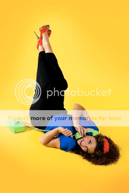
Yes! "Bye Bye Birdie" was exactly what we were going for! About a month ago, we met to talk about what exactly she wanted out of this, and she specifically mentioned the cover of the "Bye Bye Birdie" DVD with Ann Margret.
I looked it up when I got home and found this: http://www.sullivanboutique.com/Anne/stores/1/images/dvds/Musicals/Bye-Bye-Birdie.jpg

Thanks for the kind words!
 
I love the yellow back grounds they go so well with her skin tone.

You also have wonderful creative poses. Great job. Awesome first time shots.
 
Very nice work!!
One little nitpick... I would prefer no shoes in #5.
I can only imagine what we're in for when you get your practice!!
 
I think these are very well done for first time! It doesnt hurt to have an incredibly good looking model as well. Commenting on these specifically:

#1, The lighting is beautifully done and it looks like a painting. Fantastic!

#2, Very nice effect, but there could be a little better separation with a hair light.

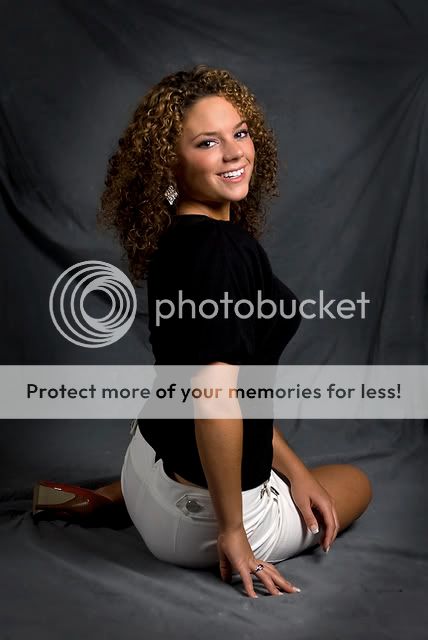
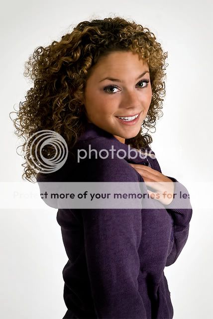
#3, The hair light is better on this one. Not sure about the pose. Usually if a subject is turned like that, you either should have a full profile or have her turned the other way so we can see the other eye fully. Also, the focus seems to be on the neck rather than the eyes, but I know that locking focus is a common thing that I struggle with all the time. :)

#4, Very nice black and white, but you can see just a smidge of the other eye peaking from the other side.

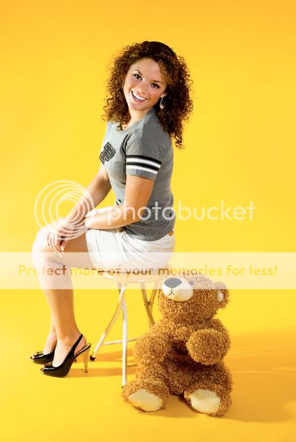
#5, Great lighting, beautiful smile. Neat pose.

#6, A little bit of blowout on the knee, but otherwise very nice and bright.

#7, Some blowout on the whites again, but fun pose.

#8 #9, color pops really well.

#10 #11, Very nice focus, skin tone, and lighting. My favorite is #11.

Overall, great job on this series. Thanks for sharing!

NJ
 
These are some of the nicest senior portraits I have seen on this forum in some time. She and mom will be very pleased with these. You have a very good control over the lighting in these. Care to comment about what type of lighting you used in these?
 
Awesome job! I will agree with NJ about the knees being a little blown out in #6, but overall, great work.
 
wow she is like a mini Beyoncee!

Nice shots
 
Thanks, everybody, for all the compliments! It really means a lot!

And NJMAN, thanks for the specific criticisms, I'll try to keep all that in mind next time.

These are some of the nicest senior portraits I have seen on this forum in some time. She and mom will be very pleased with these. You have a very good control over the lighting in these. Care to comment about what type of lighting you used in these?

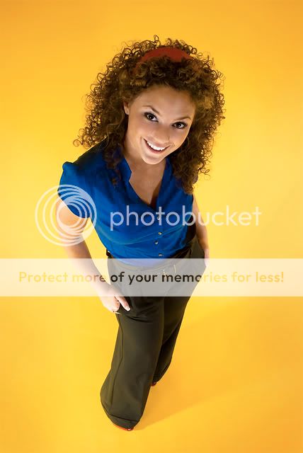
Sure! All of these pictures were generally done with three strobes (two at 150 w/s, and two at 100 w/s). The main and fill light each had a 20x28" softbox on it. Those two lights were set up at the exact same height, and exact same distance from the model on either side of her. The main light was kept at about 1/2 power through the entire shoot, though, and the fill was at 1/4 or 1/8. Instead of adjusting the distance between the fill and the model to control the ratio, I just messed with the power.

The less powerful stobe was used for the background, with a softbox on that one as well. I took the softbox off for picture #3 (the light was pretty low, and angled up towards her hair, sans any diffuser). On the pictures with the yellow background, I took the softbox off again, turned it up to full power, and positioned it so that the light skimmed across the entire length of the paper (or as much of the paper as it could. I must confess, I had to clean up the backgrounds a little bit in Photoshop with the clone stamp or paintbrush, but these are definitely close to the unedited originals). I really liked the effect that was having on the background.

This strobe set wasn't very powerful, I know - It was a very cheap starter set. Perhaps down the road, I'll be in a situation where they will be very limiting, but for a single-portrait set they proved to be very effective.

Thanks again for the comments everybody!
 
I love all of them. Except the bear in the air one, not my favorite. The only one that I noticed something, in #5, it looks like her underwear is showing?? Maybe it's just her shirt is positioned funny, but that's what caught my eye.

I wish my senior pictures looked like that.
 
VERY nice, Zach!

Especially nice are 1,2,4 and 9. There's not much I can add to what has been said already.

My only nit-pick is the poses with her shoulder directly at the camera might have benefited for a slight turn.

The lighting looks good! You should be proud.

-Pete
 

Most reactions

New Topics

Back
Top