My Friend Joe

Jeffm73

TPF Noob!
Joined
Feb 28, 2007
Messages
122
Reaction score
0
Can others edit my Photos
Photos OK to edit
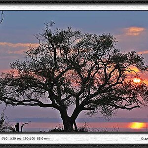
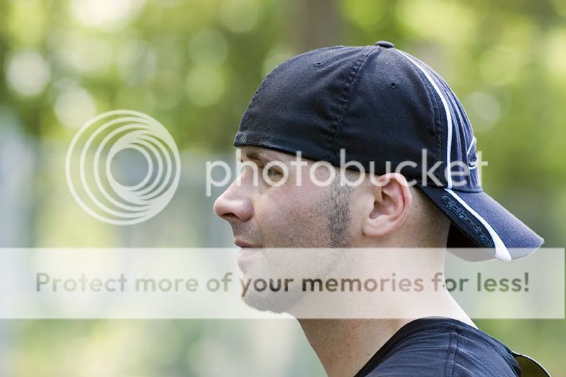
Some friends were playing in a softball tourney today, and we were sitting around drinking beers between games, so i figured I'd take a few shots.

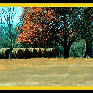
I'd also be interested to know what's the best way to get rid of the distracting fence in the second shot.

Comments and advice always appreciated.

DSC_3697-copy.jpg


DSC_3709.jpg
 
Nadda? Nothing? Do I just delete them, and take up basket weaving?
Do they suck so bad that just commenting might cause you to come down with some hidious affliction?
 
Sometimes it just takes a little while for people to get around to seeing posts. For example, I just now saw this post after it had been viewed 31 times.

The quality of the photo is apparent, but the dreamy/hazy effect that you applied to this is just not working IMO. The softness doesnt fit with a sporty looking guy like this. I would have give these shots the color punch and contrast that they deserve. They need to be sharp and colorful.

Also, the DOF is very nice, but if you are capturing him as he plays softball, it would only make sense to see a few more of the obvious elements in the composition, such as the bat, glove, uniform, etc. In addition, I think the fence would have added more to the composition in this case, but only as a background element similar to how you have it now.

NJ
 
the softness is too extreme on both of them IMHO... and why is a part of his cap in the first one so pronounced and tack sharp? add some contrast or darken them a bit and leave away that hazy effect ... just my idea about these images.
 
Am I dreaming? lol, just playing. The composition in the second one is great, and I personally like the fence. But if you really want to get rid of it then use the clone and or healing tool.

These images would be ALOT better with a contrast bump, and not look like a teenage girls dream.
 
Sometimes it just takes a little while for people to get around to seeing posts. For example, I just now saw this post after it had been viewed 31 times.

The quality of the photo is apparent, but the dreamy/hazy effect that you applied to this is just not working IMO. The softness doesnt fit with a sporty looking guy like this. I would have give these shots the color punch and contrast that they deserve. They need to be sharp and colorful.

Also, the DOF is very nice, but if you are capturing him as he plays softball, it would only make sense to see a few more of the obvious elements in the composition, such as the bat, glove, uniform, etc. In addition, I think the fence would have added more to the composition in this case, but only as a background element similar to how you have it now.

NJ

Thanks NJman,

I'm still very early on in photography, and could probably benefit from taking a few classes. After editing this again, and following your input, I agree that it works much better. Thanks for the advice and the comments.

DSC_3697-2.jpg


DSC_3709-2.jpg
 
I love them! I agree, the sharper look does the pictures more justice. And personally, I like the fence in the second one... but thats just me.
 
the softness is too extreme on both of them IMHO... and why is a part of his cap in the first one so pronounced and tack sharp? add some contrast or darken them a bit and leave away that hazy effect ... just my idea about these images.

I'm not sure how I ended up with part of the hat so sharp in the first one to be honest. I'll have to stay away from that gaussian blur tool.
 
I'm not sure how I ended up with part of the hat so sharp in the first one to be honest. I'll have to stay away from that gaussian blur tool.

when i look at it again, it is not so terribly sharp, but it has a strong contrast, and that probably makes it.
 
Am I dreaming? lol, just playing. The composition in the second one is great, and I personally like the fence. But if you really want to get rid of it then use the clone and or healing tool.

These images would be ALOT better with a contrast bump, and not look like a teenage girls dream.

Thanks for commenting. I hope the edited version is more appealing. I do think it works better. Just never really sure how far to push with the contrast.
 
Thanks for commenting. I hope the edited version is more appealing. I do think it works better. Just never really sure how far to push with the contrast.

yes, for me the new edits look way better.

as in how far to go with the contrast, that is a question of taste, if you push it too far you lose a lot of subtle detail, but still some people will like the image others won't.
 
Thanks Alex.

I guess it's like that with everything in photography. One persons trash is another mans treasure. The contrast boost does make a big difference. I'll have to file that with all of the other information I get from this place.
 
Thanks NJman,

I'm still very early on in photography, and could probably benefit from taking a few classes. After editing this again, and following your input, I agree that it works much better. Thanks for the advice and the comments.

DSC_3697-2.jpg


DSC_3709-2.jpg

MUCH BETTER! :thumbup:

Well done. :)

NJ
 

Most reactions

Back
Top