What's new

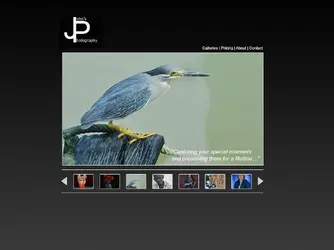
My new website - your critical review, thoughts, input, suggestions, ideas... Please!

Looks great! I think is a big improvement over your old one which was a bit dated. I like your clean layout, about section and layout of your Packages and Prices.

I found the following thoughts:
1. Was not expecting the bar of pictures on the front page to act that way. I was expecting the single picture I clicked on to enlarge, not the whole bar to load a new page.
2. On the bar of photo's again on the front page, I think it need to have more diverse photo's showing more of your abilities. I see one potential wedding. Maybe some reception hall wedding photo's or something with more than one person.
3. When flipping through the Gallery I have to keep moving my mouse due to all the different width pictures. I honestly don't have a good recommendation for this as I like how clean the gallery is and adding a buffer boarder would ruin it.
 
not really as in 'its too wordy.' That number of words is fine, but the images are small in comparison to the OTHER stuff going on. They need to be the focus. Yes, you need words, but photography isn't about words-your website needs to be about the pictures. Larger.
 
  • Thread Starter 🔹
  • Moderator 🛠️
  • #18
Looks great! I think is a big improvement over your old one which was a bit dated. I like your clean layout, about section and layout of your Packages and Prices.

I found the following thoughts:
1. Was not expecting the bar of pictures on the front page to act that way. I was expecting the single picture I clicked on to enlarge, not the whole bar to load a new page.
2. On the bar of photo's again on the front page, I think it need to have more diverse photo's showing more of your abilities. I see one potential wedding. Maybe some reception hall wedding photo's or something with more than one person.
3. When flipping through the Gallery I have to keep moving my mouse due to all the different width pictures. I honestly don't have a good recommendation for this as I like how clean the gallery is and adding a buffer boarder would ruin it.
Thanks! That home page image behaviour is annoying and I'll change that, either as a link to the image gallery, or just (more likely) make it a static image.

The whole gallery is under review; I'll be doing something with that in the next day or two; I'm njust not sure what at this point.
 
  • Thread Starter 🔹
  • Moderator 🛠️
  • #19
not really as in 'its too wordy.' That number of words is fine, but the images are small in comparison to the OTHER stuff going on. They need to be the focus. Yes, you need words, but photography isn't about words-your website needs to be about the pictures. Larger.
Not saying that you're not right, because gawd knows, you'd be hard-pressed to find someone who knows LESS about graphic design than I do, BUT... I like a clean, simple look, which is what I think I've acheived here. That said, I'm always willing to look at other ideas.
Clean and simple is GOOD!!! But your home page isn't so clean and simple with the wording and the images. Plus your twitter and facebook icons are underneath the image.
If you were going for minimal, clean and simple the wording on the bottom of your first page is part of your about.
OK, here's your page as is
8185864470_176d84d791_z.jpg


Look at the difference-these are the elements you have, just the images become more the focus
8185825101_47e384ac79_z.jpg


And without the wording with everything in the same place you have it
8185825045_7aa3316335_z.jpg
 
$jpphotography.webp
 
  • Thread Starter 🔹
  • Moderator 🛠️
  • #22
But your home page isn't so clean and simple with the wording and the images. Plus your twitter and facebook icons are underneath the image.
What browser and version are you running? The FB and LI icons show correctly on IE 7, 9, Safari (Mobile) and whatever version of Firefox I have on my Unix box. I know there are some issues with IE 6 and 8.

If you were going for minimal, clean and simple the wording on the bottom of your first page is part of your about...
Most of the social-media marketing education that I have (which admitedly isn't a lot) says that you need a 'hook' on your page; something to tell people what, where and who. Do you think that page is strong enough on it's own? Honestly, I have my doubts...

Firefox
 
  • Thread Starter 🔹
  • Moderator 🛠️
  • #24
I really like the look of that, BUT, the reason I went away from white text on a dark background (as my old 'site was) is because everything seemed to say that it was harder to read and less likely to hold people's attention and also because my logo and all my other "Branding" is a dark-blue which isn't going to contrast well with that colour, and another one of my goals with the new 'site was to bring all that in line, that is my business cards look like my 'site, etc.
 
I really like the look of that, BUT, the reason I went away from white text on a dark background (as my old 'site was) is because everything seemed to say that it was harder to read and less likely to hold people's attention and also because my logo and all my other "Branding" is a dark-blue which isn't going to contrast well with that colour, and another one of my goals with the new 'site was to bring all that in line, that is my business cards look like my 'site, etc.
So change the background to white and logo back to blue. Good to go!
 
  • Thread Starter 🔹
  • Moderator 🛠️
  • #29
I really like the look of that, BUT, the reason I went away from white text on a dark background (as my old 'site was) is because everything seemed to say that it was harder to read and less likely to hold people's attention and also because my logo and all my other "Branding" is a dark-blue which isn't going to contrast well with that colour, and another one of my goals with the new 'site was to bring all that in line, that is my business cards look like my 'site, etc.
So change the background to white and logo back to blue. Good to go!
Oh, well then, if you're going to go and get logical about it... ;)
 
I would skip the ADWords... if someone is actually looking through your site, the last thing you want to do is direct them somewhere else.
 

Most reactions

Back
Top Bottom