My Site...

A

Aaron Graubart

Guest
Hi Folks,
If you have a minute - please have a look at my website. I'd appreciate any thoughts, comments, ideas etc..

Many thanks.

Aaron.

www.aarongraubart.com
 
Last edited by a moderator:
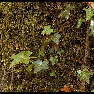
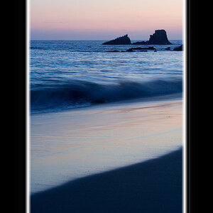
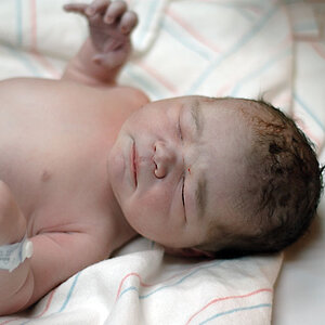
Ill comment, but take it with grain of salt. Your main page is confusing. I found myself clicking the fuzzy marbles for a minute, but i soon found the drop down bar to the right. To be honest your first pics seemed a little dark. Once i hit the portraits things woke up a bit. I really liked most of your "places pics"...especially the beach shots. I was a little confused with the "2 in 1" shots. I remember seing a man with his eyes shut in one pic and a fish hanging from a pole next to it. Maybe i just dont get it.

Overall i like the layout, but i might put another shot on your homepage. Good pics as well. Keep up the good work.
 
Cool. Thanks.

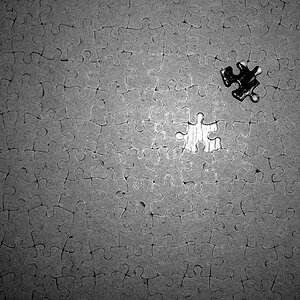
Fuzzy marbles are no longer fuzzy... Fixed. Thanks for your comments about the images - I'll give them some thought.

Cheers!

Aaron.
 
Hi Aaron,
I really like your work and your site. It's nice and clean and easy to navigate. My only problem with it is the home page. I don't get the whole beachy graphic things on the first page. I would, instead, pic your favorite photo to use there or put a slideshow of your work there or something.
 
Thanks Christina,
Yes, I've been thinking about what to do with the home page. It's a tough one really but do I agree with you about what's there right now (that image isn't beachy though - they're marbles). It's an image that sells really well for me at one of my stock agencies hence the decision initially to put it there - and that it's kind of a cool graphic thing. I'm having my designer put together an interactive home page that scrolls through the first page of each portfolio as you mouse over sections of a grid so you get a quick idea of what all of my work is about. Having multiple portfolios each with a different type of work makes it very hard to pick just one image as a first page...

Opinions and suggestions like this are really helpful in making these sorts of decisions - so thanks again!! Your time is much appreciated.

I'm hoping to have the new homepage uploaded in a few days and will check in again to see if anyone has any thoughts then...

Again - thanks for your time.

Aaron.
 
Last edited by a moderator:

Sorry, I was a bit confused with the first page.....I kept expect something else to pop up.....and nothing did. Maybe a different picture on the first page might be a bit better.

Something else which my or may not be relevant. When hitting the back button on a mac, nothing happens till I hit refresh. When I hit refresh it throws me somewhere else I've never been before.
 
Sorry, I was a bit confused with the first page.....I kept expect something else to pop up.....and nothing did. Maybe a different picture on the first page might be a bit better.

Yup... Noted. See post above. Thanks.

Something else which my or may not be relevant. When hitting the back button on a mac, nothing happens till I hit refresh. When I hit refresh it throws me somewhere else I've never been before.

It's a flash site - and as such the forward and back buttons don't work like that. There is however more than one way to navigate through the site... Clicking on the thumbnails allows you to jump forwards or backwards or anywhere you like, clicking on 'slideshow' at the bottom runs a - yup, you guessed it - a slideshow, or clicking on the + and - symbols at bottom right and enables you to go back or forwards...

I'm using a Mac too and when I hit refresh it does restart from the loading graphic page but then takes me back to the image I was just at... Odd that it's behaving differently with you? What browser are you using?

Cheers!

Aaron.
 
I'm using firefox. I tried it again, and for some reason when I hit refresh it works now. Must have been a fluke. For my site I started eliminating as much flash as I could to eliminate hassle. For your site, even though it is flash your pages still change, which is why I get a little confused, because it appears that you are sent to another page because the number changes, yet it is still flash. I might have just confused you.

Anyway, the part of hitting the back button I mentioned only because people who visited my website mentioned they like to use the back button. I do realize that comes with the territory of a flash site.
 
New home page is being done for me. Should be up by next week sometime.

Anyone else have anything to add...??
 
Aaron, I like how clean the site is. The only issue I have is with the side by side photos, unless of course they are meant to be like that and if so i don't undertand. If they are meant to be stand alone photos they should be shown as just that, stand alone photos. When they are shown side by side they tend to distract the viewer's eye.
 
OK, so I made few changes... Still waiting on the finished homepage but have taken on board some of the opinions here. Would love any more comments...??

Keep 'em coming folks!

Many thanks,

Aaron.
 
Hi again folks,
So, my new home-page has just been uploaded and I would love to hear any comments you may have. Let me know what you think about the new home page, the website as a whole and the images...

Many thanks.

Aaron.
 

Most reactions

New Topics

Back
Top