My Son

CowgirlMama

No longer a newbie, moving up!
Joined
Jan 13, 2012
Messages
338
Reaction score
53
Location
In the Middle of Nowhere
Can others edit my Photos
Photos OK to edit
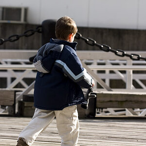
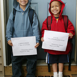
I'm trying to figure out flash and studio lighting. I'm basically figuring it out on my own, so progress is very slow. I'd really love CC and any advice possible.

This is with two speedlights with shoot through umbrellas. Only one is manual (I'm looking at getting another, so I have more control). I used the TTL as the key light, since it always seems to fire really bright, with the other set at around 1/16 power (can't remember now :( ). The umbrellas/stands are from an insanely cheap Cowboy Studios light kit (came with really dim constant lights, but I got adapters to attach the flashes to the stands, since I had flashes). They were positioned about 45 degrees to each side with the key light a little above his face and the other a little below.

I cut it too close to his foot. :( The whole shoe is there, but there's no space at all below it. I'll be more careful there next time. My guess is that the shadow behind him is because he was too close to the backdrop, so that's something else I know to correct in the future. What else can I do to improve?

Camera info:
Canon 6D
100mm 2.8 lens
ISO: 160
Shutter: 1/160
Aperture: 9

$pic-1-2.jpg
 
All I can see is a little shadow bottom right but beside that great picture good looking boy.
 
Firstly it's a nice shot.
I would suggest setting your ttl flash to manual also. Put it closer with less power. As it is closer the light will be bigger relative to your subject giving softer light. This will also help reduce the shadow behind. You will obviously have to experiment with the power on the main light.

Also experiment with position of second light. 45degrees behind on opposite side of main light often works well. I would say (even though it is not noticeable to me here on this shot) that it is generally considered unflattering to put a light source below a persons face as we are programmed to appreciating people with light from above (the sun).
 
I'd bring the fill closer to the camera axis to clean up some of the heavier shadows the key is producing.

also, any room to back the subeject away from the backdrop so the shadows being cast don't ride up the wall and stay on the floor?
 
Firstly it's a nice shot.
I would suggest setting your ttl flash to manual also. Put it closer with less power. As it is closer the light will be bigger relative to your subject giving softer light. This will also help reduce the shadow behind. You will obviously have to experiment with the power on the main light.

Also experiment with position of second light. 45degrees behind on opposite side of main light often works well. I would say (even though it is not noticeable to me here on this shot) that it is generally considered unflattering to put a light source below a persons face as we are programmed to appreciating people with light from above (the sun).

My TTL doesn't have manual settings. I'm looking at options that I can afford, so I can have manual settings. I just haven't actually placed the order yet. ;)

The flash that was low was set to a fairly low setting, basically just to lighten shadows, so it doesn't show up much in the photos. I need to play with that more. My only model only lasts for about 10 minutes at a time, so I have to spread my experimenting out over a period of time.

I'd bring the fill closer to the camera axis to clean up some of the heavier shadows the key is producing.

also, any room to back the subeject away from the backdrop so the shadows being cast don't ride up the wall and stay on the floor?

I'll try moving the flash. :) There's more space, I just got lazy setting up that time. I'll make sure to pull the backdrop out far enough next time (it's a roll of seamless paper, so I can pull it as far as I want to). It only takes once to learn my lesson on that one. :p
 
Sorry I misread that so. Depending on your camera Yongnuo do a cheap manual yn560 which is great value. With the ttl flash, still try to move the umbrella closer. If the main light is to bright you have a little adj with your flash exposure compensation
 
Boy is gorgeous.
Lighting is pretty nice with these nits.

picture is strange aspect ratio - not 4 x 5 or 4 x 6 - you should aim for enough room in planned shots so that standard mats and frames will work.
His head is way up towards the top and will be clipped even more by mat; his shoulders are in the power positions.
The brightest spor in the picture is the leg of the stool.

I agree with Lew on everything...Adorable kid! But the first thing I did not like was how crowded he is within the frame, top and bottom.

I do not mind the lighting for a B&W...the shadows reveal shape, and I thought the stool's shadow was deliberate. I think in color his face might have appeared pretty bright, but in B&W, that's much easier to accept. I really LIKE your "simulated ballpoint pen signature" way of branding! That's new to me, and I LIKE that!
 
really LIKE your "simulated ballpoint pen signature" way of branding! That's new to me, and I LIKE that!
Yeah it's clever, is mine too subtle?
75309-1st-timer-miata-girl-braineack-jpg
 
Boy is gorgeous.
Lighting is pretty nice with these nits.

picture is strange aspect ratio - not 4 x 5 or 4 x 6 - you should aim for enough room in planned shots so that standard mats and frames will work.
His head is way up towards the top and will be clipped even more by mat; his shoulders are in the power positions.
The brightest spor in the picture is the leg of the stool.

It's cropped to fit my iPad screen. There's space on top and sides to make it other sizes, but there's not any more on the bottom. I totally blew that one. :(

I agree with Lew on everything...Adorable kid! But the first thing I did not like was how crowded he is within the frame, top and bottom.

I do not mind the lighting for a B&W...the shadows reveal shape, and I thought the stool's shadow was deliberate. I think in color his face might have appeared pretty bright, but in B&W, that's much easier to accept. I really LIKE your "simulated ballpoint pen signature" way of branding! That's new to me, and I LIKE that!

I did these with B&W in mind, so I don't even remember how it looked in color. He's pretty pale skinned, so I have trouble not overexposing it. Just gotta keep trying, I guess. One of these days, I'll get it figured out.

I made the watermark by signing my name on paper, taking a picture and removing the white. I have it in both black and white, so it works on pretty much every picture. I couldn't come up with anything that wasn't super annoying or hard to connect to me, then saw something about artists signing paintings, so why not do the same for photographers. I thought it was a good idea and went for it. It seems most people like it, though there are still a few who feel photos shouldn't be marked at all.
 
Everyone seems to be directing you to get more room. Room between your subject and the backdrop as well as between you and the subject (so that the frame isn't so tight). You're shooting with a 100mm lens. Do you have something shorter? It might help with space issues.
 
I have space. There was extra space in the top of the shot that I cut out. As stated above, this was cropped for the iPad. I forgot to adjust the crop before posting. It likely won't be printed, so I'm not too concerned there. There's room to adjust the backdrop, too, but I was in a hurry and didn't set it up properly that time. Hopefully this weekend I'll be able to take some more pictures, but I'm not sure.
 

Most reactions

New Topics

Back
Top