My sweet girl

christen2484

TPF Noob!
Joined
Aug 5, 2012
Messages
41
Reaction score
0
Location
Huntsville, Alabama
Can others edit my Photos
Photos OK to edit
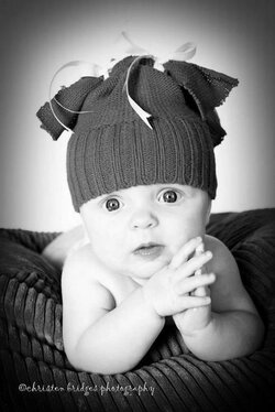
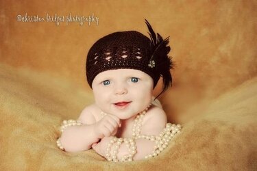
My pretty girl has been helping me practice my newborn photography. I love the B&W! The second is nice too except the hat is pulled down too far or something?! The eyes are not enhanced at all in either portrait...
 

Attachments

  • $image-4228946654.jpg
    $image-4228946654.jpg
    52.8 KB · Views: 131
  • $image-1080689133.jpg
    $image-1080689133.jpg
    45.5 KB · Views: 145
Just wondering why the headgear? I think they are distracting at the very least, and in the case of the second, actually harming the image. Oh, I know; gifts from grandma, no doubt. Try some shots without them.
 
Designer said:
Just wondering why the headgear? I think they are distracting at the very least, and in the case of the second, actually harming the image. Oh, I know; gifts from grandma, no doubt. Try some shots without them.

I agree. They are cute pictures but I think the hats are distracting. But that's just my opinion.
 
I think these are cute too, but the lighting is very flat (no shadows/depth). The black and white conversion really brings out the 'flatness' and you end up loosing almost all detail of her little face. How were these lit?
 
How were these lit?

Judging by the catchlights, it appears to be a two light setup, key camera left, and fill camera right. I could be wrong.

I agree very flat. I would back the fill off a stop or few and move the lighst more to the side of the subject (8 o'clock and 4 o'clock rather than 7 and 5) to see if that makes a difference for you. Although, the first picture isn't as flat as the second.

Also in the color photo there is some sort of unsightly smudge to the right of the baby..... Not sure if that's clone stamping gone awry or what, but it really draws my attention.

Also, I also vote to lose the hats.
 
I used natural evening light from a window directly behind me. That smudge in the color photo is a clone gone awry. I'm learning!!!! I agree the about the hats....thanks!
 
I love them! I do agree with you in the first one I think the hat is pulled down to far but other than that I love them
 
paigew said:
I think these are cute too, but the lighting is very flat (no shadows/depth). The black and white conversion really brings out the 'flatness' and you end up loosing almost all detail of her little face. How were these lit?

What do you recommend if her face is just naturally "flat"? She is very pale and her face is all one color. No rosy cheeks etc....I don't want her to look too edited.....but then again she looks that way although I haven't touched up her skin at all....
 
I used natural evening light from a window directly behind me.

That would make sense. Try and turn the whole scene if you can so the light isnt coming directly at the kiddo. That might help add some depth.
 
Stradawhovious said:
That would make sense. Try and turn the whole scene if you can so the light isnt coming directly at the kiddo. That might help add some depth.

Great tip, thanks!
 
Great tip, thanks!


Contrary to popular belief, I'm here to help.

Problem is I'm just a rank amatuer so take any advice from me for what it's worth, and remember what you paid or it. Hell, most of the time I don't even know what I'm saying...... like most people I just like proselytizing my opinion on the intrawebz. :lol:
 
her face isn't naturally 'flat'. It has depth and dimension to it; curves to her cheeks, dimples whatever! You need shadows to bring those out. Try her angled to the window around 45 degrees. That should help a ton!
 
This. The light should fall *across* her face, not straight *at* it. Have the light coming from the side a little and you'll see subtle light and dark areas of depth and dimension.
 
paigew said:
I think these are cute too, but the lighting is very flat (no shadows/depth). The black and white conversion really brings out the 'flatness' and you end up loosing almost all detail of her little face. How were these lit?

What do you recommend if her face is just naturally "flat"? She is very pale and her face is all one color. No rosy cheeks etc....I don't want her to look too edited.....but then again she looks that way although I haven't touched up her skin at all....

When someone refers to "flat light" they are talking about the fact that the light does not produce enough shadow, most probably because it is too near the camera position. Good modeling light will cast some shadows and therefore yield more definition to the contours of the face.

We are not talking about the model's features nor the skin color.

Move the light around some to gain definition. Find the place where the light IMPROVES the image.

Photographers need to understand light.
 

Most reactions

Back
Top