My Website Attempt

ksm

TPF Noob!
Joined
Mar 17, 2008
Messages
93
Reaction score
0
Website
www.ksmdigitalphotography.com
Can others edit my Photos
Photos NOT OK to edit
*****update - see last new post #19******


I also started a thread in General shop talk, hadn't seen this category so I apoligise in advance.

I wish I knew how to move the thread; if anyone knows feel free, unless it seems more appropriate over there.

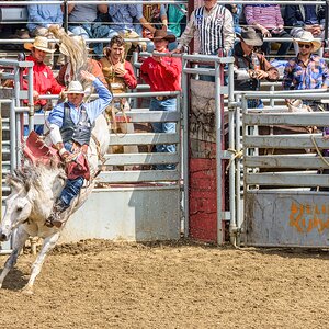
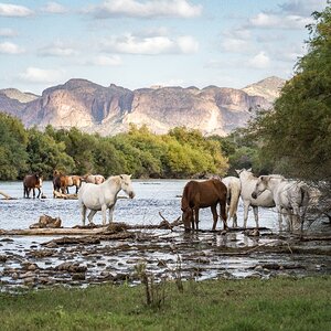
Anyway this is my attempt (and inexpensive way) of displaying my photos and being able to sell prints if anyone likes them.

I know my photos arent really grouped into categories but will work on that. Any suggestions on the website and photos are welcome.

www.ksmdigitalphotography.com
 
Something seems wonky with the image borders in your gallery.

Overall, your site looks OK...but still a bit amateur(ish). It's not bad...and I don't really have any suggestions for making it better...but it's not too exciting.
 
I agree with BigMike's comments. The whole website looks a bit soft. Maybe loose the blue? I don't know.. too many background colours for my liking.

Just out of curiosity... have you ever sold (or do you actually expect to sell) 4x6 photos for $38??
 
Thanks for the comments,

I know the website doesn't have the polished pro look. Used google's free webhosting and your homepage has to be done with their tools "Google page Creator", so kind of limited as far as getting really creative. You can upload pages build with other tools (dreamweaver or html editors) afterwards but then the general theme of the webpage wouldn't seem continuous since that first homepage has to be done with "GPC".

As far as the 4x6 (price + shipping) no I have not sold any. I have sold a few 13x19s. Its just when I was building the site I couldn't quite figure out the whole paypal thing, and I just put a number in there same went for the shipping (flat rate $18). I just have to go fix it when I get a chance. Not sure if 4x6s are even really worth it. But since you brought it up what do you think is a fair price?

Not a pro here, just like showing off some of my photos. Some better than others; if someone likes to buy a print great. Been lucky so far. Even sold a 30x40.

Thanks for the advice love some more feedback
 
Thats fantastic if those prices work for you, and you are able to sell them. I personally think that it's a high price, but that's only my opinion. I have not sold any photos, but I would think that if I did, it would be for cost + %100 - %200.

Are you able to change the colour and font of your title?
I think that is what really throws me off, first impressions are everything and you open with a simple yellow on grey text. If you could make a header image with your name built into the image that would look awesome. Alternatively, change the font to a white, non-italics font, maybe with a right side alignment?

Again only suggestions. All in all, it's a good site!
 
DigiJay,

Again Thank you for taking time and looking at the site,

I know what you are talking about as far as the colors go. I can change the font color and the italics but can't do anything about the background colors. Google gives you the template (there's a few you can chose from but they all pretty much follow the same structure) and your stuck with it. I guess I could just have a link from the homepage/template to something more creative but that would then add an extra step to get to my content. I'm really trying to come up with a solution, might be awhile.
If this was going to be my primary business I would definately look into some more pro advice and pay for hosting and design but I can't quite fit that in my budget right now.

I definately have the 4x6s priced wrong but will deal with that when i get a chance. Again just want to show off some photos for the most part.

Appreciate the help
 
Well I found a way to manipulate google's program to get rid of some of the template colors and borders. Still a work in progress. It wil never reach a complete professional look; for it being a low cost website but I tried to follow everyones advice.

So if you have a chance please take another look and let me know if its appearance improved at all.

www.ksmdigitalphotography.com

Appreciate the help
 
I definitly like it better, you are on the right track.

My only suggestion would be to work on some formatting..
For example, your title still has a "traditional" letter font.

maybe try something along these lines..

:: KSM diGital photoGraphy ::::

this is my style, this is what I like.. the important thing is to make sure that YOU like it. Do what you feel looks good.
 
DigiJay,

Thanks for taking a look at it,

I apprecite the suggestions, I know what you are talking about the fonts, I have to come up with some kind of logo or something. This google thing although inexpensive (=free which is about the right price for me right now) is a pain to figure out. No FTP upload or anything so any changes I make is really trying to "cheat"/manipulate the system with tricks.

Taking more time than I have. As soon as I get more time I'll try to fix that too.

I probably need to work on most of the text/content on the page too, but the styling is taking up a most of my time, can't even go out and take more pictures!! (which is what I really want to be doing)

Again thank you for your suggestions

Keep' em comming guys and I won't get offended. If I couldn't take it, I wouldn't have asked for it :mrgreen:
 
I think its a clean and easy to navigate site :) Well done.

However that said, i feel its lacks any eye catching features....
 
Changed the photo borders in the gallery to black and added a few more pic for now.

Work in Progress
 
I'd suggest keeping the navigation consistent on all your pages. Right now, accessing some of your pages like About Us is impossible directly from your gallery which is not ideal. You can safely design for 1024x768 instead of 800x600 to gain some real estate.
 
Thanks Sim for taking a look,

I've been trying to find a way to manipulate GPC to increase the boarders to 768 width for a cuple of weeks now and I think I got it to work now. I appreciate the suggestion. I just finally got it up this morning.

As far as the gallery goes I know I need some more links on there to be able to return to different pages on the site. I'm using an already made template for the gallery and I haven't got into tweaking that part yet.

So many things so little time still working on it, wish I was taking photos though.

Thank you all for the suggestions, inputs are always welcome. www.ksmdigitalphotography.com if you wanna look.
 
I'm happy to help.

A couple more quick suggestions:
- I'd recommend removing the visited link colour and just keeping the link colour consistent regardless of whether a user has visited that page or not.
- You may want to use a lighter blue for links to increase contrast and make them easier to read.
 
Hello:
First of all; great photos...
Second; I found bit distracting that the photos change rapidly on the home page. Maybe the you could change the time to display the photo for few more seconds or have the pictures change with some sort of effect. like some power point presentations. I felt that when i finally was able to concentrate to view the picture it changed on me... That is my opinion...Also, the banner on top where your company name is reflecting goes out of the frame for few inches, not sure if the template is that way? Other than that seem very easy to navegate... good luck!!!
 

Most reactions

Back
Top