Natural Light Portrait

amolitor

TPF Noob!
Joined
May 18, 2012
Messages
6,320
Reaction score
2,131
Location
Virginia
Can others edit my Photos
Photos OK to edit
Yesterday I pulled this http://www.thephotoforum.com/forum/beyond-basics/328922-natural-light-portraiture-howto.html together. Today I decided to go do my best shot looking for a result, rather than technical illustrations.

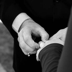
No strobes were injured in the taking of this picture, or even even used. This is 100% sunlight.

Full Rembrandt, very slightly short, SOOC JPEG (Nikon 3100 set to Fine JPEGs, B&W) resized in GIMP, and that is *it*:

$NL Hed Shot.jpg

Can it be done? Well, you decide.

C&C welcome, of course!
 
I think the lighting looks good, quite a bit of empty overhead space though.
 
I think the lighting looks good, quite a bit of empty overhead space though.

I agree with this. The composition could use a little improvement, and the head looks a little tilted to the viewer's right. Not sure if that was intentional or not.
 
Yeah, it's uncropped at the moment. It looks better cropped down to a 4:5 ratio, trim a little off the left side, and open up the midtones juuuuust a hair. And, of course, re-touching my ugly self to look more like Charlize Theron is also a big lea forward.

This was about showing what can be done straight out of the camera, so I just left the awkward framing as-is. It was hard enough getting it in focus with the self-timer ;)

Still, quite right. I shouldn't make excuses, the framing IS awkward. I could have done it better.
 
I didn't read any of the comments, just downloaded the image to LR to see what it could look like if the shadows were made a bit darker. WHile we do have the Rembrandt lighting pattern in this shot, to me the amount of fill light is just far too much...too much fill...weak shadows...does not look quite right for a dark-haired, dark-bearded man of amolitor's age and intelligence. When I think of Rembrandt lighting, I think of a bit more-crisp light. So, a tiny bit of digital enhancement...and a crop.$NL Hed Shot_crop_adjusted.jpg

Here is the same re-work as above, but with the one-click "300" present from Andrew's Killer Photoshop Presets page applied. It has the built-in vignette and the automated sepia-like color and this is just a straight, one click application of an admittedly heavy vignette, but hey...that's the way the 300 pre-set looks...$NL Hed Shot_crop_adjusted_300 Preset.jpg
 
OP...Here is my advice. Get into street photography. You like lighting? Check out Streetzen on Tumblr. He does lots of freaky lighting situations like Ray Metzger. (He burns in a lot so they are not exactly natural, but so did Ray.)

You obviously have a keen interest in photography, but you lack any interesting subjects and / or interesting photos. (Although Gary submitted a shot of some paper that was interesting, so there are interesting, banal things around the house.)

If your shy of street shooting, then try landscapes or birds or the zoo or macro. I would try to find your niche that you can grow into.


edit...Your sepia shot looks a little better. I missed it on the first round.
 
I was gonna say it was a bit flat looking, but derell picked up on that and his first edit is what I wold have done...or liked to have seen. nice derrell and nice shot experiment amol....
 
The shot was pretty much what I intended, but I agree that Derrel has improved it quite a lot. I was a little back and forth on 'gentle Rembrandt? What now?' but I was willing to take it. Partly because I am usually all about inky pools of blackness and I figured I'd try this other thing. Partly because I was obsessed with not blocking up the dark side of my hair.

Anyways, thanks everyone!

ETA: I have done a moderate amount of street, enough to know that it's not really my thing. I actually DO have a portfolio or two, and it's not of portraits. What I post here is bits and pieces, but what I do in my spare time is somewhat more organized.
 

Most reactions

New Topics

Back
Top