Need C&C's on my first portrait shoot...

theheater

TPF Noob!
Joined
Feb 17, 2007
Messages
72
Reaction score
0
Location
Halifax, Nova Scotia
Can others edit my Photos
Photos OK to edit
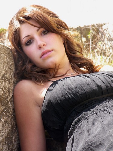
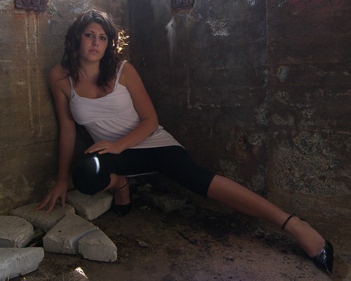
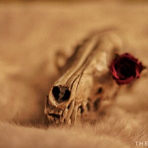
Well, I did my first portrait shoot this weekend... I was really nervous, and scared the photos wouldn't turn out very well, as I only had my internal camera flash, and natural light to work with.... but my model was great, and I hope you can all take a peek, and help me get better, and give me an idea if I did a good job...

I will post a couple of examples here, and a link to my flickr account where they all reside... please give me your honest feedback, remember it is my first shoot, and please be respectful... Thanks.

http://www.flickr.com/photos/98309359@N00/sets/72157600284396126/show/

520660367_b4333f6b31.jpg


520618304_dc744b8f9e.jpg


520656439_e189e1c3cd.jpg
 
You should have used the flash on the last one to reduce the contrast ratio on her.

If you do go portrait shooting again like this, take an assistant. Go to office depot, buy some big pieces of white foam core and use it as a fill card. If you put that on the shadow side of your subject, it will fill in the shadows and turn down the contrast. reflectors, scrims, all good tools.
 
First of all, very pretty subject. I'm not an expert by any means, but some things I noticed,

#1, Her face is lit well, but the sun got kind of harsh on the top of her head, and the sky is blown out above her. Also, she looks kind of stiff and uncomfortable in the pose.

#2, Too dark, but interesting pose. I dont know if that outfit really goes with the "crumbling basement cellar" look though.

#3, Beautiful background, but I would use a wide aperture and put some depth of field in there. That would give it a nice bluish blur in the background and make your subject stand out. And I agree with Switch, a fill flash or fill card would have helped.

Again, the model is attractive. You have something here. Keep posting! :thumbup: :D

NJ

I agree with this mostly. No 2 is well underexposed in my opinion and No 3 might have looked better with less dof (I think Less is what NJ meant).Opening up the aperture reduces the dof.

And I also agree that fill flash or a reflector was needed to lift the dark shadows.

Nice tries.
 
I like one hair light and all. Two is an easy fix with the bright and contrast adjustments.... three isnt easy to fix... You either have to use flash or expose for the face which will burn out everything else but If you have no flash its the thing to do on portraits. I also think the crops is wrong on three.
526cp5d.jpg


If it's a portrait it's about her... If it's a snapshot then it's about the ocean with her in it.
 
Lighting has been addressed, and yes.... there are problems. But I think posing is a larger concern. If all lighting concerns were corrected, you'd still have the posing problems.

In the first view, she's posed with her body closer to the lens than her face. This is usually not a good look, as it causes her body to look larger and dwarfs the size of her head. And the camera angle brings the viewer right up her nose. The bare arm has created some strong lines that lead nowhere, being abruptly cropped at the edge of the frame.

As for the other two, I've never been found of the squatting pose. I don't find it very flattering. It makes me think she needs a restroom.

I understand how we get to this point. In an effort to come up with something interesting, we can put our subjects into some very unnatural positions. In trying to be different, we sometimes forget to be good.

You have a very lovely subject and some very nice settings. The 3/4 length in the blue dress is very nice.

I hope this is helpful.

Pete
 

Most reactions

Back
Top