need feedback (fabric)

Marm

TPF Noob!
Joined
Jul 30, 2005
Messages
42
Reaction score
1
Location
DFW, Texas
53491677_d21e6fa752.jpg


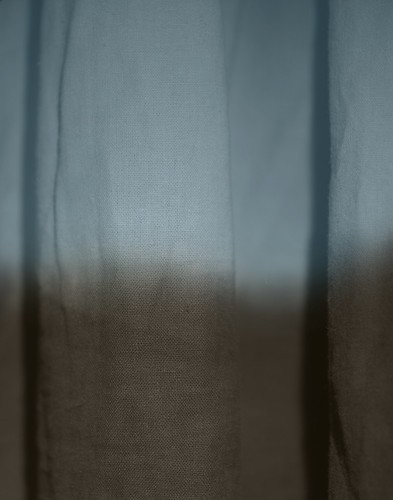
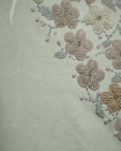
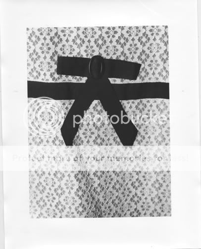
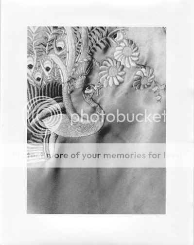
ok, I'm working on photos for my senior exhibition...I scanned in a few 4x5 B&W negs and was playing around in photoshop. I ended up adding color but I still have my doubts...What do you think of the color, is it too saturated? Should I have used different colors? The thing is, I used the original color of the fabric...but I supposed I could go crazy and use different colors :p

here's another I did for a comparison in saturation...
53603287_d6a14a0231.jpg


thanks for looking :)
 
Am I alone in not really understanding what you're talking about? Why are you shooting a B&W picture of a curtain and then artificially colouring it in Photoshop? Is it too saturated for what? Is the bottom picture out of focus?

Rob
 
Originally I printed these out black and white, but they felt like they were missing something...I'm really struggling trying to figure out what to do for my senior exhibition, and this was just one direction I'm heading...I've been working a lot with fabrics and this is my first attempt into color. I am intending on shooting on color 4x5, but I wanted a softer softer color than I will get from color film. I'm just not sure if I like the first picture that saturated as a final product. I'm thinking I kind of want a softer, faded feel. Does that clear it up at all?

PS All the fabrics are from pieces of clothing I have in my closet...
 
ok, so this exhibition or w.e you're talking about is about photos? and are they all about fabric? i'd personally suggest you go full bw but use the channel mixr to boost the contrast and w.e and maybe if you can reshoot make a macro i mean really big one of the fabric itself:D and this saturation is quite washed out...
 
eydryan said:
ok, so this exhibition or w.e you're talking about is about photos? and are they all about fabric? i'd personally suggest you go full bw but use the channel mixr to boost the contrast and w.e and maybe if you can reshoot make a macro i mean really big one of the fabric itself:D and this saturation is quite washed out...
well, it's my senior thesis basically, and since i'm a photo major, my presented work will be photo based. Right now what I've been working with is fabric, and so that is what I'm going to be presenting...I have printed the negs in black and white, 20x24 and it totally changes the subject, I've printed these out at 4x5 (basically a contact print) and the effect is really different. I will play around with the contrast as you suggested and see where that takes me. thanks for the input.
 
I am a bit confused. Is this for a HS or university? What elements of the photo are you being critiqued on? What were your other ideas?
 
It's for my BFA.
I can basically do whatever I want, but I have really working with fabric extensively, and am not ready to let it go :p
so far, all I have done is black and white. This is my first attempt at adding color into the equation. I am shooting more on sunday, with color 4x5 and color slide film (to cross-process)

here are a couple examples of previous work as a comparison:
44.jpg


6.jpg


so I guess maybe I'm asking, color or just stick with black and white?
and how big should I print? we get about 6-7 feet of space per student so i can turn in 4 16x20 (framed) or 2 20x24 (framed)
 
This last example is capturing my attention!
If you could try out your soft addition of colour to that one like you did in the second example, it could become really interesting!
 
I put the two color ones up, because they are the first ones i've added color to, but I am scanning negs tomorrow so I'll try that one and see how it turns out :)
 

Most reactions

New Topics

Back
Top