Need feedback - pictures at White Sands, NM

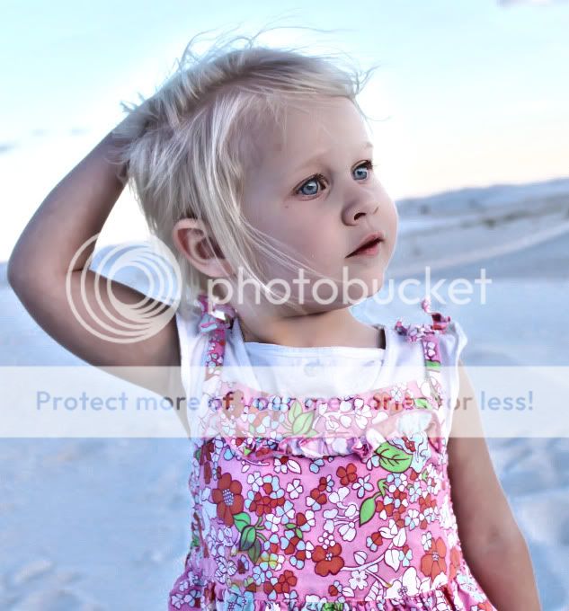
This one looks better than the one above that I did.. I used a photo filter..

Before

IMG_1307.jpg


After

photoshop2-photofilter.jpg
 
Actually Adobe Lightroom, but Photoshop could have produced the same image.

I set the white point to one of the buttons on her top, then I added very little brightness, contrast and saturation. Then I used the brush to "paint" 1/2 stop of additional exposure over just her so that I didn't blow out the sky. Finally a little sharpening for screen.

CS4 should be able to do the same tasks, but I'm not that good with photoshop either, so Lightroom is easier for me.

That looks great - did you use photoshop? I have CS4, but I am only a novice at that as well....


tirediron has covered it all. I just thought I'd have a go at correcting some of that blue cast. I hope you don't mind.

edit: I seem to have introduced a good deal of digital noise. :meh:

isabelleatwhitesands92.jpg
 
I have not really shot in RAW - at this point, I am not really sure what I am doing to be able to digitally process (if that makes sense)..
RAW isn't hard. If you have CS4 then look for ACR (Adobe Camera RAW)

Adobe - Photoshop CS4 video tutorial : Getting started: Developing raw photographs
Adobe - Photoshop CS4 video tutorial : Making local adjustments in Camera Raw

There are lots of people arguing "RAW or JPEG" across the internet and a quick Google would find you plenty to read! Ultimately, if you want the most chance of fixing mistakes, you want RAW.

For these photos, white balance can be fixed without RAW, but the results generally aren't as good:
Tutorial: Correcting White Balance / Levels in Photoshop - EyeFetch.com
 
New to photography. I took these with a Rebel T1i. The landscape pictures are terrible (dark blue colored) - I think I may have had to slow down the shutter a bit to bring in more light...? The white sands pictures that came out looking good, only did because the sun was shining brighter.

Any feedback is appreciated - some of the pictures of my daughter came out nice (to my standards I guess)..

Still trying to figure out whether its best to use Tv, Av, completely manual, etc. I read the manual, but seems like I get confused when I am taking pictures - can't quit remember what everything does.

Shawn


IMG_1307.jpg

Here ya go :thumbup:

sand-2.jpg
 
New to photography. I took these with a Rebel T1i. The landscape pictures are terrible (dark blue colored) - I think I may have had to slow down the shutter a bit to bring in more light...? The white sands pictures that came out looking good, only did because the sun was shining brighter.

Any feedback is appreciated - some of the pictures of my daughter came out nice (to my standards I guess)..

Still trying to figure out whether its best to use Tv, Av, completely manual, etc. I read the manual, but seems like I get confused when I am taking pictures - can't quit remember what everything does.

Shawn


Isabelleatwhitesands6.jpg

girl-2.jpg
 
That is an awesome picture after it is fixed up - I really like it. The footprints really set it off. Anyway you can send that to me in a larger scale? Where at in PA? I grew up in Sharon.


New to photography. I took these with a Rebel T1i. The landscape pictures are terrible (dark blue colored) - I think I may have had to slow down the shutter a bit to bring in more light...? The white sands pictures that came out looking good, only did because the sun was shining brighter.

Any feedback is appreciated - some of the pictures of my daughter came out nice (to my standards I guess)..

Still trying to figure out whether its best to use Tv, Av, completely manual, etc. I read the manual, but seems like I get confused when I am taking pictures - can't quit remember what everything does.

Shawn


IMG_1307.jpg

Here ya go :thumbup:

sand-2.jpg
 
That is an awesome picture after it is fixed up - I really like it. The footprints really set it off. Anyway you can send that to me in a larger scale? Where at in PA? I grew up in Sharon.


New to photography. I took these with a Rebel T1i. The landscape pictures are terrible (dark blue colored) - I think I may have had to slow down the shutter a bit to bring in more light...? The white sands pictures that came out looking good, only did because the sun was shining brighter.

Any feedback is appreciated - some of the pictures of my daughter came out nice (to my standards I guess)..

Still trying to figure out whether its best to use Tv, Av, completely manual, etc. I read the manual, but seems like I get confused when I am taking pictures - can't quit remember what everything does.

Shawn

Here ya go :thumbup:

Glad you like it, i'm from Erie. As far as the size goes you uploaded it here in 1023x682 and thats what i used so unfortunately that's as large as it will go.
 
Ahh yes good point - I am going to get Elements and mess around with it. I am really starting to enjoy this stuff..


That is an awesome picture after it is fixed up - I really like it. The footprints really set it off. Anyway you can send that to me in a larger scale? Where at in PA? I grew up in Sharon.

Glad you like it, i'm from Erie. As far as the size goes you uploaded it here in 1023x682 and thats what i used so unfortunately that's as large as it will go.

Yeah its fun. I recommend getting the new CS5 and Lightroom 3 if you really get into it, makes everything easier.
 
If theses shots are representative of what you are capable of, then I think you will be a very good photographer with some study, training and practice. Having said that, there are a few things to think about. Good photographs are all about telling stories. A photo essay may be a novel, but a single shot is a short story. All stories have an intro, a middle, and an ending. The intro, in photographic terms, is something that captures our initial attention in the image, then leads to the main subject (the middle), and allow us to leave the image with a satisfying ending (an insight, or a view or a perspective that we didn’t have when we “entered” the photo). Things that distract from this, weaken the story. Things that decrease the importance of the “middle”, muddy the story. And sometimes, it is the things that are omitted, that take away from the story.

The other posters have done a good job showing what can be done after the shot is made. But let’s look at what can be done at the preparation of the shot.

In the first shot, your daughter is looking downwards, surrounded by a sea of sand. It is just past sunset, and she has a beautiful light shining on her face, with the sand acting as a reflector to fill in the light on the shadow side. She’s obviously absorbed in something at her feet – but we can’t see it. She is centrally positioned, which usually creates a static image. The horizon line, unfortunately is cutting her head in half. Of course, you probably had only seconds to capture this image, but if you had to do it again, I’d suggest raising the camera slightly above her, and pointing downward to include whatever she’s interested in, and at the same time raise the horizon line above her head. As well, it you would position her a bit more to the left, you’d have some space in front of her to allow her to “breathe”. Your focus is bang-on, and you’ve chosen an appropriate depth-of-field, keeping the background mostly out of focus, but enough to allow us to see the context. In terms of story-telling, we focus initially on her eyes, then follow them downwards to see what she is looking at. Because we don’t see this, part of the story remains untold.

In the second image, we see your beautiful daughter captured in front of an airplane display. The light again is low (ah, the magic of the golden hour!) and you’ve got a really nice rim of light on her right side, and still enough light reflected into the shadow area to make out her features. However, you have to decide what is the main subject in the photos – the planes or your daughter? Because as shot, both are very detailed, and the eye doesn’t know whether to admire the machinery or the human. As a photographer, your job is to reduce these conflicts of attention. So if it was in fact your daughter who was the center of attention, you’d want to fill the frame with more of her, and provide enough background to allow us to see context, but not to compete with her. As well, using a shallow depth-of-field, centered on her, would blur out the details of the planes and make it clear to us what we should be looking at.

In the third image, you’ve captured a beautiful sunset. The clouds above the horizon line echo the mountains. Unfortunately, the foreground is quite under-exposed, and the potential story of the footprints in the sand gets lost. Compositionally, you’ve placed the horizon almost dead-center. While that can be very effective for some photos, usually is results in a rather static picture, so the guidelines are usually to place the horizon either higher or lower in the photo to emphazise either the sky (if it has interesting cloud formations), or the ground (if that’s where we can read the story). The intro to this shot is the actual sunset – that’s what we see as the eye is usually attracted to the brightest part of the image. Where to go from there? By putting the sunset in the middle, you’re not giving us the clues as to where we should look next. Let’s say you placed it to the upper left. Then from that initial starting point, your eye will naturally flow to the lower right, to discover the footsteps in the sand. Now, we have the beginnings of a story…

The fourth image has promise – the shape of the sand-dunes, and since the light is low so you have lots of interesting shadows to work with, but not so low that the shadow detail is blocked out. However, the rough sand in the foreground, and the road at the lower right strongly diminish the impact of the dunes in the middle. The way you’ve angled the top of the dunes is also good – this allow a visual slope that the eye can follow, and compositionally, diagonals are a very strong element. You have to decide whether the mountains in the background (right) contribute to the image or not. So… if you were there again, I’d suggest you get on top of those misshapen sandpiles (eliminate distracting and non-contributing foreground), adopt a low view angle (so that the top of the dune is high in the picture), perhaps use a wide angle to create more space between the shadows of the plants in the foreground and the back of the dune, and angle the shot to preserve the diagonal. Also look for something to capture the initial eye gaze, and position it so that the eye is guided in its wanders around the picture.

Fifth shot – beautiful, beautiful portrait. Did I say beautiful? So much to work with here! The eyes are sharp and clear, the way the light makes her face glow with a soft and gentle light, the shallow depth-of-field that centers our attention on your daughter… However, the horizon line is again cutting her face and perhaps if you had a slightly lower position (shooting upwards), you would have succeeded in having the sky as the primary background with a nice even gradation of tone and no distracting details.

OK, I’ll stop here. The good news is that you seem to have a good approach of using low natural light to create both warmth and shadow detail, you appear to focus well on the main subject and your photos have the basics of good story-telling. Now you have to cultivate your eye to see the images compositionally – what’s my main subject, what’s the story that I want to tell, what helps tell the story and what will diminish it? Pay attention to the symmetry in your photos – symmetry is very good in some cases, but it’s usual effect is to make the image appear static. The rule of thirds (actually, as all “rules” it’s a general guideline that works “most of the time”) is a handy way of positioning your main subject, but follow it with some kind of “path” that the eye can use to explore your images.
 
Excellent critiques. I really appreciate the time that you have spent putting that together, and I understand what you are explaining. Excellent thoughts - thanks again! I ended up sending my camera back, and buying the same one for $100 less, so I am without a camera for the next week or so. . This gives me some time to think about where I want to go next.

If theses shots are representative of what you are capable of, then I think you will be a very good photographer with some study, training and practice. Having said that, there are a few things to think about. Good photographs are all about telling stories. A photo essay may be a novel, but a single shot is a short story. All stories have an intro, a middle, and an ending. The intro, in photographic terms, is something that captures our initial attention in the image, then leads to the main subject (the middle), and allow us to leave the image with a satisfying ending (an insight, or a view or a perspective that we didn’t have when we “entered” the photo). Things that distract from this, weaken the story. Things that decrease the importance of the “middle”, muddy the story. And sometimes, it is the things that are omitted, that take away from the story.

The other posters have done a good job showing what can be done after the shot is made. But let’s look at what can be done at the preparation of the shot.

In the first shot, your daughter is looking downwards, surrounded by a sea of sand. It is just past sunset, and she has a beautiful light shining on her face, with the sand acting as a reflector to fill in the light on the shadow side. She’s obviously absorbed in something at her feet – but we can’t see it. She is centrally positioned, which usually creates a static image. The horizon line, unfortunately is cutting her head in half. Of course, you probably had only seconds to capture this image, but if you had to do it again, I’d suggest raising the camera slightly above her, and pointing downward to include whatever she’s interested in, and at the same time raise the horizon line above her head. As well, it you would position her a bit more to the left, you’d have some space in front of her to allow her to “breathe”. Your focus is bang-on, and you’ve chosen an appropriate depth-of-field, keeping the background mostly out of focus, but enough to allow us to see the context. In terms of story-telling, we focus initially on her eyes, then follow them downwards to see what she is looking at. Because we don’t see this, part of the story remains untold.

In the second image, we see your beautiful daughter captured in front of an airplane display. The light again is low (ah, the magic of the golden hour!) and you’ve got a really nice rim of light on her right side, and still enough light reflected into the shadow area to make out her features. However, you have to decide what is the main subject in the photos – the planes or your daughter? Because as shot, both are very detailed, and the eye doesn’t know whether to admire the machinery or the human. As a photographer, your job is to reduce these conflicts of attention. So if it was in fact your daughter who was the center of attention, you’d want to fill the frame with more of her, and provide enough background to allow us to see context, but not to compete with her. As well, using a shallow depth-of-field, centered on her, would blur out the details of the planes and make it clear to us what we should be looking at.

In the third image, you’ve captured a beautiful sunset. The clouds above the horizon line echo the mountains. Unfortunately, the foreground is quite under-exposed, and the potential story of the footprints in the sand gets lost. Compositionally, you’ve placed the horizon almost dead-center. While that can be very effective for some photos, usually is results in a rather static picture, so the guidelines are usually to place the horizon either higher or lower in the photo to emphazise either the sky (if it has interesting cloud formations), or the ground (if that’s where we can read the story). The intro to this shot is the actual sunset – that’s what we see as the eye is usually attracted to the brightest part of the image. Where to go from there? By putting the sunset in the middle, you’re not giving us the clues as to where we should look next. Let’s say you placed it to the upper left. Then from that initial starting point, your eye will naturally flow to the lower right, to discover the footsteps in the sand. Now, we have the beginnings of a story…

The fourth image has promise – the shape of the sand-dunes, and since the light is low so you have lots of interesting shadows to work with, but not so low that the shadow detail is blocked out. However, the rough sand in the foreground, and the road at the lower right strongly diminish the impact of the dunes in the middle. The way you’ve angled the top of the dunes is also good – this allow a visual slope that the eye can follow, and compositionally, diagonals are a very strong element. You have to decide whether the mountains in the background (right) contribute to the image or not. So… if you were there again, I’d suggest you get on top of those misshapen sandpiles (eliminate distracting and non-contributing foreground), adopt a low view angle (so that the top of the dune is high in the picture), perhaps use a wide angle to create more space between the shadows of the plants in the foreground and the back of the dune, and angle the shot to preserve the diagonal. Also look for something to capture the initial eye gaze, and position it so that the eye is guided in its wanders around the picture.

Fifth shot – beautiful, beautiful portrait. Did I say beautiful? So much to work with here! The eyes are sharp and clear, the way the light makes her face glow with a soft and gentle light, the shallow depth-of-field that centers our attention on your daughter… However, the horizon line is again cutting her face and perhaps if you had a slightly lower position (shooting upwards), you would have succeeded in having the sky as the primary background with a nice even gradation of tone and no distracting details.

OK, I’ll stop here. The good news is that you seem to have a good approach of using low natural light to create both warmth and shadow detail, you appear to focus well on the main subject and your photos have the basics of good story-telling. Now you have to cultivate your eye to see the images compositionally – what’s my main subject, what’s the story that I want to tell, what helps tell the story and what will diminish it? Pay attention to the symmetry in your photos – symmetry is very good in some cases, but it’s usual effect is to make the image appear static. The rule of thirds (actually, as all “rules” it’s a general guideline that works “most of the time”) is a handy way of positioning your main subject, but follow it with some kind of “path” that the eye can use to explore your images.
 

Most reactions

New Topics

Back
Top