The cook looks like HDR, and with people that technique does strange things to skin tones, or perhaps it is just tonemapped but again the skin tones don't appear attractive
The boy in the door frame whould be wonderful if the boy behind him wasn't growing out of his head.
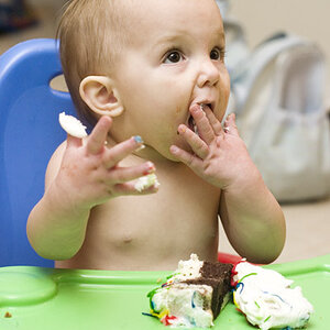
Boy at table, dead center , crop and place him off center as the woman at the side will be better balance
a non-pro suggestions:
#1 : kindly quote or address the concerned person in your replies
#2: There is an Indian saying even a child can be a Great Guru at times....
#3: KmH pointed not to post images pasted together....when images are posted without a gap in between them, the contents visually overlap that affects the observation and evaluation....
Image #1: it has full of life...personally i like the purple dominance in the image....
Image #2: By all means this is meant for a vertical crop.... or at least the fall should be more towards right...
Image #3; A major central portion drowned in darkness...that affects this image, i feel
Image #4: This image would have been classic, if the lady's head was not just above the kid and instead if she was more to the left, but seen blurred
Image #5: The cute face of the little girl should have been off center...her mother's presence-but less prominent- makes it a story too


")

![[No title]](/data/xfmg/thumbnail/31/31753-281132967af6a422c89bcc0d6f16499a.jpg?1619734991)
![[No title]](/data/xfmg/thumbnail/32/32637-865ab9beec7e00237b64e4fcb8fe947f.jpg?1619735555)
![[No title]](/data/xfmg/thumbnail/32/32638-22cfef06fc91cb3aee39b7b55c36198d.jpg?1619735555)