need some critiques on these pics

vonnagy

have kiwi, will travel...
Joined
Sep 8, 2003
Messages
3,759
Reaction score
30
Location
-36.855339, 174.762384
Website
www.vonnagy.com
Can others edit my Photos
Photos NOT OK to edit
Would appreciate any commentary here

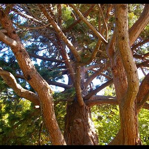
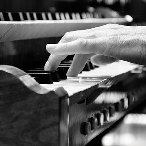
This is probably the most 'polished' shot of the lot:
camera.jpg

f/5.6
shutter: 1/15
handheld :oops: shoulda had a tripod

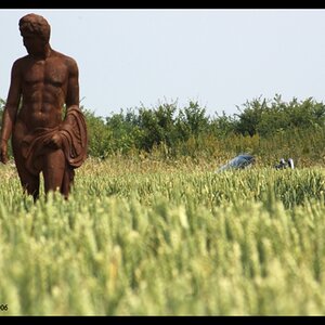
I was trying to emulate my shadow with statue.. its intriguing but i don't think it makes the cut somehow...you thoughts and suggestion would be appreciated. Do you like this or is this 'blah'?
shadow3.jpg

f/3.5
shutter: 1/45
handheld

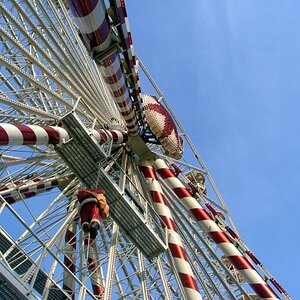
I tried to get the sense of motion and chaos with these shots. Since I didn't have a triopod i knew these were going to blurred anyway but what do you think?
tugowar1.jpg

f/4
shutter "7
handheld

tugowar2.jpg

f/4
shutter "7
handheld

canon d10 with tamron 28/300 lens

any comments appreciated, critiques welcome!
 
pic#2 not showing up

#1- love the composition, colors, etc. yup, tripod woulda been good- little too soft, but the mood you created here is excellent

#4 is better of the two motion shots- i was gonna comment that #3 would be good if more detail came through, then lo and behold, i scroll down and #4 does just exactly that. the guy with his hands in the air gives an anchor point and adds just enough static detail to complement the motion of all the others...
 
Well, what more can I say when Osmer_Toby is taking the words out of my mouth. No.2 doesn't show here, either, I sure like No.1, don't even find it too soft, I find it is a very special photo. Personally, I envy you the chance to take one like this (as one out of many you have taken so far!)

In No.3 there's actually too much motion, so it's only confusing, you don't get to see what's going on on that stage, and No.4 with the middle figure has what Osmer so nicely calls an anchor point. So in that one the other moving figures make sense.
 
Well #1 is the best of the bunch. I love it. But it's leaning a smidge to the right. I like #3 as well. The sense of motion is excellent.
 
1. is a great photo. I'd crop it differently though. I'd crop and inch or so off the left side.
 
#1 I think doesn't need to be any sharper. It conveys what's going on already, being sharper wouldn't add anything to it.

#2 Great concept, the angles were just working against you. If the alignment could have gone from your shadow to the monument and been in the tree gap it would have been perfect.

#3 & 4 I think three is the better shot, only because #4 looks sort of disjointed to me. Hard to tell what's going on exactly.

Purty good stuff altogether though!
 
Mark sweetie, I'm not getting #2 either. :cry: #1 is a beautiful shot. Love it!! Of the 2 motion shots, my personal choice is #3. I like the sense of the dancers all bent over in the right bottom, then it kind of unfolds as your eye moves up the line. The shadow is more dramatic to me, as well, and I like the overall golden tone of the image.

Nicely done! :D
 
No #2 for me either.

#1) I like it as is. Although my first impression would have been to crop some off the left side, to get the videographer out of the center of the image, I've decided that I really like the way the peoples' heads mirror the city skyline. I don't think that it needs to be sharper. Beatiful colors and the dark clouds on top really help frame the image.

#3 and #4) I prefer #3 because of the lack of detail. I don't like the look of the grass in #4. #Also, I think that the shadow in the lower left corner of #3 helps form the bright yellow into a shape that draws the viewer deeper into the photograph. On #4 it's too easy to slide off the left side. I have to admit, when i saw #3 I thought it was a conga line, but looking at #4 I guess it's a tug-o-war?
 
#1 is great as is - it's hard to judge the sharpness in the small
version though

#2 could be interesting if it would be darker and your shadow lined
up (merged) with the tower, also I would like to see the tower straight

#3 makes an interesting pic, the curved shadow and lack of detail
makes it very dynamic

#4 too static - say 3 is much better
 
but looking at #4 I guess it's a tug-o-war?

:cheer: you get the photoforum keen eye award (or something like that). There was christian concert (or something to that nature) where the commentators got the crowd to do all sorts of wacky things - in the case it was a tug o war.

when you say 'prefer' number - I am just curious how you would have take the shot - I was intrigued by the results because I really like the blur here because I felt it added to the sense of chaos - that a razor sharp focused picture would not have. I didn't have my tripod as i thought the lighting would be enough on stage, but the only thing I knew how to do was to lower the shutter speed/increase f/stop to get in as much light as possible. When you first saw these tug-o-war shots - did you immediately see anything you may have done differently?
 
I think that the tug-o-war shots were done well. Shooting moving subjects with a slow shutter speed is so unpredictable. My only advice is to shoot a lot of pics in these situations. You digi folk can check if you got the shot right away; I have to wait until I get home, at least, if not a few days.

When I shoot stuff like this I'll usually estimate what shutter speed that I think is a good idea, and then make sure I get a few on either side too. Like bracketing, but doing it to make sure I get the right motion or lack there of. If I think that 1/15th is a good starting point, you can bet I'll take at least a few at 1/30th, 1/8th, and 1/4th (adjusting aperture accordingly to maintain proper exposure).
 
#1 Great color. I would crop some off the left side to get the focus of the center of the photo.

#2 Dare I say it again?

#3 I like this one for it's color and curiosity. The movement you caught catches me and my eye sweeps through the whole pictures due to nice composition.

#4 Leaves me with a disjointed feeling because of that far right side person moved out of place of everyone else.

I love where you are going with the pictures. Keep up the good work.
 
No. 1 is gorgeous. Love the symmetry of the dark ground and sky - and the sky is awesome.

No. 2 - gotta agree with photobug.

No. 3 & 4. - of the two I like 4 the best - I also think the man in the middle with his arms up - stabilizes things just enough - but what really makes me prefer 4 is that the right side of the photo is nice and bright - alive! - in this shot - whereas in 3 it's rather dark. Only wish the tower weren't in the background.
 

Most reactions

New Topics

Back
Top