- Joined
- Sep 2, 2005
- Messages
- 14,455
- Reaction score
- 3,328
- Can others edit my Photos
- Photos OK to edit
So this is year 4 for me entering in the photography context in our local Bolton fair. I've won Best in Show three years in a row and hoping to make it a fourth. So... trying to pick what to put in and was curious of people's thoughts and general reactions.
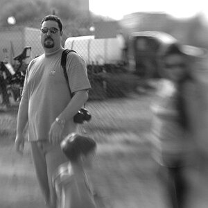
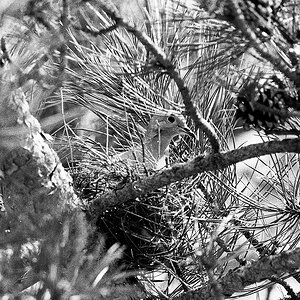
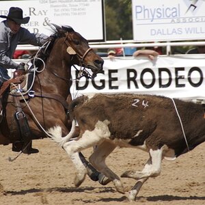
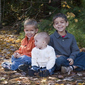
So first, the options... For "people", I was thinking one of these THREE shots.
==P1==

Or...
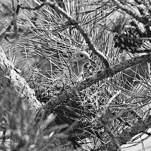
==P2==

OR...
==P3==

.
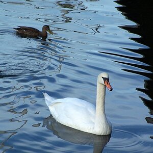
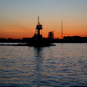
For Scenic/Architecture, I was thinking either...
==A1==

Or...
==A2==

.
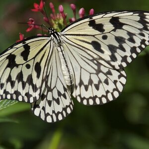
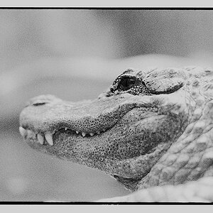
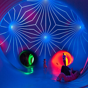
For "Fine Art", which is really just a big catch-all, I was thinking...
==F1==

Or...
==F2==

.
.
Which do you think? Any positive or reactions to any? All thoughts welcome.
So first, the options... For "people", I was thinking one of these THREE shots.
==P1==
Or...
==P2==
OR...
==P3==
.
For Scenic/Architecture, I was thinking either...
==A1==
Or...
==A2==
.
For "Fine Art", which is really just a big catch-all, I was thinking...
==F1==
Or...
==F2==
.
.
Which do you think? Any positive or reactions to any? All thoughts welcome.
")
 runnah.
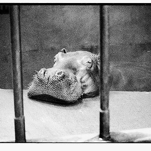
![[No title]](/data/xfmg/thumbnail/32/32701-51bacbc6ea9d40683123c14f053d4742.jpg?1619735603)