New Logo and App

theraven

No longer a newbie, moving up!
Joined
Oct 16, 2012
Messages
677
Reaction score
102
Location
Stoke on Trent, Staffordshire, UK
Website
www.ravenphotography.co.uk
Can others edit my Photos
Photos OK to edit
So I've been doing a lot of marketing etc recently, first of all to create a very different and unique logo which represents my business and second of all to create an app for free, a good app, with push notifications (harder than it sounds).

I have done both!

So I am looking for opinions from you all
smiley.gif


Here is the app for you to view and try Raven Photography - Yapp Install

It isn't a standalone but it is as close as you get for free with push notications! It's www.yapp.us if anyone wants to create one!

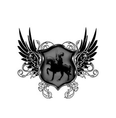
Also, here is my logo...

 
In my view logos work because they are iconic, but also often simple and easy to remember. Your logo just feels a bit too complex and busy. You could strip some detail form it and have a simpler easier to view (eps at smaller size) logo. On the subject of smaller size the text at the bottom I can't clearly read -its a combination of the font and size. Flowery fonts look neat, but at the same time they can end up being tricky to read which means people might not spell your name right and if they can't spell it right they'll give up looking for you.


Go look at some major brand logos, they are often quite simple icons, sometimes without any words at all (or sometimes the logo is the name). Look at an apple icon - you know its apple, its simple, easy to see and fits into small spaces without being obtrusive (or at least it would be if it wasn't the prime focus of all their products ;)).

I can see where you've gone with it; you've gone for that heraldic shield approach, which is likely quite suitable in equine photography. However its also just too complex for a logo - maybe a header for web-page at best (shield design sits nice in the middle of a main menu bar along the top of a webpage).

Thank you very much for your reply, and I do agree. I am in the process of creating black/white/simplistic versions of the same logo, so for stationary, invoices etc it can be simpler. I'm also creating non text versions too.

The big elaborate version that you see above is for my jackets, hoodies, shirts and car logos, to make people look twice! And tbh, it's already working! It stands out you see.

Here is an example of a black no text version. It's much simpler.

 
Ahh for a larger viewing size I can indeed see it working better, esp with reading the text. I still thing simple works, but eye-catching is also very key - I guess I'm probably thinking that some of the elaborate vines around the base and wings are a little bit of an overkill - esp around the wings (top and bottom they frame the shield rather well).

Black and white version might work well, but be mindful of colours - sometimes if you're using one colour its best to try and keep it standard throughout everything so that the image is as similar as possible to a quick glance (though of course changing colour works if you want to slip it into corners of photos to be less obtrusive since then its more like a signature than the focus of the work).
 
Why do you want an app? In what way do you think it will help you? A good website and email list would be far better at marketing a photography business that a app for someone's phone.

As for the logo, it looks like it's from a website from the nearly 90s that has midi music playing that you cannot stop. Its horrible. It's way way way to complex for a business logo. If you really want to use the name Raven a Photography instead of your name then use a simple sillioette of a ravin for the logo.

Hi there, thank you for the feedback.

An app is something that will be very useful for my work as I am an Equestrian Event Photographer, so people having the app means I can send an instant message to all of them to let them know when the photos are up and ready to be bought!

In regards to using a raven for the logo, Google Raven Photography and you will see why I haven't, what you have suggested is what every one else is doing!
 
What you need is a raven riding a horse for your logo!
 
An app is something that will be very useful for my work as I am an Equestrian Event Photographer, so people having the app means I can send an instant message to all of them to let them know when the photos are up and ready to be bought!

If that's what you want an app for your time and money would be better spent on a good website and email list. 99% of people are NOT going to install an app just to get notified when photos are ready to be purchased.

In regards to using a raven for the logo, Google Raven Photography and you will see why I haven't, what you have suggested is what every one else is doing!

Then that's a sign to you that perhaps you should choose a different name. What does a ravin have to do with horses anyway. Since you specialize in horse photography use a name that goes along with the horse theme.
 
I would say that a notification app or a facebook or email setup is going to give a similar level of feedback in that it lets you communicate with the clients. Emails might prove to be the most suitable for all generations since pretty much everyone has and checks email - apps might work with younger riders but some olders one might just not make much use of them - same for facebook.

Then again sometimes if you've got an email and an app and a facebook you can ensure that you communicate 3 times to your customers that the shots are ready - that way you get to hit everyone since they can check on their preferred medium. The only thing to watch out for is that you keep very good track of where they communicate back to you through - and also that you make sure the universal updates (shots done) go out at the same time.

I think apps are more valid in this market today than they were a few years back; they are the new in-thing and "everyone has an app" is a kind of thing now - especially for working companies. It's kind of like how facebook was once exclusive, but now is very normal to use for marketing.
 
The Raven is the Observer, and in this case, the Photographer.

I like it. I can see your new logo posted either on your car or a sign near a display table. I think your name should be larger.

You might have to manipulate it to fit on ordinary business card, or better yet, make your business cards a large square single-fold design with contact information inside the fold.
 
All of the flourishes around the shield scream, "No graphic design experience!!!!" I totally "get" the idea of the knight on a horse, shown on a shield, and then the wings of the raven coming from behind the shield...that's plenty to convey the message and to be distinct. The extensive flourishes though...just wayyyyyyy too gaudy.

Look at the principles here: 10 Rules For Designing A Great Logo | SmashBrand

Can you see the utter simplicity?
 
Last edited:
All of the flourishes around the shield scream, "No graphic design experience!!!!" I totally "get" the idea of the knight on a horse, shown on and a shield, and then the wings of the raven coming from behind the shield...that's plenty to convey the message and to be distinct. The extensive flourishes though...just wayyyyyyy too gaudy.

Look at the principles here: 10 Rules For Designing A Great Logo | SmashBrand

Can you see the utter simplicity?

Exactly.

If you want to stick with the ravin thing despite how you photograph horses. Maybe try a simple horse with a ravin wing or the letter R on horse as if it was branded onto it.
 
Or you could go with a raven winged horse (pegasus) although that might require more custom art.

One bonus with the Raven name is that you do leave the door easily open to do other areas of photography whilst still keeping it all under the same title (eg dog agility or show-ring photography of stock animals etc...). If you call yourself Equine Photographer or anything really horsey its very market focused (and to be honest as much as raven is used equus and other horsey terms are used loads as well).
 
While it would make a good band jacket, it makes a terrible logo, with the gradient, all the swirls, the fancy font. Looks like a big mishmash on my phone at small sizes.

Also, agreed no one is going to put a one-use app on their phone's valuable real estate. Just use an email list.
 

Most reactions

Back
Top