So I am new to this forum and i thought i would post some photos i have done and get your guys say on them... Dont be too harsh im 17 and i havent been in the game for to very long.
I like it. What you have done. Most of what you really and truly learn, the bulk of it, will come in the next few years. After that it is refining what you know. That's why when I talk about thirty year I say two years 15 times. So don't let being new to the art concern you just keep shooting.
Now for the pics... You will get mostly the art of photography from me. Someone else can have a go at the craft. The nuts and bolts as it were.
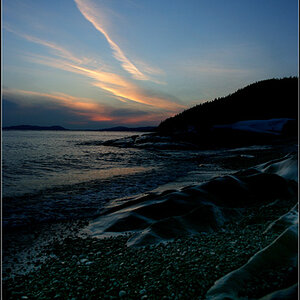
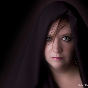
Picture one is dynamite. Lots of opposing lines and textures. The coke thing has universal appeal. I see a poster in this lol.... Just kidding. It is by far the best but you knew that.
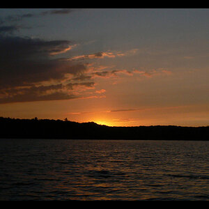
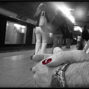
#2 is dark and brooding maybe a little too dark. The first impresson of picture often makes the most difference in whether a person will stay to explore all it's hidden details. If you take a step back and look at this and say number one, you will see what I mean.
Three has an appeal to those of us in the south. There have been junked cars everywhere down here. It is an appealing nostalgic shot but could use a different crop I think. At the bottom I would crop up to the table top keeping the proportions by cropping from the right ladder side as much as possible. Then if need be get some from the left. The crop you want is from the bottom the rest is to make it fit. My opinion only
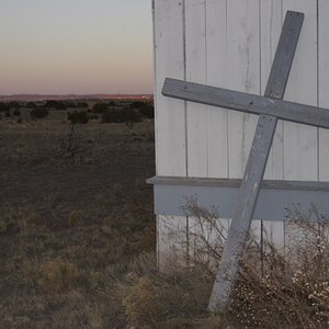
#4 is mostly random lines. The best thing about it is the line on the left that leads the viewer's eye into the picture. The rest is confusion for me at least.
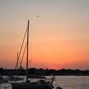
Number five would be a really cool shot, if the water color was a little more real. Now that is just my opinion. I think if you took that shot into even the simplest editor and lightened it over all almost to the point of what, around here, they call blowout. You would have a totally different picture.
Over all assessment by me, and trust me, I have a terrible record with trying to explain things, You have a very nice set of pictures. Over all they fall into the good range. For someone fairly new to the craft they are excellent. Of course if you save these and you should, then revist them every six months you will be shocked.
Taking everything into account you should be proud of what you have done. Especially with a modern camera... The last was a dig at everyone not you lol...
Keep shooting pictures.
Ps. If you can work it out so that I am seventeen again and you were 60, you can be as harsh as you want with me, rofl.
I like this series overall. There are a couple of standouts for me. I agree the first shot is really good, but I don't think it's the best - that would be the third shot, for me. It's a little contrasty (very deep blacks and extreme highlights) but for this particular shot, it looks great. It's fun to learn to play with contrast so certain images can pack a little more punch. I think you'll look at this one down the road and like it even more - it has a great feel. :thumbup:
What follows, the 4th shot, is quite flat - very gray tones throughout. I think Charlie is right when he says the lines of the lumber are drawing your eye into the shot, but it's not a real strong composition. However, visual interest could help it if there were better contrast. For instance, I can barely make out that roll of twisted wire, which you probably used as part of the composition. Richer blacks here would help that wire pop into the shot and add some drama.
The last shot does absolutely nothing for me, I'm sorry. I am not a huge fan of selective coloring, anyway. Here, the unreal shade of blue lends nothing to the scene. It is true that sometimes *unreal* colors can be effective, but this has no feel of intent behind it, just an arbitrary attempt at an "oh wow". :razz: I'd like to see it in plain B&W!
Im not sure of the shade of blue, they were acrylics and you can use your finer or a q-tip if your the non get dirty kind... then you just use a clear paper mount over the top. it takes time but not too hard and it has an awesome finish.


")