New Website

I really like it. Its clean, loads fast, is easy to read, and isnt cluttered. Did you make this yourself or pay someone to do it? Just curious.
 
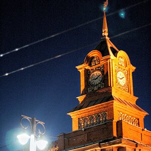
nice bridge!
I like the way you blend your black white gray color.
good job!
 
Thank you both!

The site design was done by a graphic designer friend of mine. His wife did some initial templating of the site with HTML and CSS and I used that basis to figure the rest out. (I didn't know CSS prior to this... now I know some) :)
 
Chris,

It looks good. I don't know web design, but I know what appeals to me as design. It kept me looking which I suppose is the major key in having a successful website. Whether it was the color combination, or the text size/color or general layout, it kept me there.

The "About" page (for me) is too much text. My action was, I read the About paragraphs then I didn't see an end to the text, so I scrolled. My instant thought was "I don't want to read all that". I actually did, because I do like your work, but I tried to be unbiased and I have a bad feeling some people will feel the same. The problem is, the whole page is worth reading to fully discover what you are offering, and it would bother me that people will bail way too early.

I think your "Contact" should be at the end of your navigation bar, because if I want your services for commerciaL reasons, I want to flow from your introduction, to let's see some examples, to, let's get a hold of this guy.

If you have approval, footnote the bottom of your images. This will (at minimum), display prestige. e.g. I saw an image of a Sheraton Lobby, with a footnote, your potential customer's reaction will be, "huh, he's done work with reputable companies", kind of mentality.

If this was my site, I would be very happy that I have something to work with. Good job.
 
Looks decent Chris. You can never really go wrong with a black colored theme - especially for photography.

I would suggest changing the font of the navigation buttons (top), it just look fuzzy, even on Firefox. You might also want to consider closing off your footer with a 1px border or something similar because on pages such as Contact, it looks broken.

You should also consider putting in proper meta tags, keywords and description to help with Google and Yahoo SEO. Other than, looking good.
 
It looks good. I don't know web design, but I know what appeals to me as design. It kept me looking which I suppose is the major key in having a successful website. Whether it was the color combination, or the text size/color or general layout, it kept me there.

Cool! :) I'd call that ideal. :)

The "About" page (for me) is too much text. My action was, I read the About paragraphs then I didn't see an end to the text, so I scrolled. My instant thought was "I don't want to read all that". I actually did, because I do like your work, but I tried to be unbiased and I have a bad feeling some people will feel the same. The problem is, the whole page is worth reading to fully discover what you are offering, and it would bother me that people will bail way too early.

I tend to be overly verbose in my writing. I'll give it a second pass to see if I can tighten it up a bit, though to be honest... I expect very few people will actually read it, no matter how short it is. Who ever reads any text on anyone's site? PARTICULARLY a photographer. :lol:

I think your "Contact" should be at the end of your navigation bar, because if I want your services for commerciaL reasons, I want to flow from your introduction, to let's see some examples, to, let's get a hold of this guy.

Yeah, I was thinking I wanted to re-order those myself. Glad someone else felt the same. Confirms my suspicions.

If you have approval, footnote the bottom of your images. This will (at minimum), display prestige. e.g. I saw an image of a Sheraton Lobby, with a footnote, your potential customer's reaction will be, "huh, he's done work with reputable companies", kind of mentality.

I'm not sure I quite follow you... are you saying that you are thinking people may think I just randomly walked into the Sheraton and shot the lobby unless I footnote it?

If this was my site, I would be very happy that I have something to work with. Good job.

Thanks much, I appreciate all the comments.
 
Looks decent Chris. You can never really go wrong with a black colored theme - especially for photography.

I would suggest changing the font of the navigation buttons (top), it just look fuzzy, even on Firefox. You might also want to consider closing off your footer with a 1px border or something similar because on pages such as Contact, it looks broken.

I'll have to confer with my GD buddy on the font. I'm fairly certain he will murder me in my sleep if I change the font. Though, actually, I know I will put him into fits and spasms if I change it to Copperplate, which would be oh so very entertaining. :)

You should also consider putting in proper meta tags, keywords and description to help with Google and Yahoo SEO. Other than, looking good.

Oh yeah, good point. I'll do that! Thanks for the comments!
 
Its a nice site, but to me it sounds like an architecture firm, not a photography company.
 
Its a nice site, but to me it sounds like an architecture firm, not a photography company.

I'm not working to be like "a lot of photographers". I'm pretty specialized towards commercial real estate and architecture. I do other stuff when it comes up, but it's not my primary thrust. That's part of the name and the way the site is laid out.

So, overall, my short answer to your comments is... "good!" :lol:
 
Excellent site! Clean and just the right amount of images. Most importantly great photography.

Thank you, craig! I gotta say when I saw you responded I was like "uh oh, I'm gonna get it now!" :lol: I was pleasantly surprised. :)
 
I liked the simplicity of your website. And, like the other guys here, I was impressed all the more with the photos you took. Great job! Good luck on your business.

Cheers!

Captain Kimo
 

Most reactions

New Topics

Back
Top