New Website

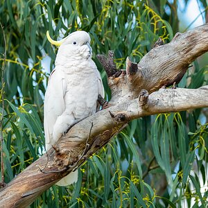
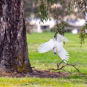
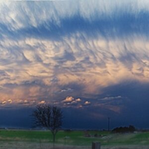
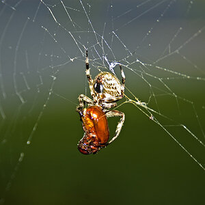
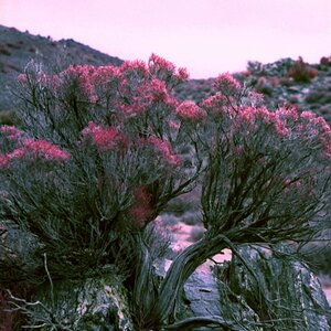
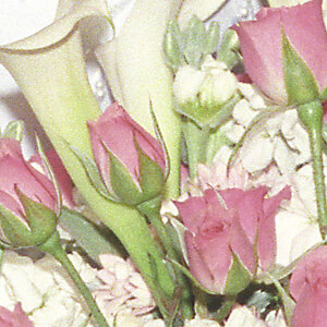
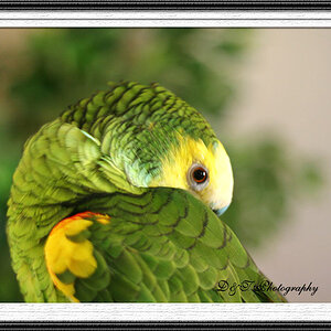
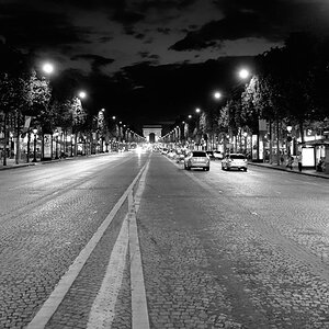
I really like the simple layout with the changing color schemes. The site looks really nice but still keeps the focus on your photography...which is pretty awesome, by the way. It looks like you have a lot of fun with your photos. I loved the B+W's, but I'm kind of a softy for that sort of thing. I also liked that you indicated which photos had been post processed. I'm guessing you used an editor, which one?
 
pcs2

i only do contrast/brightness, unless i feel creative (rarely) in which the whole 'unless otherwise noted' thing comes into play.

thanks!
 
I would drop the changing colors, but that's just me. If you know PHP, you can always put up a "theme selector."

Easy to browse, and I'm a fan of minimalism.
 
ironsidephoto said:
I really don't know anything about PHP.
I thought the colors worked, but that's just my opinion i guess.

The colors worked individually - any of those individual themes are good. I would just make it uniform across all pages.
 
I understand choosing background colors that are complimentary to the photograph. It makes it easier to see, and brings out the features you want.

I'd recommend using a border frame for pictures on the web, like in a gallery. Otherwise, you get an "epileptic fit" effect as you change pages. That way, you have the proper neutral frame no matter where the picture is.

It is, unfortunately, one of those areas where web design and photography tend to have a conflict.
 

Most reactions

Back
Top