Newbie looking for feedback

brudawn

TPF Noob!
Joined
Aug 18, 2006
Messages
10
Reaction score
0
I have been a long time lurker on this site and have always been impressed with the thoughts and knowledge of the participants.

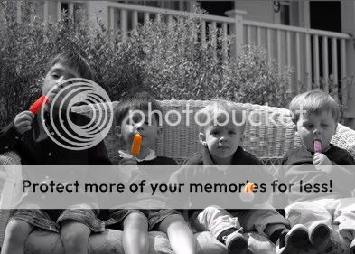
I recently had a few assignments taking pictures of kids and families and want to get some constructive critisism on my work so I can improve my skills. Please do not hold back!

deering_30.jpg


nrusso7-1.jpg


Thanks!!
 
First off, welcome to TPF, glad you decided to join. :) Secondly, I love these pictures! The colored pop's in the first one are great, I think one of the neatest uses of that technique I have seen. The second one is also very nice. :) Hope you keep posting. :)
 
I have one immediate thought with regards to your second pic here and that is that the shoes look very big and heavy and kind of distracting and that this photo might have been more endearing with this child sitting there in bare feet. Somehow I find these shoes and their colourful soles very prominent and therefore distracting.

The first is cute as it is.
Your selective colouring technique is good fun.
Though the kids' lovely expressions would not need this. But it is good fun.
 
The first is a good fun image - the kids will enjoy it and the second is nicely framed and exposed but with young children try and get the mother to remove the shoes as the modern sole is usually distracting or offering free advertising. Sometimes a little rafty blurring in 'shop of the material of the sofa - like the foreground will bring out the subject.
 
#1 is a great idea, and I am normally sort of biased against selective color. I have seen a few examples I really like, but most of the time I think it looks gimmicky; done because it could be done, not because it brings anything to the photo. I really like it with the popcicles though.

To me the bright points of color make the subject the popcicles, and I wonder if they are possibly too small to be the subject. They are more like an accent. I think that by coloring something else too (the foliage behind them, or their clothes?) it would help balance the intensity of the popcicles, and help make the boys the main subject.

I think you should have composed with the boys' heads closer to the top of the photo, possibly showing us more of their feet. More of the boys is more interesting than the white fence in the background. It competes somewhat with the boys for the viewer's attention.
 
Geez I haven't been on here in a long time. All I have to say, is that the black and white and then the colored ice pops is freakin awesome. I really like it.:thumbup:
 

Most reactions

Back
Top