Newbie with photos

bluettu

TPF Noob!
Joined
Jun 16, 2007
Messages
10
Reaction score
0
Can others edit my Photos
Photos OK to edit
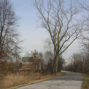
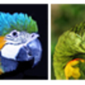
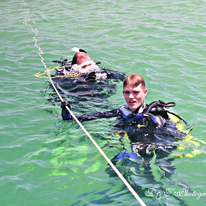
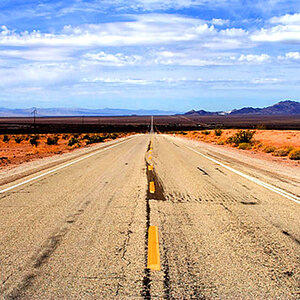
Hi everyone! This is my first time on this forum. I started my own photography business about 4 months ago, and I LOVE every minute of it. I bought a Nikon D80 and love it also. Here are a few of the pictures I have taken so far. The 2nd one is my daughter. Feel free to critique and make suggestions.

DSC_0076.jpg


hb_falleaves4copy.jpg


DRAKE001.jpg
 
I've recently been playing with the same effect of B&W Masking, I think its an interesting effect but often draws attention away from what you are trying to "say" with your photo.

I have some examples on my flickr, these were mainly for practice with the tools rather than to make nice pictures. The problem with this effect is that it is soo easy to over do it. Often the point of shooting in B&W is to stop the distraction of colour and try to focus the view on the subject of the photo, the story or the message that you are trying to convey...

Photo 1 is OK but do you really need to highlight the nappy? Also, image one has a high contrast (+blur?) effect that obfuscates the subject a little, in short, its confusing to the eye.

Photo 2 just doesn't sit well with me, sorry. Was she actually wearing that jacket at the time? Either way the colour of the jacket and the eyes look to have some extra saturation, which is fine if you are using saturation to highlight something in a colour pic but in conjunction with a B&W mask, in this particular instance at least it doesn't work for me. It seems a little unnatural and unbalances the picture.

Photo 3, In my opinion this is the "nicest" image. The colour is soft and the use of the mask is therefor unobtrusive. Was the aim of this picture to sell T-shirts or to portrait the smiling fellow....I'm not sure, should I have to ask?

Please excuse me if I ask too many questions and assume the wrong things, I'm still learning. These are just my unqualified 0.02chf, feel free to disregard what I have said and demand a refund!

Cheers
-Rob
 
I agree with the points Rob has made. The first picture seems to be a bit "alien" IMO. The eyes are waayy to dark, they almost look like black holes, especially the left eye, where no white can be seen. It seems to over PP'ed.

On the second image if you just left her eyes in color the image would be MUCH stronger.

Great job balancing B/W and color on the third image.
 
i would have to agree on the 2nd one, maybe try and tone down a little on the blue, and it might look better., at this point i think the colors are too bright.

keep on shooting :)
 
Thank you for the input. I do agree the 2nd one is way too bright, and I now see the problem with the eyes in the 1st one. To answer the question about the 3rd one...it was a Senior Pic. I'm glad you people are honest, because it makes me pay more attention to details (i.e. the eyes). Here are a few more that I have done. After this, I promise I won't bombard you with pictures. I'm in the process of setting up my Flickr.
#1
familygraduation22.jpg

#2
chasingbubbles-1.jpg

#3
chasingbubbles.jpg

#4
DLACYWATERFALL30.jpg

#5
COLTER8.jpg

#6
DRAKE24.jpg

#7
SISTERS11.jpg

#8
DeNae16.jpg

#9
SISTERS0.jpg
 
You have some very nice pictures there, I'm going to point out a few things that I think could be different but I won't hesitate to point out that I am very much a newbie - pointing out flaws in photo's is a lot easier than taking them!

The only thing that jumps out at me as being strange is the first one, I understand what your going for but I think the colour is a little too saturated, looks more like a sale of graduation robes (funky purple ones) than a guy celebrating graduation with his family.

Two is really nice, I'm not sure about the bright spots but come on - thats being picky! I'd love to have pics like that taken of my kids...when I get around to having kids!

Three is very nice its just a shame you couldn't capture the picture with the bubbles a little closer to the girl so that you could crop out the edge of the grassline at the top of the picture. The sun on your daughters head is pretty bright also.

Four is a nice picture. Perhaps she could open her eyes a little, was it a very bright day or just a shy subject.

Five is good, the brightness seems to be washing out the guy though, perhaps shoot with a higher shutter... I like the effect you have with the mask this time, it works well.

Six is a well composed shot, the guy seems pretty blinded by the daylight though.

The next few shots of the girls are nice, well composed, simple images.

The only real comment I have to make is that its far easier for people to critique you shots, particularly when you post > 3, if you number them.

Some great work there my friend!
 
I feel like I am echoing what everyone else said, but here goes. The use of subtle color in an otherwise B&W picture can be very powerful (the red coat on the little girl in 'Schindler's List') but there should be a real reason to do it.

You should want to attract attention to the colored portion of the picture and the color shouldn't detract from the overall impression of the picture.

The very first picture you posted was just great - the pose, the expression, the expression, the treatment - but the color in the diaper attracted attention and hurt the picture.

Ditto, the others, especially the John Deere guy and the graduation robe picture.

You have a good eye but tricky stuff is hurting these pictures - and gets old really fast.
 

Most reactions

Back
Top