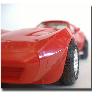
ah i see it now. very nice, i really like that it has that real dark, rich feel to it. nice glowish look too. was it really humid? sometimes humidity can fog a lens just right to make it look really neat. maybe it just looks glowy.
anyway, lets see. there isnt much that I find 'wrong' with it if you know what i mean, but there are a few things that you could have done to make it pop more. first thing that comes to mind is the composition. the subject and tones are really interesting, so the composition is a little less stressed, but it's still very important. IMO the jaguar feels a bit too centered. I'm thinking if you had a tad bit more black (from the car) and bumped the jaguar a little bit up and to the left it would give it a stronger composition. there are a couple places where the background blends with the car and/or jaguar, but that's usually not preventable. also, if you could have (not sure if your lens went to a larger aperture) it would have been even better to use a wider aperture (so that the background has a more smooth blur). there are some things you could do in photoshop (clone out the highlights (circle bokeh) right above the emblem's head, for instance) but besides that there really isnt anything else I can think of that is really fixable without adding in objects.
Actually the photo was taken inside, so there wasn't too much moisture. I completely agree with what you're saying about the backround blending. Thanks for the opinion, it's greatly appreciated.
honestly, i find the background kind of distracting... not sure what to do with that, though, unless you make the background completely dark and just leave the reflections on the car for contrast?


![[No title]](/data/xfmg/thumbnail/32/32929-22e23acc63d6ecb25e5ee941be87121f.jpg?1619735758)

![[No title]](/data/xfmg/thumbnail/34/34065-43f99c081a04bd087c00711d2fe010ee.jpg?1619736261)