Old and "time-beaten" (no... not refering to myself!)

Jzero

TPF Noob!
Joined
Dec 9, 2006
Messages
204
Reaction score
0
Location
On the coast of The Mediterranean Sea
Website
ronunna.googlepages.com
Can others edit my Photos
Photos OK to edit
Hi
Before I proceed to follow my natural and uncontrollable inclination to distort my fresh photographic efforts beyond recognition with my array of “Picture-Distort-and-Fiddle-About-with-Settings” Software, let me show you what I came up with on today’s little photographic expedition….

1.An old and 'time-beaten' little house that I found out in a field somewhere.
farm_ruin.jpg


2. Same house, different angle.
IMG_0527.jpg


3. The rusty door. Still from the same house.
IMG_0538.jpg


4. This is from a quite different house, probably a lot older than the previous one but in much better condition.
IMG_0524.jpg


5. This one probably defines the term; "Time-Beaten".
saturate.jpg


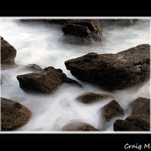
6. For the sake of diversity, here's something a little different. A winter grove...
IMG_0269.jpg


Thank you for taking the time to look at these. All comments welcome...

J
 
I think 5 would look awsome in a Duotone.

Like this:

saturate_EDIT.jpg
 
I think 5 would look awsome in a Duotone.

Like this:

saturate_EDIT.jpg

looks like BW to me? what is duotone?


Oh and to the OP

I Happen to like 1,

And I think I would like number 3, but the sepia draws me away. I think number 3, only in BW would like lovely.
 
I really like the composition of #2...but don't like the color. I think it would look much better as a straight B &W.
 
Thanks for your comments, they really do improve ones ability to be self-judgemental when it comes to evaluating the qualities of a photograph.

NoChance - I am not sure what 'Duotone' is but you have improved the photograph considerably. Thanks!

Here is picture #2 again. in B&W this time, as it was originaly shot with only a marginal, and hardly noticeable tweak:
houseonhill.jpg


...And here's another one of the rusty door. As suggested, also in B&W this time:
rustdoor.jpg


J
 
Oh well, lovely variations of the photos now...

I liked all the green in the fully dilapidated house (#5), but then how would I not love it, eh? But I must say that the slightly tinted version that Sw1tchFX created is also highly attractive and models out the texture of the remaining walls even more!

The very first of your series, Jzero, is a bit too dark for my liking.
I was forever thinking whether I liked the colouring you gave to the second, and was torn between not liking it at all and finding it quite interesting in the way it shows, it looks like a photo that hasn't stayed in fixation for long enough (if that really is the effect that insufficient fixation has!?!?!? Whoa, "talking darkroom" is soooo not my thing, it is very thin ice for me to say such things), and I kind of like this effect.

And I certainly like the composition of #2 with the rows of the field all leading towards that shed.

The rusty door (#3) in the way you first posted it is a colour photo, isn't it, Jzero? It is not sepia, like was suggested by NoChance, or is it?
For a rusty door I like the colour of rust, and I like to see it, too. It's only that exposure is not quite right for that one and you are losing the walls (too bright). Also the shrubbery in front of that door is too bright.

But I see that this is the unedited original, anyway, without any PS work done to it before, so I felt like giving it a try (since you are giving us "the green light" to do so ;)):

jzeroimg0538myedit.jpg


I tried to win back some of the wall around the door.
Don't know if I succeeded?
Your b&w of the door is very flat, too ... sometimes when you convert a photo you had to do more to it afterwards.
 
Hi LaFoto

Yes you are correct, the door was originally posted in color and not in sepia (very observant you are! well done!) ;) I like what you did to it though, the surrounding wall does stand out a bit more in your version. I cropped that picture a bit in order to reduce the amount of wall and emphasize the door (which is really just a sheet of red rust).

I agree that the first picture is a bit dark but for some reason, most of my shots seem to come out like that, a bit on the dark side even if the lighting conditions are reasonably bright. This is something I haven't figured out yet but I do still have a lot to learn about my camera settings. I have only been at it now for 3 weeks...

Thanks for the input
J
 
#6 does it for me !! its like grotesque and creepy, but in all the right places.
 

Most reactions

New Topics

Back
Top