Old Barn in the White Mountains

Big

TPF Noob!
Joined
Apr 22, 2009
Messages
1,227
Reaction score
0
Location
New Hampshire
Website
coffmanimages.webs.com
Can others edit my Photos
Photos NOT OK to edit
OldBarn.jpg
 
Nice procesing, I really like

I'm not sure about that piece of fence at the bottom of the frame and then leads to the house, kind of cuts from the simple image of the house.
 
Nice procesing, I really like

I'm not sure about that piece of fence at the bottom of the frame and then leads to the house, kind of cuts from the simple image of the house.
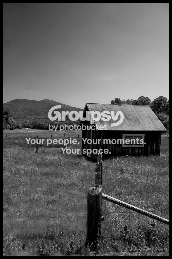
Thanks! I played a lot with the b&w trying to get something I really liked. I could shoot old barns all day long. Just something about them I love.
 
Perhaps it should be titled Gray Barn in the Gray Mountains?

Too much gray. For me, it doesn't work as a black & white image because the scene (and the way it's shot) does not emphasize the strengths of b&w imagery. There's no texture or contrast, which is like Rule no. 1 when it comes to b&w.

Green and blue are both reduced to middle gray. The same is true for red. Was the barn red? I will slice my wrists to the consistency of cured ham if you shot a scene with red, green, & blue as black and white. What a waste of color!

But the barn is probably a boring, country brown. I still think that would be better than what you have here. The picture needs contrast -- color contrast, or more b&w contrast.

I like the diagonal fence line leading from the right side. I don't like the nearly vertical fence line going toward the house. Right idea, bad execution. Get a better angle on the fence, like moving to the left or right more. Turn both lines into diagonals.
 
^^^ I think I give up on b&w's. If I boosted the contrast, I would lose the detail in the barn walls. Also the primary colors of this scene were red, green, and blue...
 
I hope you dont mind my editing this.

What I done:

first - Correct the levels, press auto worked fine.
if you want to be really specific when lightening an image and dont want to mess with colour detail and stuff, change image mode to LAB and lighten the lightness channel (default when levels is open)

second - I pushed contrast to +100

third - I used curves to brighten the sky to seperate it from the image to give more depth

fourth - applied image and sharpened
(using unsharp mask: amount: 205% radius: 0.8 threshhold: 0.)

fith - I used gaussian blur to reduce the sharpness a bit, (0.3 strength.)

imex.jpg


obvious banding is noticeable, due to the fact I was using a compressed image, using raw wouldn't be so noticable.
 
Personally, I like the dark sky in the original. The only thing I would do is lighten it up just a hair while holding the sky if possible, and while not increasing contrast.

To each his own! Capisce?

Big, don't give it up. It looks pretty good as is.
 
Well, I was going for the look of b&w because it's an old barn and when I think old photos, I think of black and whites... I like the edit William but the top left is a little distracting. Thanks for commenting guys!
 
I like the edit William but the top left is a little distracting. Thanks for commenting guys!
you could always push the curves to make the top left brighter too.
original was nice, just felt flat as it didn't have much speration and was more grey than black and white.
 
Here's an edit I just did. I dodged the sky and the side of the barn and also burned the fence posts a little and the mountain too. I like it a lot I think. Now looking at the original, it does look "blah". I'm just glad people think it's worth taking their own time to edit it for me!

OldBarn2.jpg
 
Our edit is much nicer now, you are getting a little bit of halo around the barn door, just be careful when using a soft brush.

much better contrast now.
 
Our edit is much nicer now, you are getting a little bit of halo around the barn door, just be careful when using a soft brush.

much better contrast now.
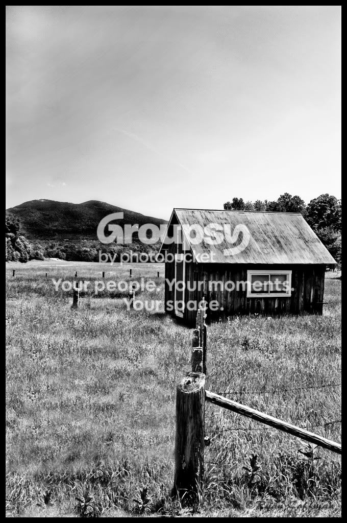
Ya I just fixed that on the saved version on my computer. It was just a slip with my burn tool, I didn't hit that one spot. You got good eyes! :lol:
 
^^^ I think I give up on b&w's. If I boosted the contrast, I would lose the detail in the barn walls. Also the primary colors of this scene were red, green, and blue...
I didn't mean to be discouraging. I was just trying to illustrate a point.

Contrast is everything.
 
^^^ I think I give up on b&w's. If I boosted the contrast, I would lose the detail in the barn walls. Also the primary colors of this scene were red, green, and blue...
I didn't mean to be discouraging. I was just trying to illustrate a point.

Contrast is everything.
No, it's fine. It's not just you that has said something about my b&w's. I didn't literally mean I was going to give up lol
 
I still prefer the darker sky. It gives it impact
 

Most reactions

Back
Top