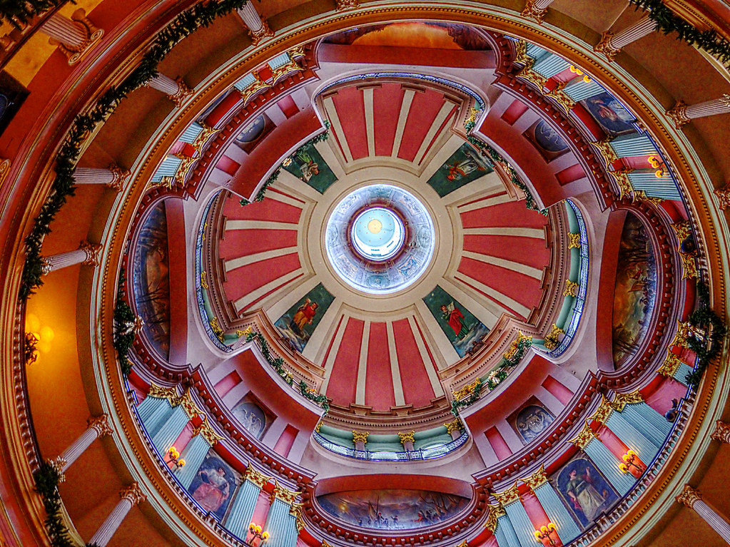
Oooh man, if it was just a bit wider. Typically, in a shot like this, symmetry is nice. This shot has an awkward off-balance look. Sorta like having two similar colors that don't match ... either match or go with contrasting colors ... I think your need to crop to symmetry or crop to a greater degree of off-balance.
Apart from the crop, I like the colors and the dome. I'm wondering who/what is depicted on all those panels. Are there pamphlets with descriptions? Where is this located?


![[No title]](/data/xfmg/thumbnail/35/35965-cac1057a7f2dd8e8aeeefed50ae8c080.jpg?1734167827)

![[No title]](/data/xfmg/thumbnail/34/34070-2a43e701f983f62ada1c66a54d00be4e.jpg?1734164507)


