Old man in the Carnival, redone.

Corry

Flirtacious and Bodacious
Supporting Member
Joined
Feb 5, 2004
Messages
21,168
Reaction score
110
Location
North Central Illinois
Website
corryttc.blogspot.com
Can others edit my Photos
Photos NOT OK to edit
Not sure if this is worthy of the Critiques section or not, but I really would like to know if I hit the mark with this one, and if not, how to hit it next time.

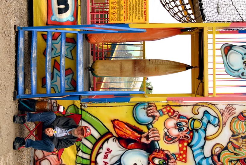
I posted almost the same thing yesterday in the gallery...when I went back today, he was in the exact same spot, so I shot a few more.

Don't have the Aperature or shutter speed, but it was around 8 or 11, shutter speed...I think in the 100-200 range.

My intent I guess was to show the difference between the worn old man, and the brightness of the children's monkey house.

Also, I'm posting two because I can't decide if the child in the picture helps or hurts.

Thanks in advance for any advice. :)

OldMan.jpg


OldMan2.jpg
 
For me, the second one has a great feel that the first one doesn't. The interesting story to me is the old man and the kid draws my attention away from him. Colors and composition on the second is good, too. I'd be tempted to try a B&W conversion on it and see how it looks.
 
For me, the background competes to much with your indended subject. I think a closer crop on the man will still get your intent across as the colors are so vibrant that the discinction can still be made without the full wall behind him. I agree with Chase that I prefer the image without the child.
 
i prefer yesterday's image (close cropped) with the man sitting alone.
 
He has a lot of character; I can see why you wanted to capture him.

I think I'd have been tempted to zero in on him in the first image, keeping the garish colored background and the words "Just ape it!" to his above right. It's the typical fake jocularity seen at these events that seem in direct contrast with his speculative face, gazing off... wonder what he's thinking about? ;) That's the crop I see, anyway. :)

The second image cuts out the words and he's looking directly at the camera....not as effective to me.
 
Hmmm.... very good suggestions and observations. I'll try out some edits as soon as I get a chance! Thanks!
 
#2 for me.

Beautiful perspective. For me, the old man is only part of the image.
I would have moved a bit to right to get the text above him. It would also have been better if you had included the other eye of the monkey on top.

If your main intention was the old man, I would agree to the comment on zeroing in on him.
 
I'm not an expert or even a beginner :p but i still feel compelled to offer my views on this one.

I do like the tighter view of the second picture, but to me the first picture is much more poetic. There's a fantastic contrast between the old, wandering, fragile man and the young, vibrant, playful boy. It's as if the old man IS the boy, looking back on his childhood, or it's a projection of the boy in years to come. The hands of time kind of thing. "Just Ape It" is the icing on the cake.
The second picture is nice, but the story isn't as enveloping.

Not much help as far as anything else goes, but i thought i'd offer my artistic opinion. Take it for what it's worth :wink:
 
I like the second shot as well...although I agree with others it could use a tighter crop, and for some reason this IMO seems like it may be one for selective coloring...leave the old man in color and maybe that will place emphasis on him and show the "childish" difference even without a child being in it...just a thought...it may be terrible idea though
 
Personally I like the old man looking away in the first (disinterested in your photo or more to the point the viewer). It lends more to his story. I agree with the distracting background colors, try B&W. Definitely without the child. I'd also crop off the left side to just beyond the stairs. I do not like the safety sign - just another distraction. If you do go to B&W I'd lighten the old man a bit - at least in my less than ideal conditions (bright room dull monitor) he looks a bit dull. Great shot!
 
The two can be spliced together very easily, I can post up what I mean if you want. You may be able to do it though. I tkn the one with he child in is better except the child is in it and that can be removed easily.
 
Ok...I think I'm agreeing with those that like the one where he's looking away, but without the kid...however, I'm having problems finding a crop without the kid, and still keeping the pic interesting. I tried doing black and white, but I can't seem to get that to look decent either. Anyone want to help me out and explain to me how I can fix these problems? Daniel, you said you could remove the child cleanly...can you explain how?
 
I took the liberty of grabbing the photos and trying a little chopping in PS. It's crude and basic but you can do some blending. I used both photos, took a rectangle (rather large up to the ape's nose) and placed that on top of the other photo. You see what I mean. With some work you can make this happen. The only other crop I did was removing the safety sign - sorry.


Hope you don't mind, I didn't see the OTE anywhere but it looked like you were asking.


OldMan2copy.jpg
 
It's no problem...I was asking...thanks. Tommorrow when I have a chance, I'll have to take a closer look at it and what you said you did to it. (I REALLY have to concentrate when learning PS. :( )
 
I love the character in that guy! But I agree- the shot without the kid is better, but there is too much background that distracts me. I'd crop in on his face and the bright colors behind him.
 

Most reactions

Back
Top