Alexandra
TPF Noob!
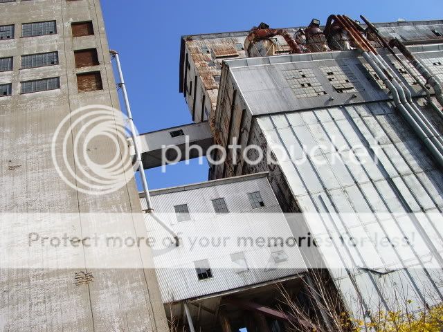
Ok, well here's the second part of my amazing walk at the old port. I sor of made a compromise here: 2 sepias, 2 B&W's and since not everyone is a fan of these, one in color. Tell me what you think of them:
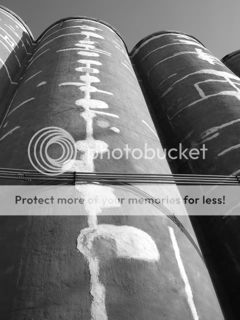
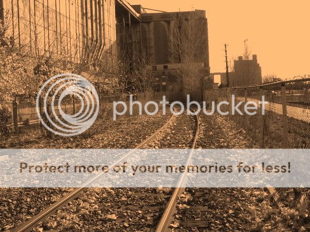
1. Silos...
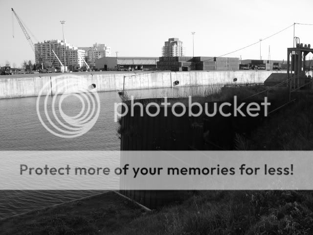
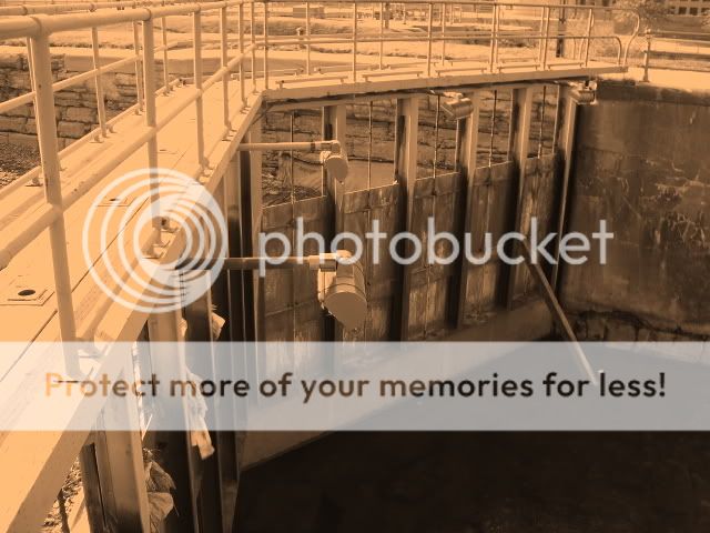
2. A part of the docks
3.
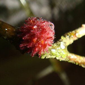
4. For some reason i don't know, I don't really like this one, but it looks good in sepia...
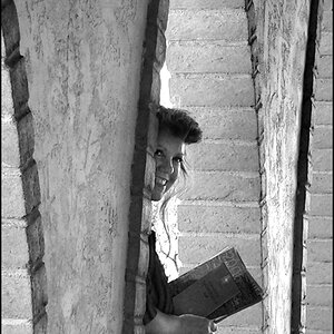
5.
1. Silos...
2. A part of the docks
3.
4. For some reason i don't know, I don't really like this one, but it looks good in sepia...
5.
")

![[No title]](/data/xfmg/thumbnail/41/41821-2e92de82ffc4cd2d520a8fa10fb8b6a5.jpg?1619739905)

![[No title]](/data/xfmg/thumbnail/33/33029-f4556b4c89cecbad12ebe6b782a51ef5.jpg?1619735843)
![[No title]](/data/xfmg/thumbnail/33/33031-909b1e1ff8739eef165c60b70c9a6a38.jpg?1619735845)
![[No title]](/data/xfmg/thumbnail/35/35266-f58b019dadff6920c09071a847f052c3.jpg?1619736970)
![[No title]](/data/xfmg/thumbnail/33/33030-2d80455c47ebf5f145e0bd5064267aea.jpg?1619735844)