Older photo: feedback, criticisms, and critiques.

DavidVote

No longer a newbie, moving up!
Joined
Jan 20, 2015
Messages
153
Reaction score
28
Location
Seattle
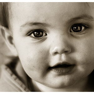
Well, since I haven't taken a picture in almost a month - aside from a test shot with a new lens, so I suppose I could get criticisms on an older photo from a few months back ( October of last year).

Before anyone give me these critiques, don't, I already know:

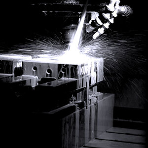
- The shadows look blown out, it is. The highlights are blown too. The dynamic range is too high in this particular scene. Should have gotten better lighting.

- The photo isn't sharp, its not.

- The background is plain

- The subject's eyes is looking down a bit too much.

Despite all the errors and mistakes, this remains to be one of my favorite photo. It is a visual representation of my interpretation of this song, and frankly, titled after the song.

I would really like to capture something like this again in the future. With this particular mood and feelings. Breaking away from customs, I would like to hear what I did right in this picture, but what I did wrong is also welcomed.

DSC_1281 as Smart Object-1.jpg


Thanks.
 
its moody, I like it, the softness in this context does not even come into it, the little highlights on the hair is nice
 
The composition looks random and the shot looks incidental. You can cut all the empty spaces to her right and left and make it vertical.
 
Last edited:
The composition looks random and the shot looks incidental. You can cut all the empty spaces to her right and left and make it vertical.

Why lose the space make it vertical? It would lose its incidental-ness! It would close the image down, cramp it up, and change the entire atmosphere of the composition.

@DavidVote , I think this is a great shot. It's very cinematic and I love the dulled colours. Nice job :)
 
I don't think it's a great shot ... it's nice...

....but I can't ignore that highlighted area. Honestly it's all my eyes are focused on.

She's pretty and I like the idea..
 
The composition looks random and the shot looks incidental. You can cut all the empty spaces to her right and left and make it vertical.

As much as I appreciate your feedback, cropping out the picture in this situation would change the mood and message of the image.
 
Honestly, with a shot like this, blocked up shadows (they may not be with careful editing) and blown highlights don't really matter -- especially highlights like these.

A plain out-of-focus background throws all the attention on the main subject. In my opinion the way she's looking down is fine too. So I think you're selling yourself a bit short thinking too much about errors and mistakes.

I like it and the space around her doesn't conclusively push the composition towards a vertical aspect. She looks lonely and dejected, so that fits well. A little more space above her head could prove useful.
 
The composition looks random and the shot looks incidental. You can cut all the empty spaces to her right and left and make it vertical.

The composition looks random and the shot looks incidental. You can cut all the empty spaces to her right and left and make it vertical.

Why lose the space make it vertical? It would lose its incidental-ness! It would close the image down, cramp it up, and change the entire atmosphere of the composition.

@DavidVote , I think this is a great shot. It's very cinematic and I love the dulled colours. Nice job :)

I don't think it's a great shot ... it's nice...

....but I can't ignore that highlighted area. Honestly it's all my eyes are focused on.

She's pretty and I like the idea..

Honestly, with a shot like this, blocked up shadows (they may not be with careful editing) and blown highlights don't really matter -- especially highlights like these.

A plain out-of-focus background throws all the attention on the main subject. In my opinion the way she's looking down is fine too. So I think you're selling yourself a bit short thinking too much about errors and mistakes.

I like it and the space around her doesn't conclusively push the composition towards a vertical aspect. She looks lonely and dejected, so that fits well. A little more space above her head could prove useful.

Mass quoting here. But ultimately, whether its a good photo or not, do you think it communicated the mood/idea/emotions of the song well enough?
 

Most reactions

New Topics

Back
Top