One Portrait for Crit.

nathanlegiehn

TPF Noob!
Joined
Dec 24, 2009
Messages
77
Reaction score
0
Location
Toronto, ON
Can others edit my Photos
Photos NOT OK to edit
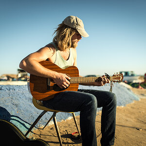
I got together with a musician friend of mine and took some shots of him. Just looking for any feedback on this shot as we are going to be doing some more shooting tomorrow.

Here is one (let me know what you think):
4477912937_60f61aa65b_b.jpg


Thanks,


Nathan
 
Everything looks sweet besides the framing. I feel there is way to much dead space up top, and not enough of the city scape at the bottom. Anymore from this set you wanna post?
 
Sure! Heres another one, one thing about our shooting location was that the ledge at the top of the building is quite high so it does look somewhat awkward in some shots if I dont crop. anyways, heres another:

4477911855_61c651a9b9_b.jpg
 
Im I think i still like the first more, that processing looks really smooth which im guessing is similar to his music.
 
if you scroll down on the images you can stop at a certain point and actually see that a different crop would help the overall feel of the image.
 
I actually LOVE all the negative space around the top. I would go even farther and make a ton more of it so the subject is in the bottom third and the dimesions of the overall image are 10x30ish. But this is probably for an album cover or something, so that wouldn't work. The BW conversion is beautiful. All the tonalities are very pretty. Great subject great location!!
 
I actually LOVE all the negative space around the top. I would go even farther and make a ton more of it so the subject is in the bottom third and the dimesions of the overall image are 10x30ish. But this is probably for an album cover or something, so that wouldn't work. The BW conversion is beautiful. All the tonalities are very pretty. Great subject great location!!

I was thinking the exact same thing. You might play with it a little and see what you can come up with, but overall, great.
 
I like them, but a tighter crop would relly set them off. Great pics either way!
 
Much prefer the first one. His pose, his expression AND the B&W. But I agree with the composition problem. If there was a reason for it such as copy going in there it would be another story. Crop it square and you have a pretty nice album cover.

Only pretty nice because his jacket appears slightly blown on the right side of the photo. If you have details there, you should do a slight burn. Then you will have a really nice photo.
 
Really nice stuff and I like both. However I agree with an 8x10 ratio crop here. It would really make it work.
 
I like the dead space! But it would look great if it were cropped as well. B&W image is my favorite.
 
Dear, Nathanlegiehn

I literally fell in love with your works.
They ARE INCREDIBLE!

This is the way I LOVE how pictures should be taken!
I love, love these photos.

And wouldn't change a thing!!!!
Thank you for this minute of pleasure)
 
Thanks so much guys! Considering that this thread has gone beyond the "One Portrait" I had originally stated I may as well throw in another that I took last night. This is of a friend of mine who was kind enough to model for me. Let me know what you think:

4527498928_bc45aea815_b.jpg
 
I definitely like the high key shots but regarding the crop -- why did you do it the way you did?

The aspect ratio is weird so I'm pretty sure that's not what came out of your camera...

It could work depending on how you were displaying the photo but if you print it for most normal sizes you'd have to recrop
 

Most reactions

Back
Top