Camper Dave
TPF Noob!
this was taken at the tidal crossing to the holy island, on the east coast of england, about a month ago. i quite like it, but what do you think? it was quite a dull, murky day so unfortunately the colours aren't very varied (it was taken on fuji 400 film btw, but can't remember the camera settings).
anyhow, any comments/critisism welcome")
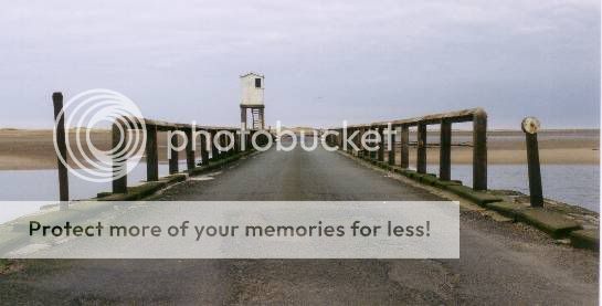
cheers,
dave
anyhow, any comments/critisism welcome
cheers,
dave


![[No title]](/data/xfmg/thumbnail/34/34347-8b81549fefc38aca163688d07a9f5ced.jpg?1619736384)


![[No title]](/data/xfmg/thumbnail/42/42040-7a66cabbeffd44783ea44a91ef4d0e70.jpg?1619739987)
![[No title]](/data/xfmg/thumbnail/34/34345-5642c495cae8d6c7bb83c28664146cf1.jpg?1619736381)