Opinions on this picture?

mrsalty1223

TPF Noob!
Joined
Nov 12, 2015
Messages
22
Reaction score
8
Can others edit my Photos
Photos OK to edit
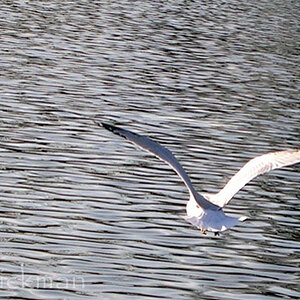
I was messing around with the 50x zoom on my new camera and I took a bunch of pictures of things around the room.

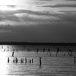
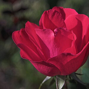
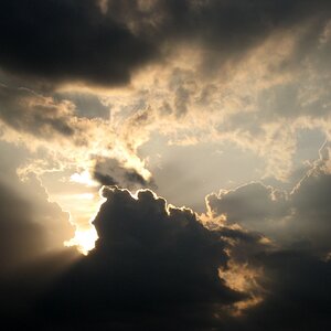
I think this one turned out pretty good. It really stood out to me at least. No editing and taken at iso 100.

What do you guys think about it? Any suggestions?
IMG_7484.JPG
 
The first thing I notice is the date stamp. I would turn that off. It ruins the picture. It's also a good idea to not state your own opinions about a photo if you want honest feedback.

Now-- I personally would prefer this in black and white. And I might clone out the writing on the bulb. Just my 2 cents.... YMMV
 
it is fairly sharp as the letters on the bulb show.
the fast shutter speed made sure it was going to be sharp.
did you point your single focus point on the bulb letters ?
I'm not sure but the WhiteBalance looks off.

Camera: Fujifilm FinePix S1
Lens: 138.9 mm
(Max aperture f/5.6)
Exposure: Auto exposure, Program AE, 1/1,097 sec, f/11, ISO 100
Flash: Off, Did not fire
Focus: Auto, Single Point
 
The first thing I notice is the date stamp. I would turn that off. It ruins the picture. It's also a good idea to not state your own opinions about a photo if you want honest feedback.

Now-- I personally would prefer this in black and white. And I might clone out the writing on the bulb. Just my 2 cents.... YMMV

Thanks. I'll keep that in mind.

I tried it in black and white but it loses the flare that I like about the picture. You lose the 'old timey' feel of the picture.

it is fairly sharp as the letters on the bulb show.
the fast shutter speed made sure it was going to be sharp.
did you point your single focus point on the bulb letters ?
I'm not sure but the WhiteBalance looks off.

Camera: Fujifilm FinePix S1
Lens: 138.9 mm
(Max aperture f/5.6)
Exposure: Auto exposure, Program AE, 1/1,097 sec, f/11, ISO 100
Flash: Off, Did not fire
Focus: Auto, Single Point

Yes. I focused on the bulb letters.
Is the white balance being off what gives it the sepia tinge?
 
I kinda like the lettering. I don't think you can buy those type bulbs anymore. Nice shot.
Thanks. I agree on the lettering.
Who would have thought the good old incandescent light bulb would ever be phased out? Crazy, isn't it?
 
I can still buy incandescent bulbs all over the place.
I recall years ago they were going to completely phase them out, but they disappeared for a short time and then came back. they're just so much cheaper.

Yes, with the Whitebalance being off you get that sepia colorization, which kinda makes it look old fashioned in a sense, just like the light bulb LOL
 
I try to use an 18% grey card as an initial test shot before shooting. This gives me proper adjustment for the White Balance.
Here's my correction of your WhiteBalance a bit. Assuming the White of the bulb is the correct white color / temperature.
Done in LightRoom with a Temp -46 and Tint -10 White Balance adjustments.
LightBulb-1.jpg
 
Incandescent lamps are still just as available as they always have been. But now they cost 20x more.
 
I try to use an 18% grey card as an initial test shot before shooting. This gives me proper adjustment for the White Balance.
Here's my correction of your WhiteBalance a bit. Assuming the White of the bulb is the correct white color / temperature.
Done in LightRoom with a Temp -46 and Tint -10 White Balance adjustments.
View attachment 113406
Thanks. I think I see what you're saying. I was able to somewhat match the image you made by adjusting temp. It is closer to the actual colors but I think I prefer the look of the original still. Just my preference.
Yea I like the original shot better.
 
I agree with @wyogirl ... kill that datestamp!

And I like the original color you posted. And the sharp lines and shadows in the glass embossing are very interesting.

Oh, and there are a couple of little specks that I would clone out around the rim.
 

Most reactions

New Topics

Back
Top