Opinions please! (I know you're good at that :) )

butterflygirl

TPF Noob!
Joined
Feb 21, 2007
Messages
401
Reaction score
0
Location
Michigan
Website
www.photosbymcdonald.com
Can others edit my Photos
Photos OK to edit
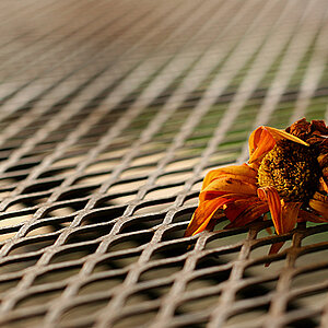
Please tell me what you think about these photos...I'm almost thinking they're too saturated, but I like the colors. Any suggestions? Comments?

1.
IMG_2418DP.jpg


2.
IMG_2415RT.jpg


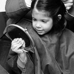
Then I have this one with the colors toned down a bit ...

3.
IMG_2408.jpg


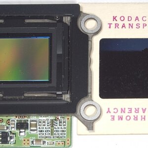
Or this one in sepia - what do you think? Favs? Yeah/nay?

4.
IMG_2412sepia.jpg


Thanks!
 
#2 sticks out to me, i like it. I think i might crop a little bit of the sky off the top though.
 
You got dust on your sensor...

And if your question about the first is if it is too saturated - yes, I think it is, the amount of magenta is way too high, the sky begins to look purple. But if YOU like this then that is all that counts, really!

I like the timeless look of the converted, sepia-toned last, though compositionally I feel there is too little ground and too much sky for the picture format you have. And something tells me this area is not hilly - but the horizon is not level - maybe? :scratch: ?
 
Yes, the first is way too saturated. Not such an issue with the others.

My questions is " What is the subject of your photos". It appears to be the sky with its various cloud forms. Personally, I do not find the sky to be that interesting or a much of a help to the pictures.

The second and third images would work much better for me if the sky were cropped. Then you will have the traditional landscape (ho-hum), but they will be more compelling to me. Since I would love to be where you are and walking in these fields, doing what you are doing, I like their potential.

Rusty Tripod
 
Newbie question here but why does everyone say that the first is way too saturated? I was of the opinion that "the more saturated the better" so I always saturate my photos as much as I can possibly get away with, but if that's not desirable maybe I need to change my postprocessing. When I look at the pictures that come on the advertising brochures with my camera and the sample photos that are on display in photo shops they are always highly saturated, and the pictures that win awards on the Canon web page (they have a competition that gives away expensive dslrs), the pictures that win are always saturated to the max. Thus giving me the impression that this was what I was supposed to do!
 
You can make the colours look vivid, yet retain a certain realistic charm(which are usually used in advertising), or you can saturate certain images to a point where they just look... odd?
I just checked your FlickR and none of your pieces are saturated to an unrealistic scale.

There are no set rules with how to make images look, do what makes you happy.
 

Most reactions

New Topics

Back
Top