Opinions welcomed..Image imbeded.

CJ76

TPF Noob!
Joined
Sep 20, 2005
Messages
12
Reaction score
0
Hi Ive just purchased myself a camera & am interested in developing my skills, as such knowing that Iam a novice Im turning to those of you that can guide me & point out the right & wrongs. All critiques appreciated.

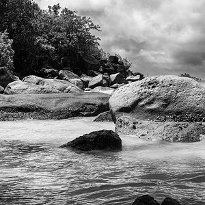
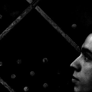
With this pick I was trying for the mood of lonelyness, I think maybe a greater DOF may have helped achieve this...or a may be way off... Thoughts ???OTE

3742501-md.jpg
 
I'd give it a little more space, though I like the horizontal (extreme) feel. I also like that you're low to the ground shooting this one. Mostly it needs some more contrast, I think. But in my opinion you did capture a feeling of lonliness. Do you have frames where we can more clearly see his face?
 
i would have liked the face to be higher, this way it kinda gets lost inside the body, it is too crouched. i like the panoramic look and also the trashy background but i don;t appreciate the pose of the character as i said higher.
 
What's the original look like w/o it being cropped? Just curious is there was another way to crop that would give more of a feeling of space that you're wanting. Also I think it could use a touch more contrast as well...like the idea you're going for with this one, and the placement on the man is nice as well :)
 
Thanks for the replys, much appreciated.
Here's a copy of the original. As you can seethe light at the bottom was of concern & the sign's & extraat the top just seemed a bit trashy. I like the Idea of seeing more of his face!! in retrospect that would certainly added to the mood of the image.
Thanks again.

Alone8x6untouched.jpg
 
I would have liked to have seen it closer in on the man. I also agree that you need a bump of contrast there.
 
Hi again. Ok, here is my take:

3742501-md.jpg


I took out room on the left side. I felt that too much background was taking away from your subject. I though the distance in the back was enough to tell the story. Your levels were off, so I did a little jog to make your subject "pop" more. I bumped up the contrast a hair to bring out shadow detail.
 
Elsaspet, I like those changes. So when you say you gave the levels a jog, what is it your looking at??? You mentioned Shadows is this to add depth etc?
Just trying to get my head around this, I personalythink B&W images can be extremley strong but I cant personally cant put my finger on what it is that makes them that way.

Chris.
 
Hi Chris, glad you like it. If you open your levels dialog box, you will see the histogram for your image. Basically, I moved the black arrow to the right and the white to the left and the gray just a tad to the right. Play with that and you will see how the image will start to become more three dimensional. A slight (only about 8 points) bump in the contrast brought out shadow detail, and reinforces the depth. Auto levels and contrast can be used for this, but they tend to be on the "safe" side, so I use them manually for more impact. Your gallery seems to be photojournalistic in nature. Nicely done, BTW. With Photojournalism, you will always want to go with a higher contrast image.
Anyhoo, lovely photograph and I think you have a definate talent.
 
After seeing the original image I really like it, and created a few versions to see what you thought. I went with your idea of tring to emphasize him being lonely. I think the rest of the original helps that idea bit more, so I didn't crop it but burned the bottom in a bit darker on the images, then did some different techniques, you may totally hate them and that's cool with me, I just always like a good challenge :)

Black and White using channel mixer layer, high contrast to really emphasize the surroundings
3745611-mdbw.jpg


Used an action in PS on this one, the Dragan Action
Draganizedefittpf.jpg


This was done w/another action, and then some of my own tweaking...
3745611-md.jpg


Again if you hate them I don't mind...I just enjoy a good edit when I have the time :)
 
After seeing the black and white posted here it looks completely different...very blown out, so it definitely needs some toning down, but you get the idea :)
 

Most reactions

Back
Top