
cauzimme
No longer a newbie, moving up!
- Joined
- Nov 3, 2009
- Messages
- 469
- Reaction score
- 362
- Location
- Montreal
- Can others edit my Photos
- Photos OK to edit
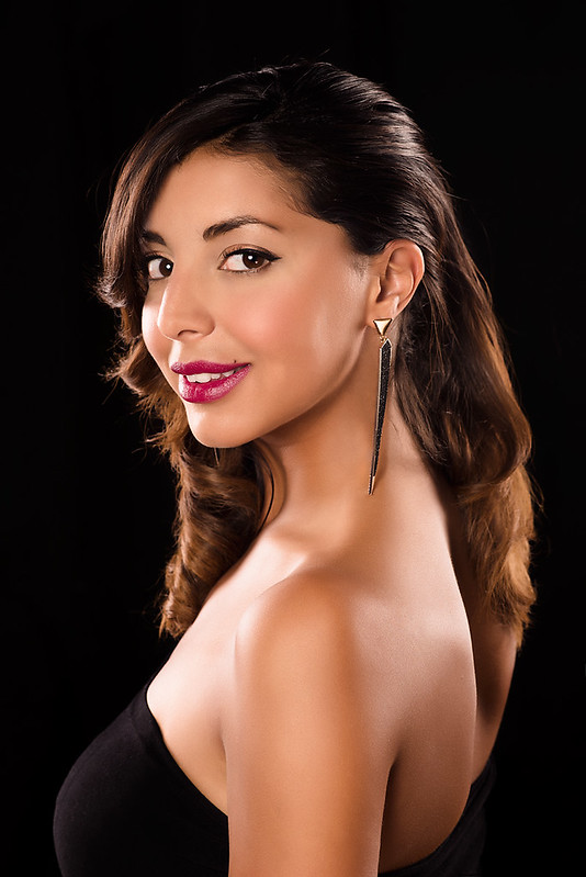
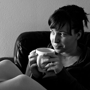
So one of my good friend is a hairstylist, she's building her port and ask me if I could help her, I agree even tho, it's not really my thing.
Here's the first 2 I had time to edit;
Any C&C welcome, hope she's gonna be happy with the photos.
ISO 100,
f8, 1\100
85mm
1.
2.
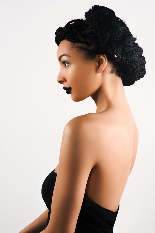
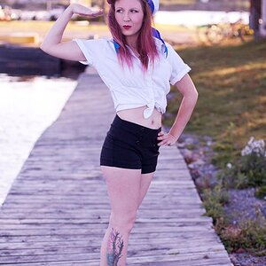
Here's the first 2 I had time to edit;
Any C&C welcome, hope she's gonna be happy with the photos.
ISO 100,
f8, 1\100
85mm
1.
2.
Last edited:


![[No title]](/data/xfmg/thumbnail/38/38734-a0c4ec46a440db881aca3700b0c62879.jpg?1619738703)
![[No title]](/data/xfmg/thumbnail/35/35877-b537a0bce18fcb18b610d787610f3d3d.jpg?1619737203)
![[No title]](/data/xfmg/thumbnail/30/30879-16ad830465e571dee0a784c7fa122909.jpg?1619734493)

![[No title]](/data/xfmg/thumbnail/38/38732-8364f5190d3f325e8ee02d23404a610c.jpg?1619738703)