
GerryDavid
No longer a newbie, moving up!
- Joined
- Sep 18, 2003
- Messages
- 1,221
- Reaction score
- 9
- Location
- Virginia
- Can others edit my Photos
- Photos NOT OK to edit
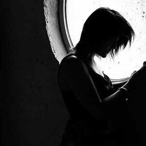
Just wondered what everyone thought of this one. Anything in it you find distracting/annoying?

http://gerrydavid.smugmug.com/photos/33084679-L.jpg
Aperture: f/4.8
ISO: 100
Focal Length: 6mm *I think this is 35mm in terms of 35mm perspective*
Exposure Time: 1/680
Post production:
* rotate to straighten it
* cleanup on the picture to remove some unwanted items
* umm, some adjustment layer that helps you convert things into black and white, gives you more range or something like that, I cant thinkof the tecnical name for it right now.
* channel mixer set to monochrome and various adjustments on the sliders
* curves adjustment layer to increase the contrast
* I think I copied the image over to helicon noise filter, reduced the noise and brought it back into photoshop. If there is a plugin for ps for this, that would be handy.
* background adjustments. I dont want to say what it was, but if you can see anything that doesnt look natural, please let me know.
* copied previous layer *ctrl J* and applied USM, then brought the opacity down to something like 50%
Im going by just memory here so I may have left something out, like blending modes.
I dont really like how the picture is centered but I cant crop it and keep the 8x10 ratio. I wish I had more of the bottomof the tower in the picture but I would need a wide angle lense for that. :0)
Hmm, and just looking at it now, you can almost see a face in the sky on the top right, odd.


![[No title]](/data/xfmg/thumbnail/33/33447-c3f5563c9b8b1f19498a3062f60f92b1.jpg?1619735973)
![[No title]](/data/xfmg/thumbnail/42/42058-8597ac0f687fb4007aa3ca0210936f04.jpg?1619739994)
![[No title]](/data/xfmg/thumbnail/42/42059-61b97bbebb00e6276672551f4e3b3e43.jpg?1619739995)
![[No title]](/data/xfmg/thumbnail/35/35666-9f404fab7b896e4ec114160079fa71c6.jpg?1619737090)