Navigation
Install the app
How to install the app on iOS
Follow along with the video below to see how to install our site as a web app on your home screen.

Note: This feature currently requires accessing the site using the built-in Safari browser.
More options
You are using an out of date browser. It may not display this or other websites correctly.
You should upgrade or use an alternative browser.
You should upgrade or use an alternative browser.
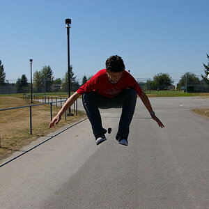
Photographer #3
- Thread starter rub
- Start date


Alpha
Troll Extraordinaire
- Joined
- Mar 15, 2005
- Messages
- 5,451
- Reaction score
- 41
- Location
- San Francisco
- Can others edit my Photos
- Photos NOT OK to edit
Yikes. #1 looks something like a catalog shot but the couch just don't make no kinda sense. #2 and 3 are really just quite silly. #4 is rather plain. They look just as you described...an afternoon with a friend. Why that places them in the "professional gallery" I'm not sure.
JohnEBongo
TPF Noob!
Yikes. #1 looks something like a catalog shot but the couch just don't make no kinda sense. #2 and 3 are really just quite silly. #4 is rather plain. They look just as you described...an afternoon with a friend. Why that places them in the "professional gallery" I'm not sure.
Wow, that's pretty harsh, and not very constructive. Are you always this much of an a$$?? (from the few posts of yours that I read, you don't need to answer that). Anyways, about the OP's photos. Using a prop like the one you used in #1 can work out very cool. I would try a wider approach so more of the background is visible and maybe stop down a little to increase the DOF. Their is also an exposure issue, it looks a little washed out to me. #2 is nice, but I would like to see the models whole face. #3 could be good but the pose just doesn't do anything for me. #4 is not exceptional, but is a nice naturally lit close up.
ocular
TPF Noob!
- Joined
- Jul 29, 2009
- Messages
- 1,107
- Reaction score
- 1
- Location
- outoftown
- Can others edit my Photos
- Photos NOT OK to edit
They are cheesy but in a good way lol. Last picture I don't agree with. I really hate when people feel the need to sharpen eyes for every photo. In this case it looks odd and from her expression she looks fed up with the shoot a.k.a tired/bored.#2 and 3 are really just quite silly
Alpha
Troll Extraordinaire
- Joined
- Mar 15, 2005
- Messages
- 5,451
- Reaction score
- 41
- Location
- San Francisco
- Can others edit my Photos
- Photos NOT OK to edit
Wow, that's pretty harsh, and not very constructive. Are you always this much of an a$$?? (from the few posts of yours that I read, you don't need to answer that).
I feel that stylistic concerns are just as important as technical ones. Technique is rarely, if ever, an end unto itself. Nothing strikes about the photos I referred to as "silly" or "plain" except the fact that that's how they feel. If what jumps out at me is not a subject for commentary, I don't know what is. I agree it's not flattering. I've had worse things said about my own work. But I think it's perfectly acceptable to voice emotional concerns or reactions, however unflattering. If you've read through so many prior posts here, you should know that this particular discussion is a dead horse anyway.
Last edited:
mat wildlife
TPF Noob!
- Joined
- Jan 19, 2007
- Messages
- 54
- Reaction score
- 3
Looks as if you had a fun afternoon. Here's my take on the pics FWIW
#1 - too cramped and foot cut off, uneven light across the face.
#2 - I like but might need a little contrast boost.
#3 - sorry, but this one does nothing for me at all.
#4 - my favourite, but I'd remove the purple blob on the left.
#1 - too cramped and foot cut off, uneven light across the face.
#2 - I like but might need a little contrast boost.
#3 - sorry, but this one does nothing for me at all.
#4 - my favourite, but I'd remove the purple blob on the left.
OP
OP
rub
TPF Noob!
- Joined
- Oct 17, 2007
- Messages
- 932
- Reaction score
- 214
- Can others edit my Photos
- Photos OK to edit
Thanks for the feedback everyone, including Alpha. ")
I have been in a terrible rut for some time now, and it shows in this work. I thought maybe trying to go more casual would pay off, but its pretty clear it didn't.
John - thanks for your comments, but I am okay with Alphas take on them. After posting here for the first time, I was creamed by some of the big dogs. It stung then, and still does now, but it makes me better in the end. I get enough pats on the back from family friends and customers, but that will never make me advance.
I think we fall n love with our images so much that they can hold us back, and thats not what I want.
Either way, the client loved them (dont they always) but I did not. So the feedback will help me for the next shot to come.
Cheers,
Kristal
JohnEBongo
TPF Noob!
Wow, that's pretty harsh, and not very constructive. Are you always this much of an a$$?? (from the few posts of yours that I read, you don't need to answer that).
I feel that stylistic concerns are just as important as technical ones. Technique is rarely, if ever, an end unto itself. Nothing strikes about the photos I referred to as "silly" or "plain" except the fact that that's how they feel. If what jumps out at me is not a subject for commentary, I don't know what is. I agree it's not flattering. I've had worse things said about my own work. But I think it's perfectly acceptable to voice emotional concerns or reactions, however unflattering. If you've read through so many prior posts here, you should know that this particular discussion is a dead horse anyway.
Fair enough.....
You are really great. I just love how you capture the moment in your camera. It looks so surreal. The photo is outstanding. The lighting is superb. Looks like something out of a Fantasy movie.You have a strong feel for contrast. I like your style, keep up the great work!!
templatephotoshop
TPF Noob!
- Joined
- Mar 26, 2010
- Messages
- 79
- Reaction score
- 0
- Location
- Iowa
- Website
- www.templatephotoshop.com
- Can others edit my Photos
- Photos NOT OK to edit
Alpha's a little negative that's for sure, I enjoyed 2 and 3 for the reasons he didn't. I love the movement and the branches. The lighting on number 1 wasn't my favorite. Too harsh, just wait a little longer and it will be perfect.
Brad Hardy
TPF Noob!
- Joined
- Jan 6, 2008
- Messages
- 145
- Reaction score
- 1
- Location
- PA
- Can others edit my Photos
- Photos NOT OK to edit
Rub, I wouldn't take Alpha's critique all that seriously. Really hate to see somebody give such a harsh critique only to find that the person offering his or her critique has a body of work that doesn't hold a candle to that of somebody like yours. That being said, I quite like #2. I'd suggest exploring this look a bit further and seeing what you come up with.
Best,
Brad
Best,
Brad
matteahmb
TPF Noob!
- Joined
- Mar 3, 2010
- Messages
- 8
- Reaction score
- 0
- Location
- Pensacola, Fl
- Can others edit my Photos
- Photos NOT OK to edit
1. I don't mind the overall photo, but it does stop short of a great photo. The photo is a little washed out. I can see where you were going with it. Maybe with the prop, having her less "posed" might have worked. I like the hand by the legs, but not the hand on her shoulder.
2. I actually like two a lot. It's an interesting shot and black and white was the right choice, in my opinion.
3. sorry, this one does come off looking a bit silly in her pose.
4. This shot seem to be an ok shot, but doesn't stand out.
Being in a rut is tough. Don't let this shoot or feedback stop you from trying a casual approach again. The more you do something, the better you normally get and either way...eventually you'll shoot yourself out of a rut
pbelarge
TPF Noob!
- Joined
- Feb 11, 2010
- Messages
- 2,680
- Reaction score
- 0
- Location
- New York
- Can others edit my Photos
- Photos OK to edit
Thanks for the feedback everyone, including Alpha.
1. I think we fall n love with our images so much that they can hold us back, and thats not what I want.
2. Either way, the client loved them (dont they always) but I did not. So the feedback will help me for the next shot to come.
Cheers,
Kristal
Kristal
1. that is so true, but it is good to realize this.
2. A good musician always knows when they have missed a note.
Most reactions
-
 407
407 -
 312
312 -
 280
280 -
 270
270 -
 264
264 -
 224
224 -
 196
196 -
 181
181 -
 165
165 -
 152
152 -
 141
141 -
 139
139 -
 135
135 -
 122
122 -
 102
102