Photoshoot with Justine.C+C welcome

MrMorrill

TPF Noob!
Joined
Sep 11, 2007
Messages
26
Reaction score
0
Can others edit my Photos
Photos NOT OK to edit
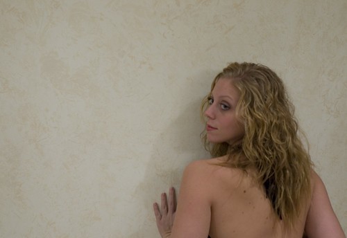
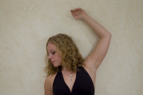
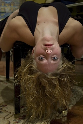
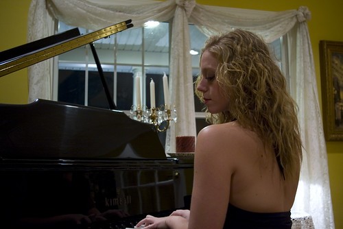
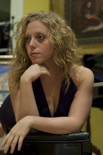
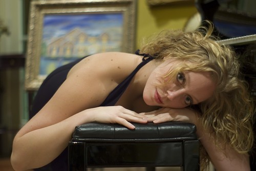
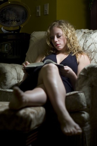
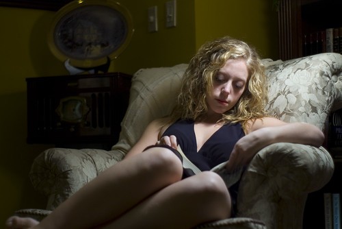
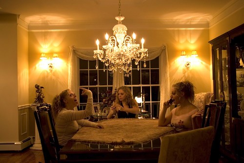
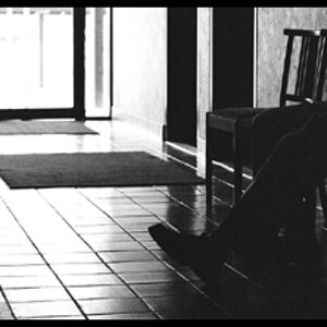
I took some shots around her house and was wondering what you all thought. The lighting is what was in the house no studio lighting or anything . The camera used was a Pentax Ist* DS with a 50mm smc f2 lens. C+C welcome!

1
2061808662_f75977346b.jpg


2
2061808668_1cd9d3c162.jpg


3

2061808670_df7d11c077.jpg


4

2061808676_e1c81de04e.jpg


5
2061808678_867b677944.jpg


6
2061027841_adab352e18.jpg


7
2061027845_c6dec1b922.jpg


8
2061027847_484fd883b5.jpg


9
2061027851_55932b2e05.jpg


10
2061027857_ea64055e64.jpg


11
2061029773_f30ef35982.jpg
 
I don't have time to comment on each photo individually, but I will say that you're not going to get effective portraits with plain indoor overhead lighting. You need some light to be coming from the side or front - see how she has dark shadows under her eyes in many of the pictures? Lighting like this also won't create the type of depth and contrast you want, these are very flat (particularly the first 3). I like the last 3 best because the lighting is appropriate for the scene. The others would be better tried near a window in the daytime, or with some studio lights. Your white balance is also off in these due to the incandescent lights, did you do a custom wb?

Good for you for getting creative though, and I'm sure your next try will be better! I like the shallow DOF you used in 6, 7, and 8.
 
i'm on dial up (ugh. . . no high speed available here)

so i only looked at the first 3.

1, i think the light is not at all nice or flattering, and light should be your first concern when shooting portraits. try a looser pose, not so much back. some people say to make sure you can see the whites of both eyes. . . and i agree generally if there is eye contact that should be the case. she looks really uncomfortable and like she is straining to make eye contact with you. its oddly framed, i think we should see a tad lower instead of cutting the hand off the way it is.
2. there is camera movement. and unflattering light. shoot vertical? why is she in the center, i don't get the feeling that was intentional.

3movement. again, why not shoot vertical? have her hips in the shot so she doesn't look square.

sorry if this is way more critique than you wanted, i mean it all only in a friendly way.
 
the light is BAD. heres a cheap light to make,

buy a cheap hot lamp, buy a lasagna tin, cut a hole in the middle, tape your light to the tin where light can shine into it, now cover the tin with wax paper.

or use one of those lights with a dish over it, and add some depth to these.

on 9,10, get higher, the foreshortening is unattractive.

6,7,8 would be better with a plain background, and in 8 i think both elbows should have been in the photo, the framing is off.
 
with the first three I really wonder why they are "landscape" and not "portrait". Also the wall does not give a good contrast to skin tones.

7 an 9 are my favourites ... moody colours as well
 

Most reactions

Back
Top